Illustration in experience design
Helen recounts a recent illustration project which highlights the value of illustration in experience design.
The topic of illustration is broad.
In this blog post, I want to shed some light on the power of illustration within branding, and the ability it has to reinforce identity and connect with consumers.
The best way I can describe illustration, is as a visual language. And not just in the sense of communicating a message. Illustration can also convey personality, encourage a user to take an action and build trust (I could go on…).
Why illustration matters
Illustrations are unique, they are typically less literal than other forms of visual media. And this is possible as they are created for particular purposes; not everything should be an illustration.
For brands looking to establish a solid identity in the digital world, illustration can be a crucial tool as it offers the chance for personality to shine through and better communicate with customers.
I do a lot of editorial illustration and client led illustration work, which recently gave me the chance to tackle a brief that allowed me to channel my knowledge of illustration into a project that was focused around creating a style to be used going forwards, rather than the content.
Interpreting the brief and understanding the context
Let’s examine the brief.
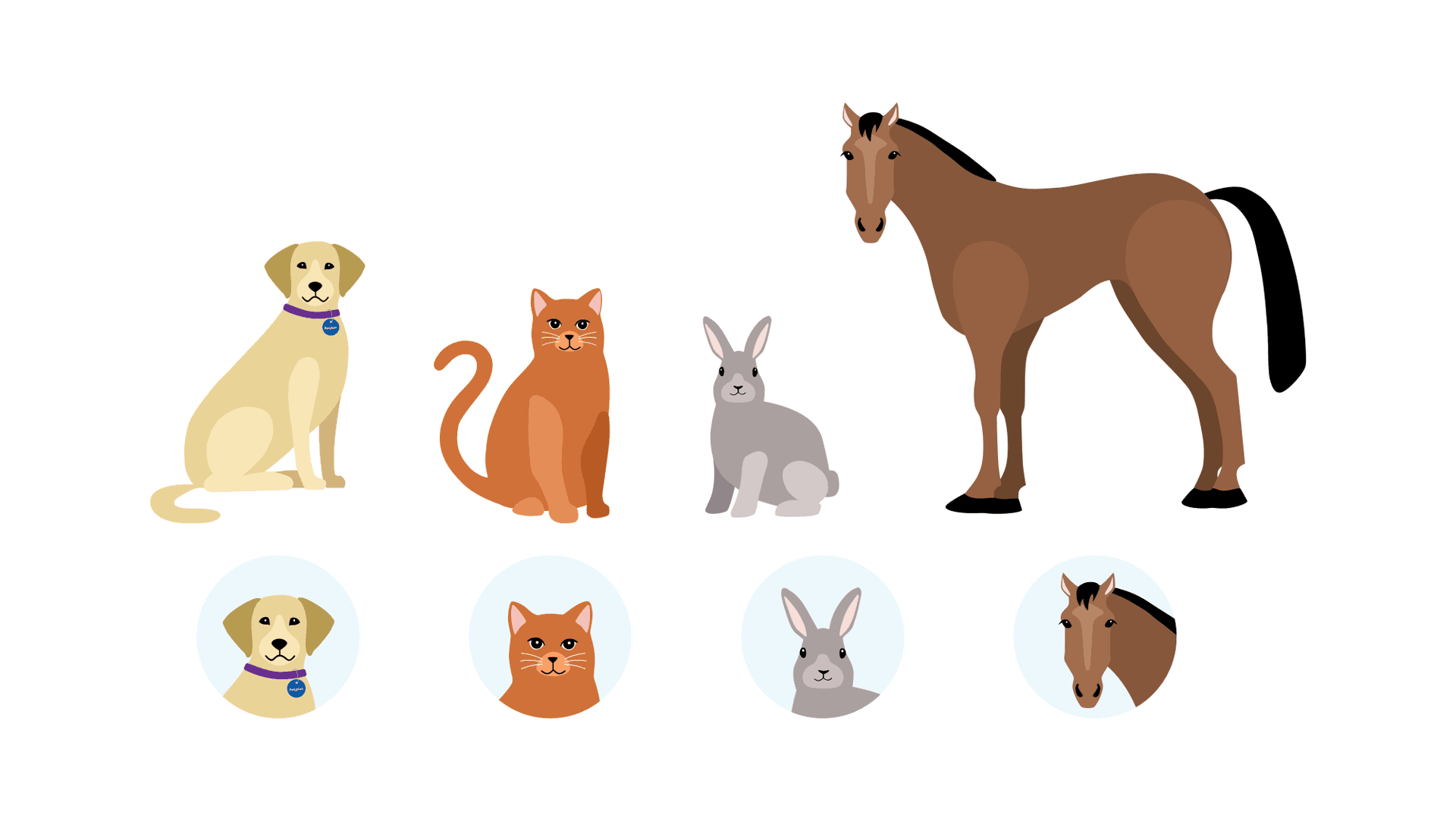
I was tasked with creating four placeholder images of different animals: a dog, a cat, a rabbit and a horse. These will sit on an owner’s hub site for a pet insurer.
The purpose of this placeholder is that it should act as an empty state and encourage the user to personalise the space by uploading their own photo. Essentially, it needs to be generic enough so a user updates it but engaging enough to make them want to do it.
On the current site, the space is occupied by a photo – it’s first worth comparing the use of photography vs illustration in that context. If I were a user logging onto this site expecting to view details of my pet, how would I feel when the image on my hub is a photo of someone else’s dog?
However, if the placeholder image is an illustration, it will have been made with purpose. This means that by design, it can fulfil the needs of being generic yet also feel relatable - much better.
Challenges with illustration
Now we’ve considered the context of the project, it’s time to create some work. But this idea of creating ‘generic’ imagery poses its own challenges…
As soon as you start to draw a dog, the head and body shape starts to resemble a specific breed. With that in mind, how do you draw these pets in a way that makes them recognisable, without being too recognisable? And how do you create an illustration that feels generic yet also relatable?
We decided that the best way to structure the workload was to produce three illustration styles that answer the brief, but in slightly different ways.
Because we already knew what we were creating, it was more a question of styling. Using feedback from the client, we could create a final set that felt both on brand and generic.
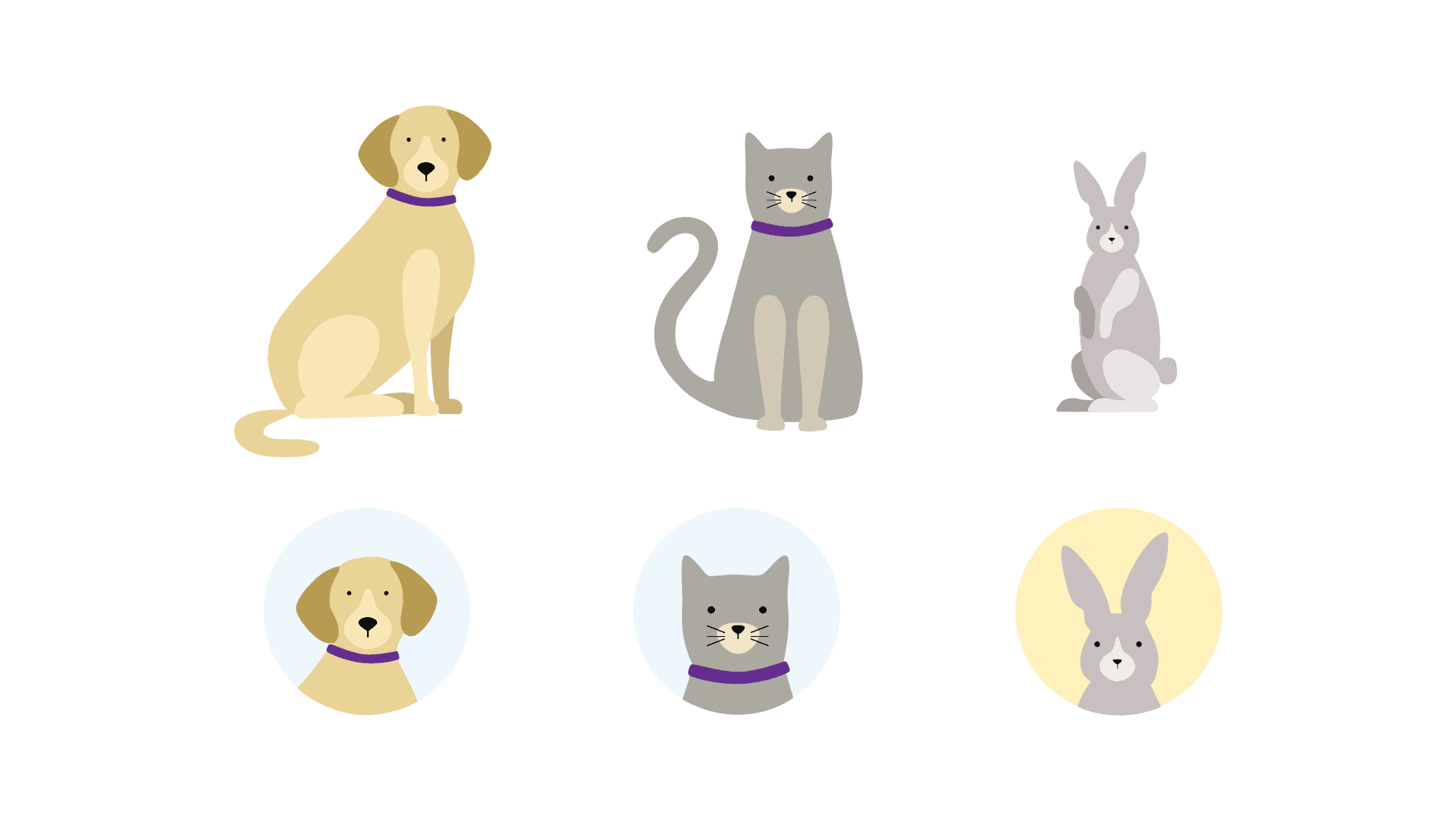
The first concept was what I would describe as a standard and generic style.
The illustrations were loosely based on life, but used flat colour and simple curved shapes so they weren’t too realistic. Using these as a basis we developed the next two concepts, which were more stylised.
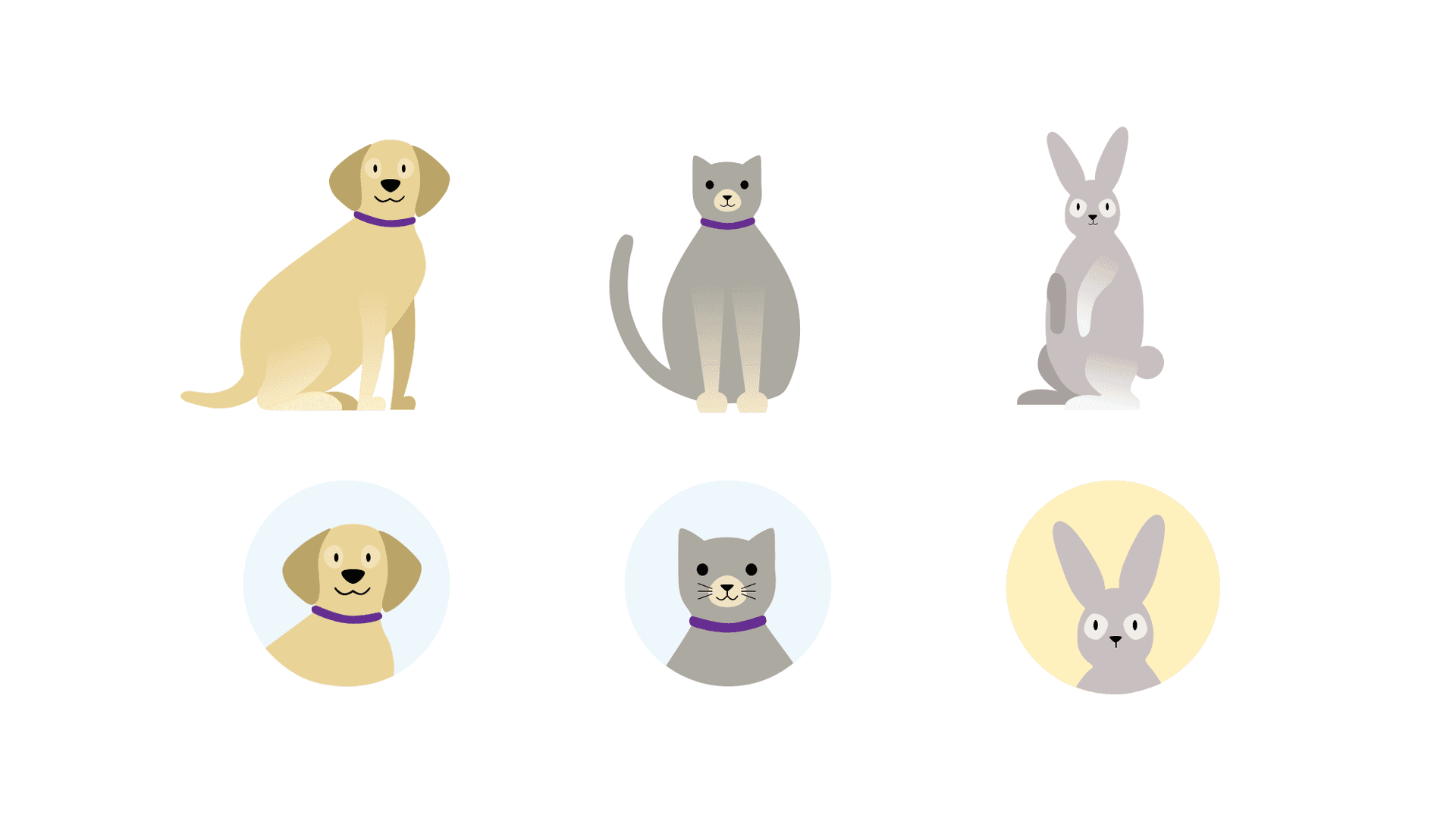
The second illustration style was heading more towards a cartoon or caricature.
You may typically associate this type of style as something quite tacky. But the beauty of a cartoon is that by nature they aren’t true to life, and usually have exaggerated features with heaps of personality. We felt that this made it an appropriate route to explore and we were able to create illustrations for the client that didn’t resemble specific breeds, with lots of charm.
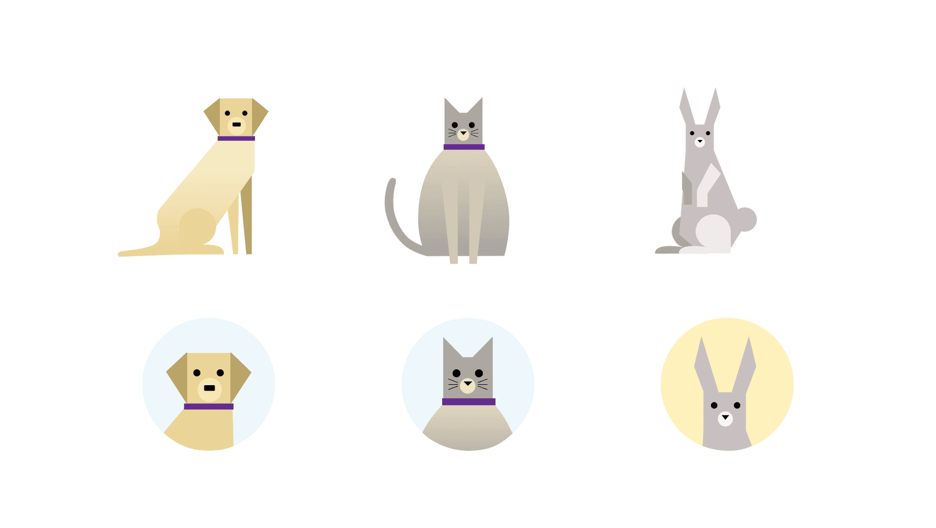
We developed the third style from some of the previous work we had done for this client, which involved illustrations made using geometry and simple shapes.
By constructing the illustration in this way, we were able to tackle the issue of not making the pets too recognisable. But this also allowed us to find an unusual and interesting way of creating generic imagery.
Choosing the style and iterating
After discussing the options with the client, the decision moving forward was that we would go with concept 1, the ‘standard generic’ style.
Two things to work on were giving the illustration more personality, and including extra detail so that they are more true to life.
In terms of adding more detail, we return to the age-old issue of striking the right balance when applying detail.
One consideration was that you must be able to recognise what they are at a glance. You need to be mindful of how small the space illustrations may occupy is. Especially on a mobile screen. With this in mind, here are the changes I made:
Body shape - Fine tuning and making sure they were true to life. We added in extra details to the ears for added interest in the cropped versions. For the dog, we agreed that we should style it based on a Labrador. There is a lot of differentiation between dog breeds, and Labradors are more typically ‘generic’
Eyes - It’s a fact that you recognise people by their eyes. Maybe that’s not true for animals, but nevertheless each pet has a distinctive eye shape.
Colour - What colour would you normally associate with a dog/cat/rabbit/horse? This was the basis for the colour choices we made, while also ensuring the colours provided some differentiation between each animal
Then we had to give the illustrations more personality.
You’ll remember that one of the earlier styles was mostly based around this. And I’d managed to do this quite successfully, so I was able to pinch details (such as the mouth) from this and add it to the chosen style. Simple, but effective.
Wrapping up
Hopefully, this has given you insight into the complexities and considerations involved in an illustration project. And that’s just the tip of the iceberg.
When illustration is used as part of a brand identity, it can be integral to all sorts of outputs. Sites, advertisements - you name it.
By adding charm to products and services, it presents opportunities to businesses wanting to connect to consumers in a personal and meaningful way.
While I was studying I spent my time improving the way I approach editorial illustration and I’ve had plenty of opportunities to develop my skills at Foolproof.
Creating illustrations for the journal in particular challenges me to illustrate topics and ideas that I probably wouldn’t otherwise, as my personal work is very focused around women and surrealism.
The beauty of editorial work (for me) is the challenge of creating a singular image that captures a tone, complex themes and ideas.


