Sticks and stones: How data visualisation includes or excludes
Mario offers tips on and dives into the history of data visualisation.
We work on how best to relay and visualise information to our clients and their users.
Often, simplicity and ease of understanding are paramount to relaying potentially critical information.
This is because humans benefit from visual cues - they can be processed quickly and give a base understanding. Vision itself requires minimal mental effort. It’s why data and information visualisation work so well for most of us.
Effectively visualising information
Visualisations are meant to contain information which offer the viewer knowledge. We’re tempted to think that whimsically decorating data is the craft required for that to happen. Stale statistics quickly become inviting and pleasant to look at. However, by dressing them up rather than addressing the communication need, we’re falling short of improving the cognitive understanding of that data or information.
Visualisations also shouldn’t be judged on how much information they show, but rather how effectively it facilitates the flow of information into knowledge and understanding. This is highly contextual and cultural, and what qualifies as a visualisation is tricky, because there’s no consensual definition. “Easy to understand” is a reasonable expectation but a vague criterion: to whom?
Successful visualisation requires a focus on the usability of the information, representing it so that it neither distorts, distracts or misrepresents. The simplicity of the visualisation also needs to honour both the complexity of the data and aid understanding.
When upholding these criteria, it’s easy to see that today’s omnipresent information overloads opposed to informing us. This feeling of information paralysis occurs when the amount we observe is denser than our ability to process the information in it. This negates the visualisation of information.
Exclusive visualisation
Visualisations can broaden cognitive gaps; sometimes there are deliberate efforts to present information so that only a select audience can understand it. Language, and the fact it requires reading, is an example of conditioning the transfer of information to an intended audience. Other graphics or maps require a viewer to be educated or to hold a certain expertise. Sometimes that’s the intent, sometimes it’s the unfortunate outcome.
If we concluded that the craft of visualisation is for specialists skilled in data science and graphic design, we’d miss the fact that humans have always excelled at visualising information when transferring knowledge. We’re naturally good at making sure the right people get the right information (even if that information is untrue or misleading). We may be most familiar with visualisations on screens and paper, but accurately depicting information to aid comprehension isn’t new.
Historical data visualisation
The availability of paper and screens has offered us the visualisations of maps, train systems, periodic tables, planetary movements, electoral outcomes, engine construction, river lengths, all the way to dance step instructions and how to change your new-born’s diaper. We’re not short of examples or inspiration. But, I’m fascinated by early examples that predate computers or print.
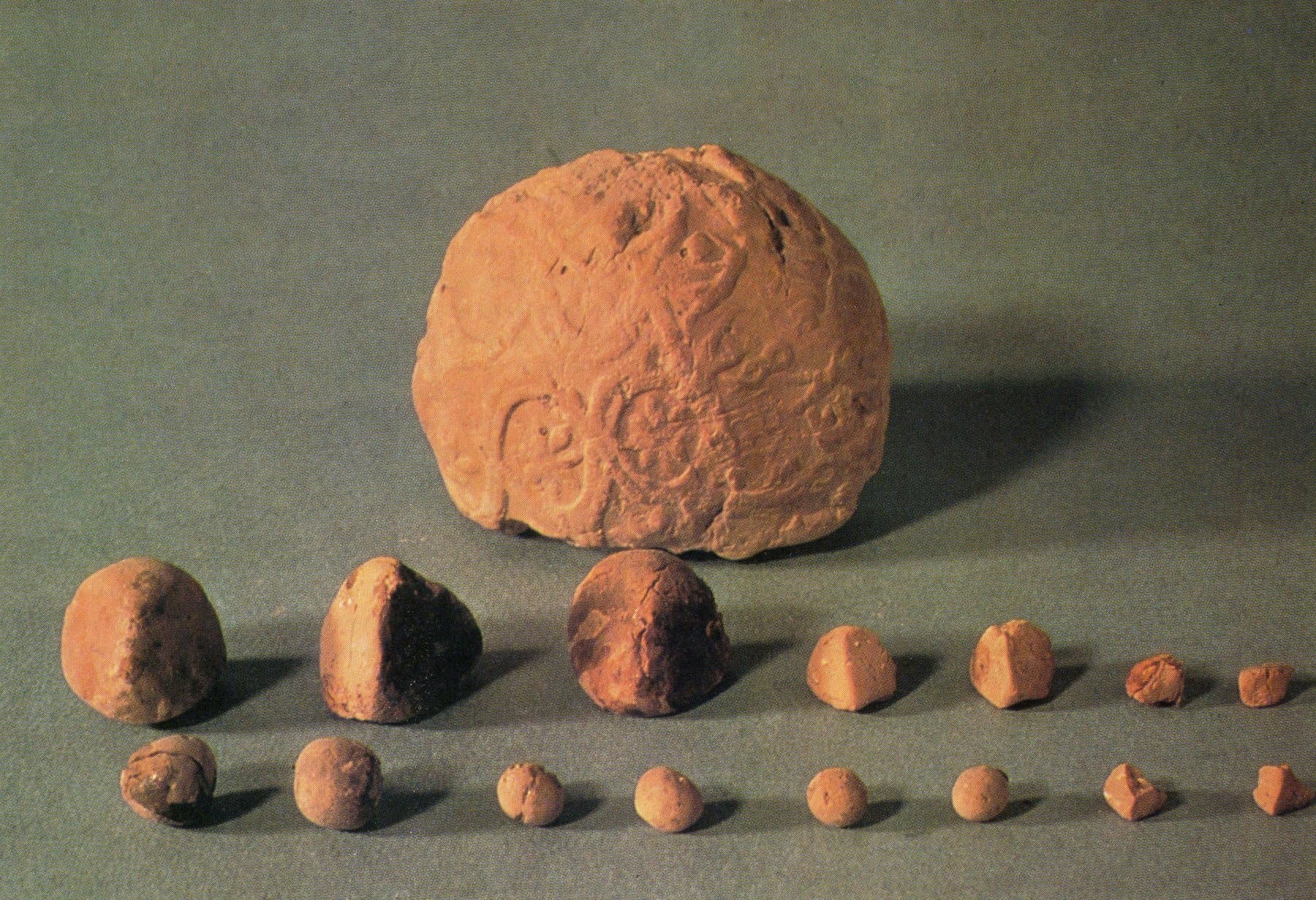
The earliest visualisation systems humans made were from physical objects, built by arranging stones or pebbles, and later, clay tokens. We’ve been patterning and configuring data since as early as 5500bc, according to archaeologist Schmandt-Besserat, referring to the discovery of the Mesopotamian Clay Tokens. By using different sizes and shapes, this visual system was easily understood and applied. The outcome of this system was that everyone could use it to have a common, non-verbal language, allowing the ease of trade and growth of a middle class based on the commerce it allowed.

In contrast, the Incas had a visualisation pattern that was only for their elite. Quipus were complex constructions of knotted ropes that were used as a data device that only a handful of specialists could use and decipher. Their meaning mostly remains a mystery, but it seems that colour, the relative position of knots, knot types and rope length were used to encode categorical and quantitative variables.

The sophistication of some of the earlier information maps is mind-boggling. Point in case are the Marshall Islands Stick Charts. Native Micronesians explored surrounding islands and oceans using amazingly accurate (and beautiful) physical visualisations, made with sticks. Some sticks represent regular currents, while curved sticks showed ocean swells. Seashells placed atolls and islands. Easy to memorise, these maps held the knowledge and wisdom of their way of life.

When compared to the navigation maps 18th century explorers used, you can understand how those maps were only meant for authority; the captain of a ship and the officers that reported to him. If you held a sextant, and compass and were asked to plot a journey across open waters, you’d have a sense of how these tools were designed for a particular user. Whereas stick charts were meant for everyone in the tribe to understand and use.

So what?
Visualising information enabled the development of our civilisations. For almost as long as we’ve had civilisation, we’ve been visualising data and information. How we do this will determine who we include, and exclude, from accessing the knowledge they convey.
Today data’s availability is overwhelming - how we design for it will either help or hinder our audience’s ability to make sense of it. Research helps us understand who our audience is and by looking beyond the known examples of screen or paper visualisation we expand our possibilities of simplifying and codifying the information we need to relay. As experience designers it’s our job to challenge exclusive visualisations of data in products and services whilst understanding the contextual and cultural nuances underpinning them.