Touchless tech: what’s the future of devices in public spaces?
How we interact with public touchpoints is set to change in a really big way. Here are our thoughts on what those changes might look like in two different contexts.

We’re all becoming more wary of touch in public settings.
We studied this in the research for our Touching Technology post. 80% of respondents stated they want to change the way they engage with screens and devices in public.
If there’s going to be a movement towards no-touch or low-touch interactions in public how will it happen? In this post we explore this topic and share some design speculations which bring it to life.
Touch: where are we now and how did we get here?
Shifts in user expectations and preferences have a big impact on the trajectory of service automation.
Since the early 2000s, we have witnessed a rapid growth of touch-based self-service machines, from the ATM to the self-service checkout. As we rolled humans out of some service points, we replaced them with screens and buttons.
However, what was intended to be convenient for both customers and businesses, is right now viewed as a potential health hazard. As we get used to living in a world with Covid-19 we find that there is just too much touch.
We expect smarter companies to rethink public device interaction. Every touch or tap removed from day-to-day interactions will be a sign of care and respect for the customer.
Even before Covid-19 the ‘touch-bloat’ of public devices had been a source of irritation: poorly thought out interaction flows cause confusion and delay. When we are punching buttons on a public kiosk or tablet it often feels like unnecessary work is being pushed onto us by careless design.
What can we do to reduce touch today?
The move towards contactless payment is a start.
People are using less cash and touching fewer payment terminals. However increasing touch payment limits increases fraud exposure for customers and payment is only one small part of the picture.
Gesture and voice interface could be the future, but are they the ‘now’? Interaction patterns are unfamiliar to users and unreliable in busy public settings.
Technology standards aren’t stable and exotic forms of interaction represent a big cost – and risk - for companies managing customer interaction at scale.
Perhaps instead we should focus our energy on making public devices more hygienic and easier to clean. Yes, we should but that might cause us to miss the opportunity to remove work and friction from customer journeys.
How do we liberate ourselves from the tyranny of touch?
Our initial research gave us the insight that one answer is already in our pocket.
Our personal phones are devices we trust more from a hygiene perspective. We control how clean or dirty they are and they are objects in our close personal space.
Interaction patterns and styles on our devices are more mature and familiar, so it’s easier to learn to use new tools.
Is there an opportunity for us to get more control over public devices by using our private devices?
We decided to explore this in a couple of contexts: the grocery store and building access. We focused on app-less interactions, picking up control via browser-based user experience (if we have to download and sign-in to an app every time we enter a new building, we won’t reduce friction, only add to it).
Store transactions
We imagined how we could help customers pay for their shopping in-store without the need to handle store devices or interact with cashiers.
Yes, some supermarkets already offer zappers and apps to scan as you shop but the adoption rate of these is low.
This is because the solutions have been designed against the grain of how people shop and require more effort on the customers’ part to use than other conventional options.
Current experiences mean:
Customers need to download an app for everywhere they shop. They’re told to scan and bag as they go, but what if eggs are the first thing they pick up, they decide to put something back or are holding a baby in their spare arm?
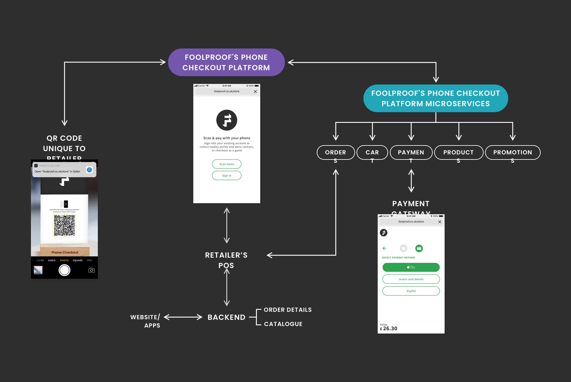
Our phone checkout solution offers a frictionless experience for the customer, and could make the check-out process faster and more secure:
As a universal browser-based solution, it doesn’t require an app or any hardware – it’s powered by native smart phone functionality
It allows customers to shop in a way that’s familiar to them (gather - scan – pay).
It makes the ‘check-out’ step faster by allowing customers to scan multiple items in one go at the end of their time in the store
It offers more secure payments, as each payment gets validated through the customer’s phone, no matter how big or small
It comes with direct benefits to retailers:
Can be implemented by any store, even one that doesn’t currently trade online, as it integrates with the POS backend
A white label solution makes overlaying it with the retailer’s brand easy and low in tech effort
Faster checkouts increase the daily footfall in store whilst allowing for appropriate social distancing
Existing checkout space requires minimal modification (mostly a Marie Kondo style clear out) and continues to separate the aisles with goods from the exit.

Redundant hardware culled:
Point of sale hardware, e.g. self-checkout machine, till or stand. Although, the actual space can be used for phone-checkouts
Payment terminal e.g. card machine or contactless payment reader
Considerations
Phone-checkouts in small stores will rely on customers’ honesty and/or the eagle eyes of staff – be it direct or through security cameras. Theft can be further discouraged by introducing spot checks. The check-out flow would need to be perfect to minimise honest mistakes.
In larger stores, smart security gates could be introduced which would detect unpaid for items through an integration with the store’s inventory management system.
Our solution could be adapted to handle non-barcoded items, with an additional feature allowing customers to select items from a list. Loose fruit and vegetables sold by weight would require a smart scale in the checkout area or stores moving towards selling all of their products per item.
Access to buildings
In a non-transactional context, we looked at how visitors could enter an office building and navigate their way round it, without the need to touch intercoms, lift buttons or check-in stands.
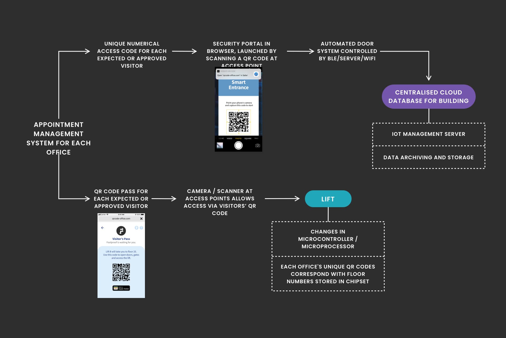
We pieced together the individual interactions required to get a visitor from the building’s main entrance to the person they’ve come to see into one office-access system.
This solution also relies on the visitor’s smartphone and QR codes to offer a frictionless, holistic experience, making the process faster and more secure:
A universal browser-based solution which doesn’t require an app and integrates with existing access points
No need to check-in with the building’s reception
No need for physical
An easy way for visitors to navigate the building within their permissions
Those with a prearranged visit will receive their visitor pass via email, allowing them to head straight towards the access gate or lift
It relies on three key requirements from the building’s management:
Adopting the visitor management system, which will generate unique QR codes for visitors
QR code scanners/cameras at gates, doors and lifts in the building
Providing floorplans for the map feature
Our solution offers better visitor authentication and removes the need for a building-wide reception or fetching guests from the lobby. We anticipate this would reduce costs and reclaim precious floorspace.

Redundant hardware culled:
Intercoms
Lift buttons
Check-in touchpads
Considerations
Accessing buildings in a touch-free way doesn’t have to be limited to high-tech office buildings.
Any electronic door can be configured to open after the visitor scans a QR code and enters a unique code into the browser that pops-up.
There may be wider contexts for use, like hotel check-ins or healthcare settings.
Where does this leave us?
Looking for touch-free versions of existing interactions made us revisit the need for each of them in the wider context of user needs, goals and tasks at hand.
We remain mindful of the complex systems already in place combined with the behaviours of users who operate within them.
The success of either of the suggested solutions is as much to do with their ease of implementation as it is with creating something desirable, familiar and usable for people.
We had fun speculating on how we re-imagine two everyday interactions with public tech. It’s given fresh eyes on the world and renewed energy to try to improve what happens between humans and machines in public spaces.
Touchless tech is firmly on your customer’s agenda and the answer may well be in their pockets.
In need of help to imagine future touchless interactions and transactions? Drop us a line today, to discuss what we can do for you.