Changing the face of farming with a global agricultural business

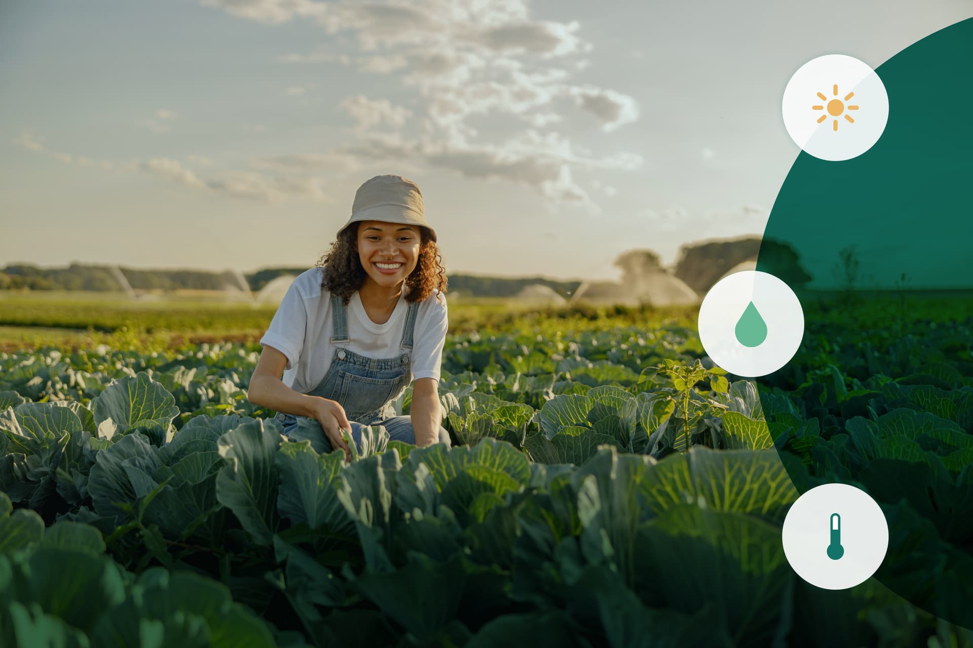
Our client creates digital products to enable farmers and agronomists to increase their harvest yield utilising GPS, data analysis and digital monitoring. We supported them with a new vision of creating a single product that started the journey of consolidating their other mobile agricultural products into a single, multi-channel platform.
The challenge
Align internal understanding with the experience of using the application in the field
Understand the workarounds being deployed in the field that avoid the use of digital technologies, such as a simple notepad and pen
Consider how technical constraints impact design, based on the usage of applications in places with low, or no, connectivity
Bring the new product design into line with the existing design system and brand ecosystem
Support customers to improve yields and meet sustainability goals
Our approach
Qualitative interviews with stakeholders, farmers, agronomists, and partners to form complete picture of the ecosystem and application landscape
Evolve the design through intuitive and easy to use features that map to environmental constraints
Work with the client’s team to evolve the existing design systems
Prioritise the existing backlog to get the most important features shipped first
An eye on the field
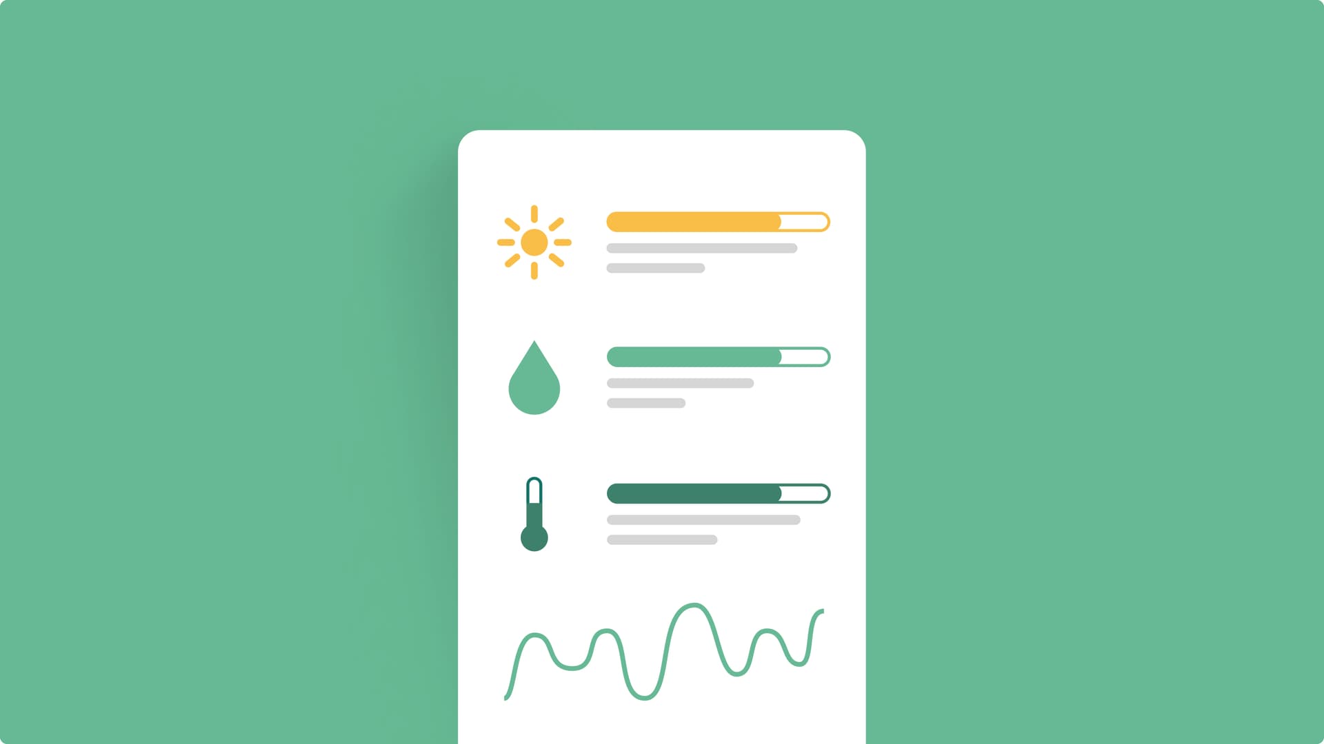
Agronomists work in their ‘mobile office’ – the humble truck - for most of the year. Currently, they are often forced to go back to the office to complete tasks digitally, adding hours to their workday. The alternative? Using unreliable and hard-to-use apps.
To right these wrongs and begin understanding the problem space, we conducted formative research with stakeholders from within the client’s business to understand their needs and aspirations for the product. We also surveyed their current product and created site maps to reflect this. This highlighted some of the problems with the relationships between the current suite of products and areas that impacted user comprehension, i.e. what product to download and use.
We used existing product data on feature usage to inform hypotheses to explore in user research. We then spoke to current and previous users from across the suite of products the client owns.

Insight-led journey mapping
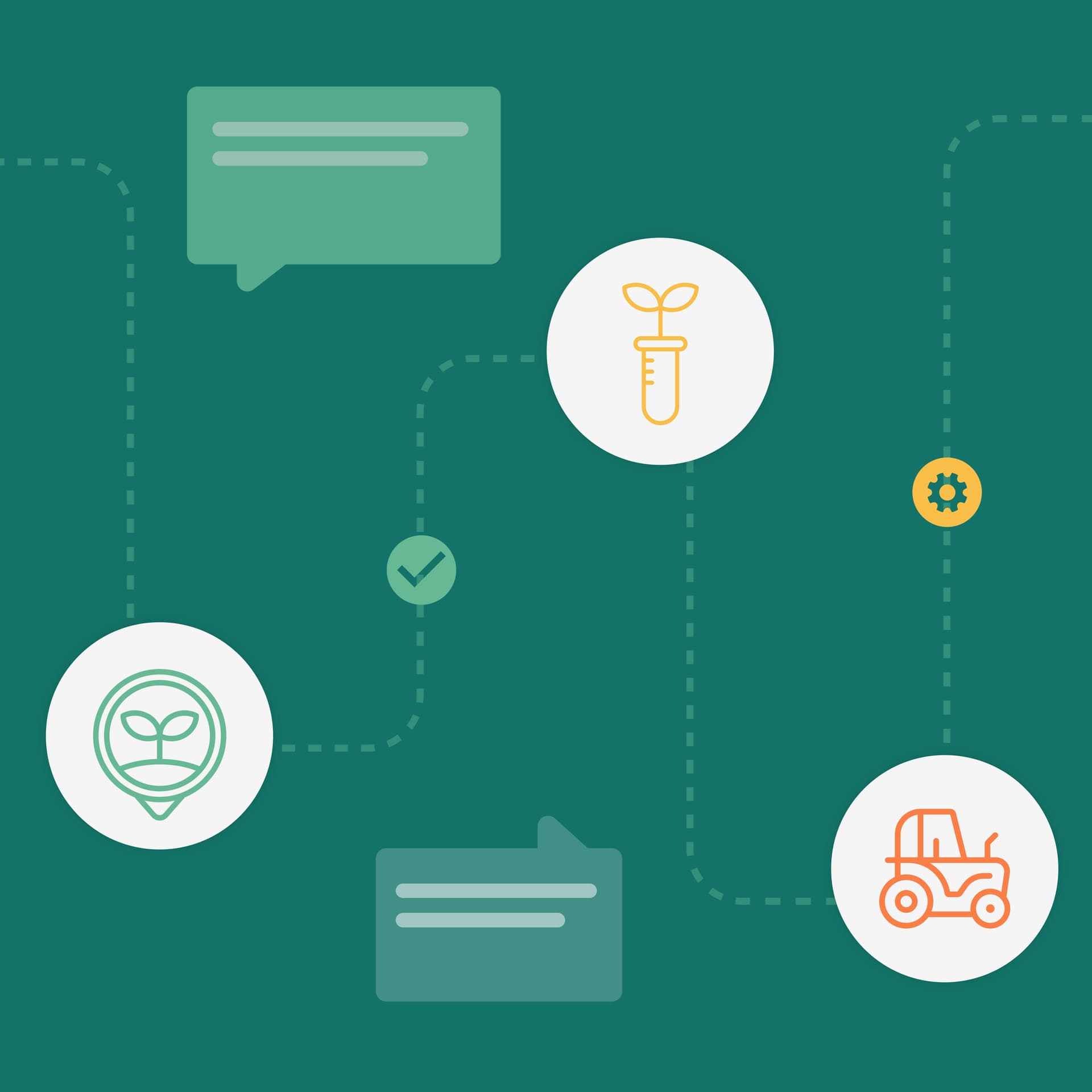
This insight resulted in the creation of a journey map, which blended the qualitative and quantitative insight we gathered. When formed, it helped us communicate back to the client the pain points and opportunities beyond just providing a report. This journey map highlighted how users interacted with each other, the product(s), other communication tools they used in the process, and the online and offline hand off between parts of the journey i.e. taking a sample and recording it. This laid bare the experience customers had with the existing suite of digital products as well as just how much was still conducted offline. This helped inform how we’d approach evolving the first application and removing the reliance on other non-digital processes and ways of recording information.
From field to screen: insight informed design
Before designing anything, we formed experience principles. These were informed by the insight we gained from research and discussion with internal stakeholders and serve as guiding principles for the evolution of the digital product, while promoting a shared vision of the trajectory of change.
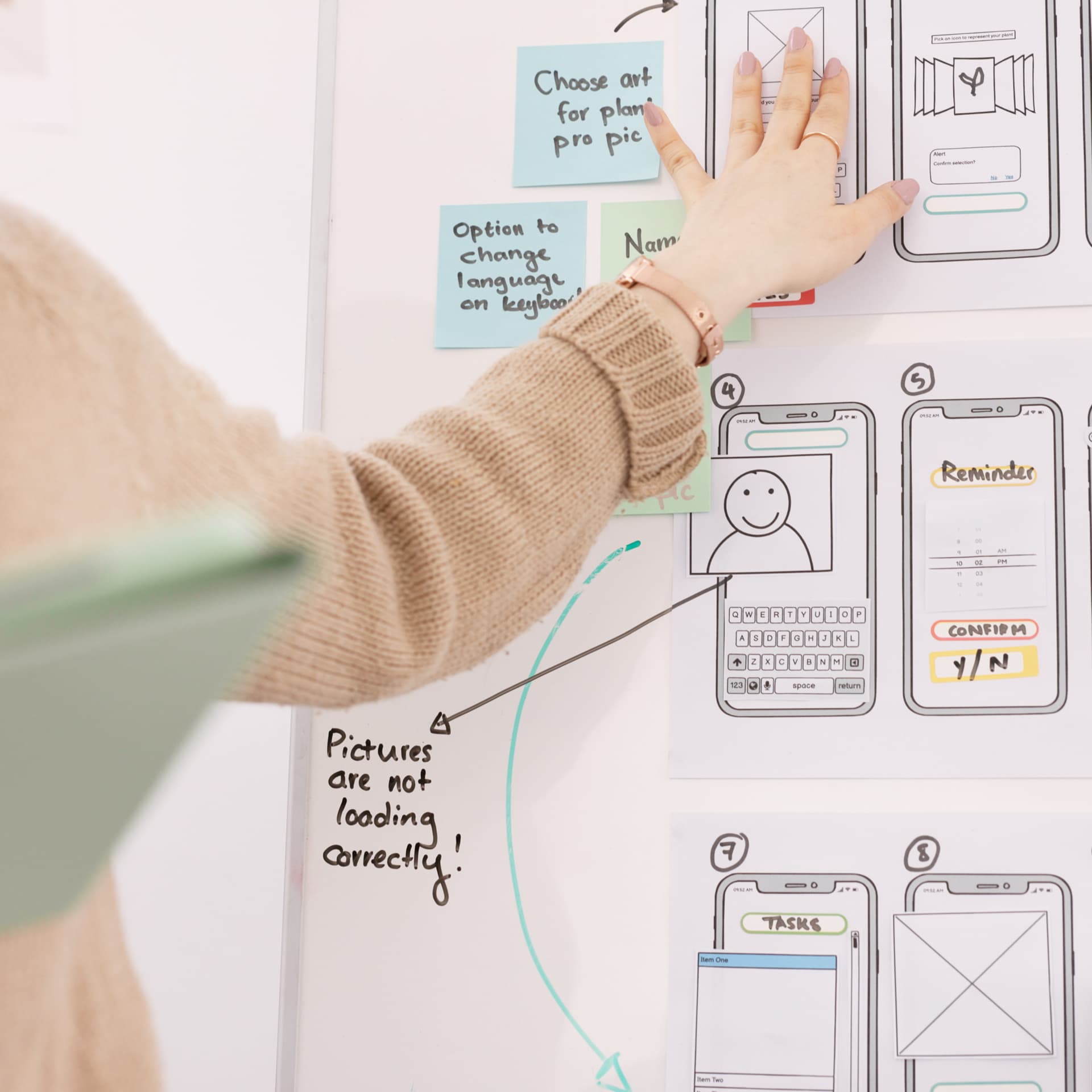
After we’d established the experience principles, we brought together our learnings to drive the design of a new prototype of an in-field mobile app bringing to life the core functionality in a single market. The features and branding of the app were created to align with user expectations and needs discovered during our formative research.
We then used this prototype to capture feedback and rapidly iterate on it. It served as stimulus to study the clarity of task completion and to receive verbatim feedback on the processes we’d designed to capture information as well as the detail provided within features of the product. As part of this summative study, we also validated the priority of the features for MVP and other future releases.

As quick as picking up a pen
One thing we learnt was how many people used a notepad over a digital device. Given this, we had to ensure the experience of using the product was just as quick as picking up a pen. Big touch areas and the ability to enter observations wherever a farmer or agronomist is located were crucial considerations. Another important element was clearly communicating the progressive caching that would support the evolution of the application, rather than relying on offline/online syncing.
We also had to ensure accessibility was at the core of the product. This is because being in the field capturing information about crops and the environment means the weather, equipment and clothing play a big factor in how usable a product is. Given this, all design elements were checked for colour contrast to ensure that even in the most direct sunlight the product could be used to full effect.
Enriching the existing design system
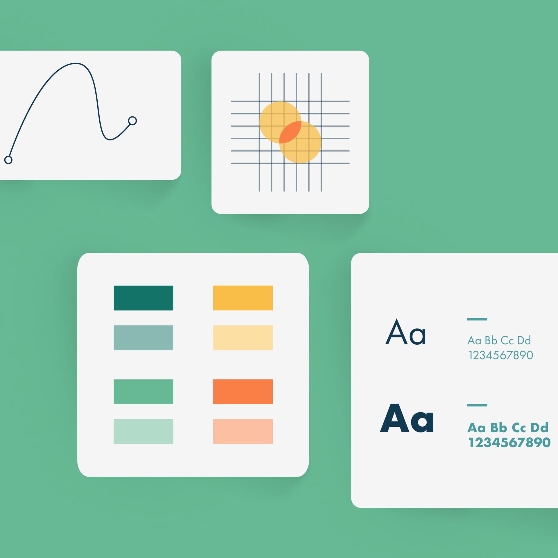
We adapted the current design system so that the product would fit within the client’s existing family from a visual perspective. Doing this also helped to supercharge quick development and release. Moreover, we created a long-term strategic plan for the evolution of design as part of the system and defined user needs and recommendations to help the client take it to market successfully.
The road ahead
After establishing the order of priority for the delivery of the digital product of maximum value to the client and agronomists, we established a roadmap to detail epics and features ordered around meeting the most common mobile use cases to promote adoption in the field. Ultimately, this will help make for greater crop yield through quicker and more effective planning, improve the experience of people working in field environments and establish this product at the forefront of the clients’ refreshed digital ecosystem.

Contact us
Like what you see?
We'd love to partner with you. Contact Ed, on ed@foolproof.co.uk
