Building a banking experience fit for the future with Nedbank
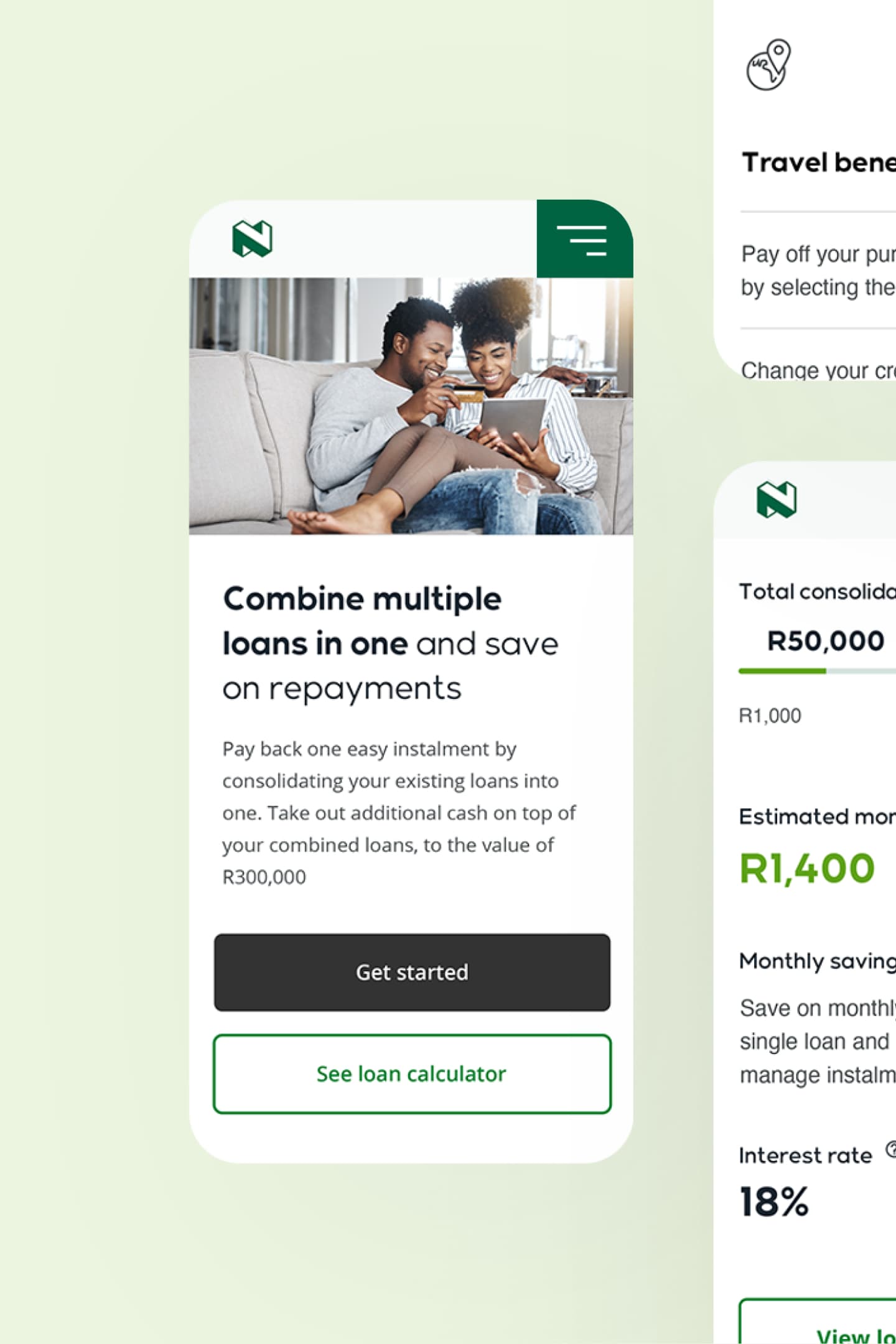
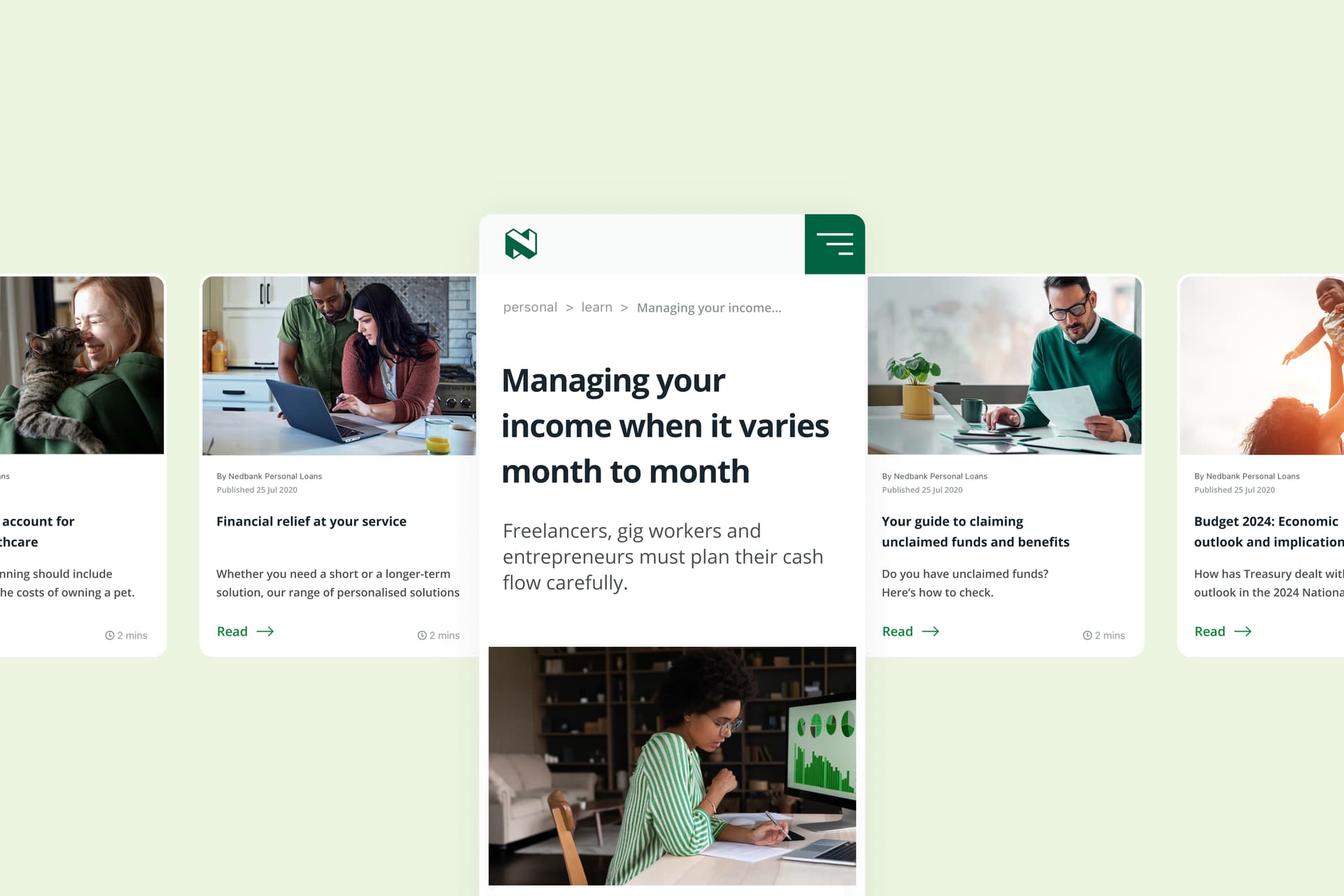
We worked side-by-side with Nedbank to undertake a radical end-to-end transformation of their technology and customer experience by taking a strategic, user-centric approach to design.

The challenge
Develop the organisation’s understanding of the value of taking a design-led and data-driven approach to design and technology
Transform the organisation’s approach to technology
Create a scalable experience, underpinned by smart cloud-based platforms, a design system and an operational framework
Establish a Content Centre of Excellence to raise standards in content production and management across multiple digital and physical branded touchpoints
The solution
Created a Nedbank digital experience strategy to envision the journey from the current state, to the desired future state
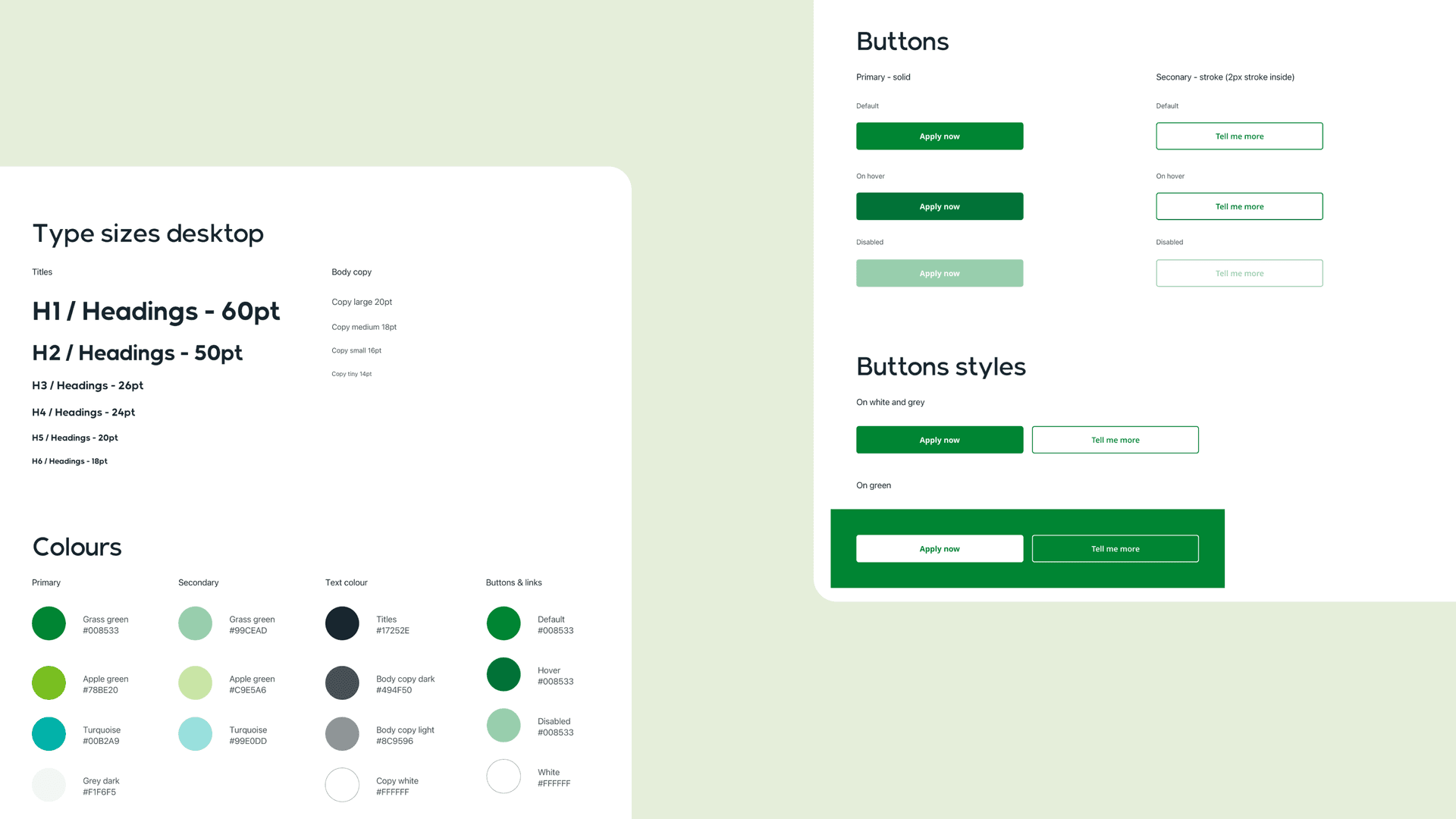
Designed foundational artefacts, including a new look and feel that was distilled into Nedbank’s reusable design system
Built a component-based Adobe Experience Manager solution for use across all customer touchpoints within the platform. This enabled us to release Personal Loans to market in just three months.
Delivered a robust content strategy and scalable Content Centre of Excellence that produces quality content to support the entire customer lifecycle

A future-proof financial experience
Nedbank recognised their customers needed more from their banking experience. This desire was being driven by an increasing demand for customer-centric, mobile-first solutions to banking. Meeting this need meant designing and engineering a customer experience that better reflected Nedbank’s brand position, as well as enhancing their sales and service experience to set them apart from other financial institutions. Our approach embodied agile ways-of-working and incorporated the ability to understand, articulate and respond to customer needs as part of design and technology decisions. To manage design and engineering at scale, we used market-leading technology and processes.
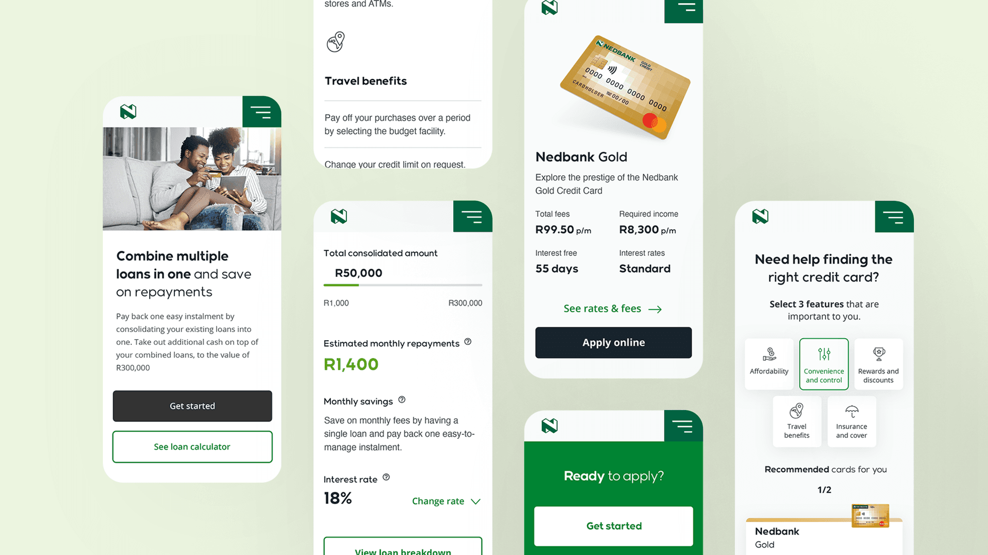
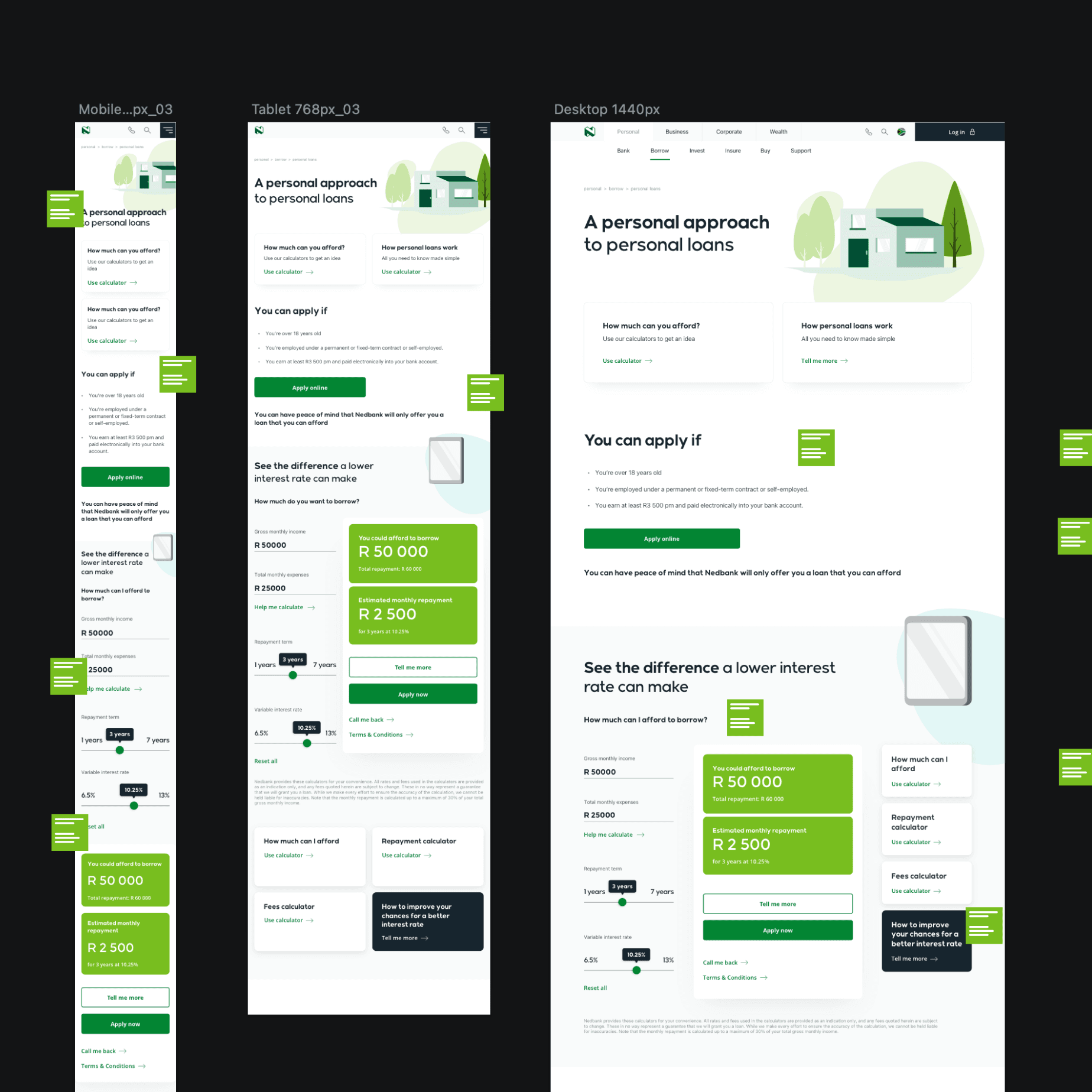
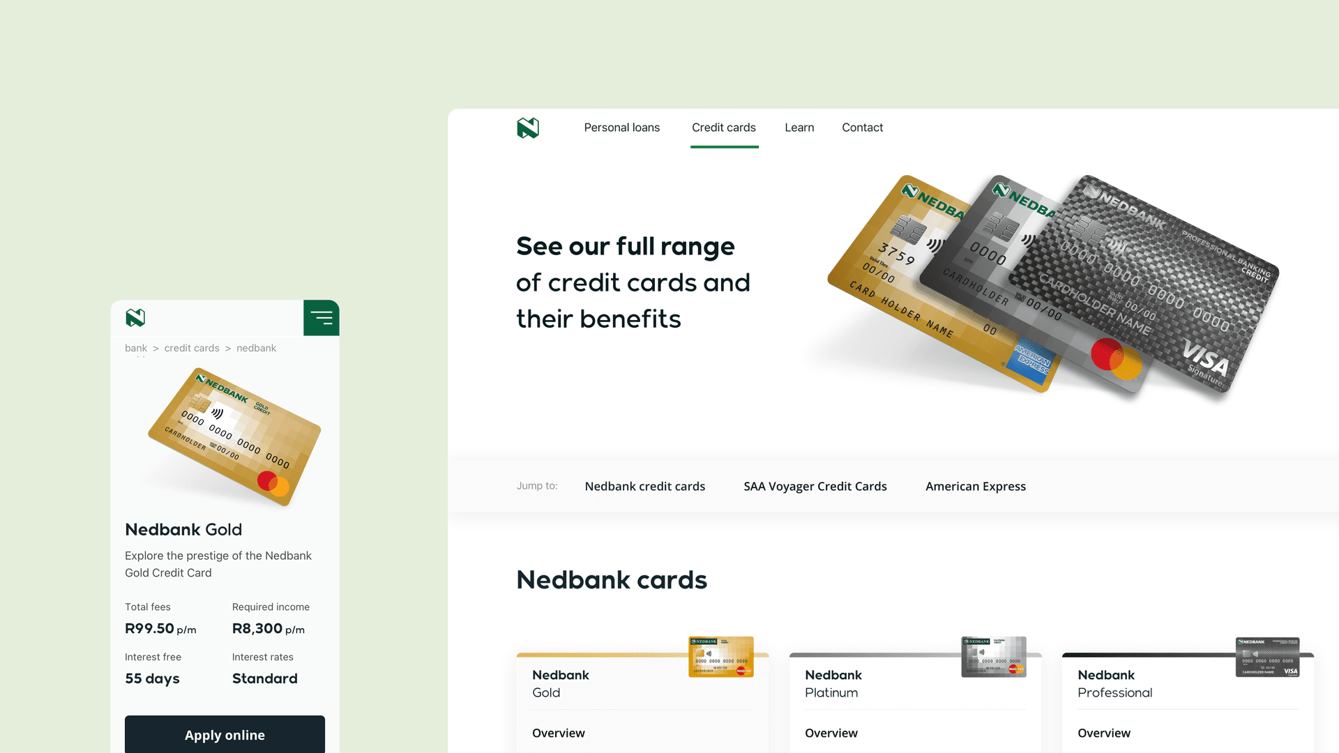
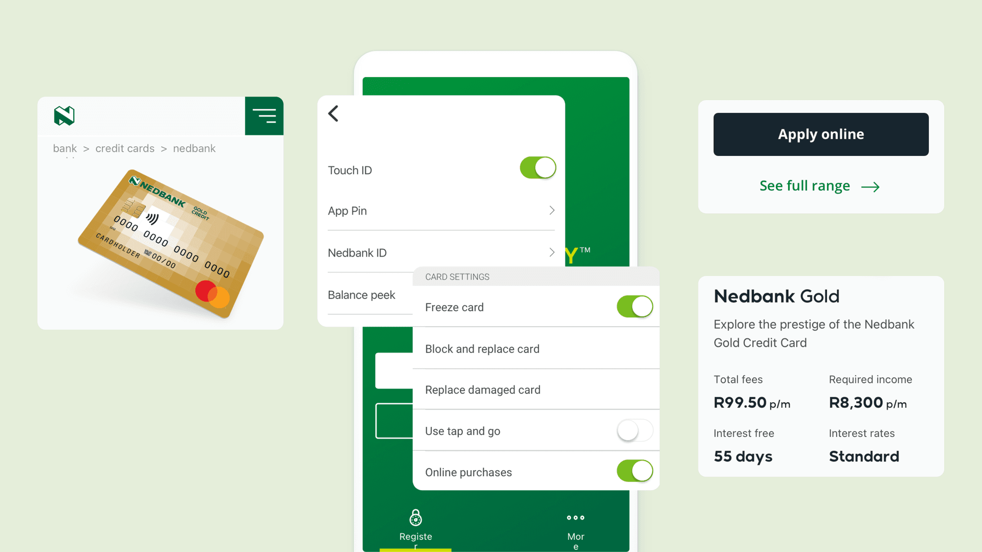
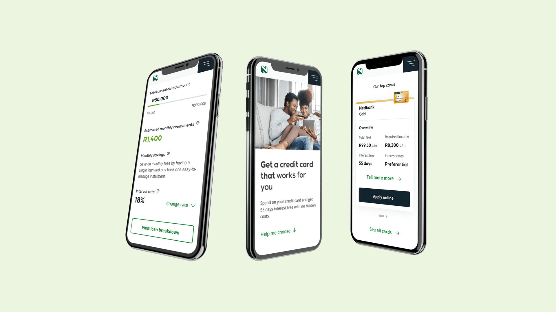
To meet customer and business needs we took an incremental approach to delivery. We defined, designed and deployed reusable components to the underlying AEM stack through a series of launches to two core products: personal loans and credit cards. This allowed us to prove our ways of working, capability and competency, as well as to gather and act upon insight from customers and clients. As we moved from strategy through to execution and integration, our strategic approach meant were always able to keep a view of the bigger banking picture.

Immersion. Strategy. Action.
To set the trajectory of change when reimagining the digital banking experience, we conducted four weeks of rapid work to take stock of the existing experience. Through immersion with stakeholders and customers, in the form of depth interviews and stakeholder workshops, we captured people’s thoughts about the existing experience the bank provided and their vision for the future. To create a compelling picture of tomorrow, our research and initial strategy were combined with a maturity assessment of today against other benchmark experiences. This enabled us to create a vision for the future and clearly articulate the associated strategic and operational drivers required to enable it.

Insight-driven execution and engineering
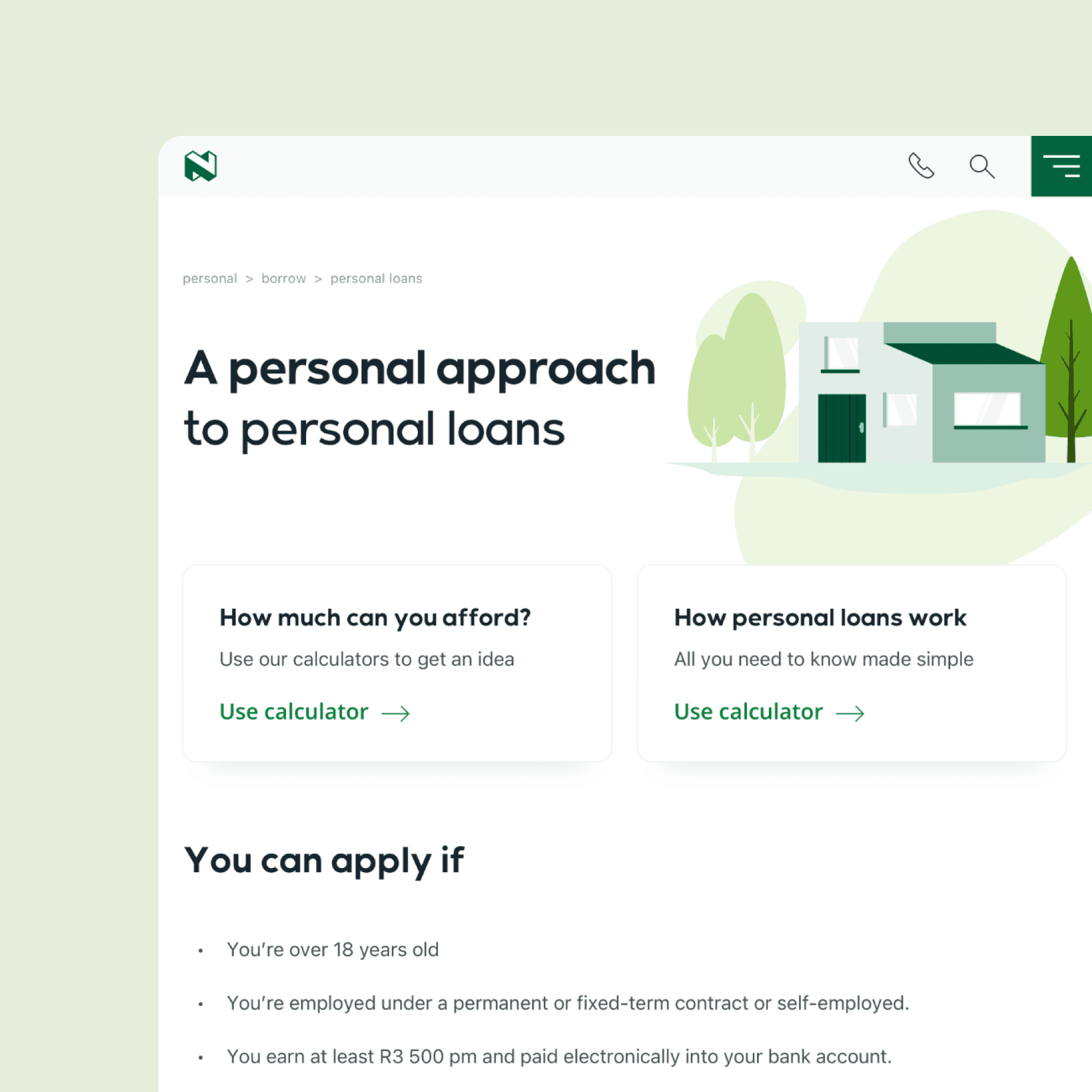
Across design and technology, we collaborated with the Nedbank team. Initially, this meant understanding the flow of user journeys, before articulating all new ways to bring them to life. We gained a deep understanding of Nedbank customers’ mental models when searching for and selecting a personal loan or credit card. We delved into the insight we uncovered, which powered design by further validating future flow designs through summative customer research. Collaborating across multiple locations using best-in-class remote working tools, we rapidly agreed the underlying design and architecture of pages. We captured content requirements and designed sleek, intuitive modules and components which formed the user interfaces. Nedbank’s banking products are powered by a single code repository using a combination of AEM 6.5 managed services, Java, HTML 5, CSS3 and JQuery UI to deliver pages quickly, efficiently and consistently to users. After engineering, the pages were then tested against functionality, design and usability criteria before going live. This guaranteed they met customer and business needs whilst delivering against Nedbank’s vision. We took a component-based approach to design across the two releases, where UI and other foundational elements (for example, global navigation) could be re-used as we scaled beyond loans and credit cards. This approach supercharged deployment and go-live times across the digital banking experience.
Think like a publisher
Nedbank created more content than it realised – from customer communications and marketing campaigns, to blogs, UX copy, chatbot and help text. To align processes and improve quality across all content touchpoints, we created an omnichannel approach to content creation and management. We advised on digital asset management, re-use, governance and content lifecycle across all touchpoints in the customer journey, from initial discovery through to the conversion and retention of banking customers.
Ongoing partnership
Working in collaboration with Nedbank, we successfully completed the initial phases of the engagement and continue to work side-by-side as a trusted partner, designing and delivering in line with Nedbank’s roadmap for digital banking.

Activities
Depth interviews, strategic vision, migration strategy, user journeys, information architecture, content strategy, analytics, visual design, design system definition, pattern library, Adobe AEM implementation and integration, front-end development, back-end integration, QA, UAT.
Delivery
Project managed across four countries using Scrum working to three week sprints.
Contact us
Like what you see?
We'd love to partner with you. Contact Ed, on ed@foolproof.co.uk
