Transforming employee experience with UCL
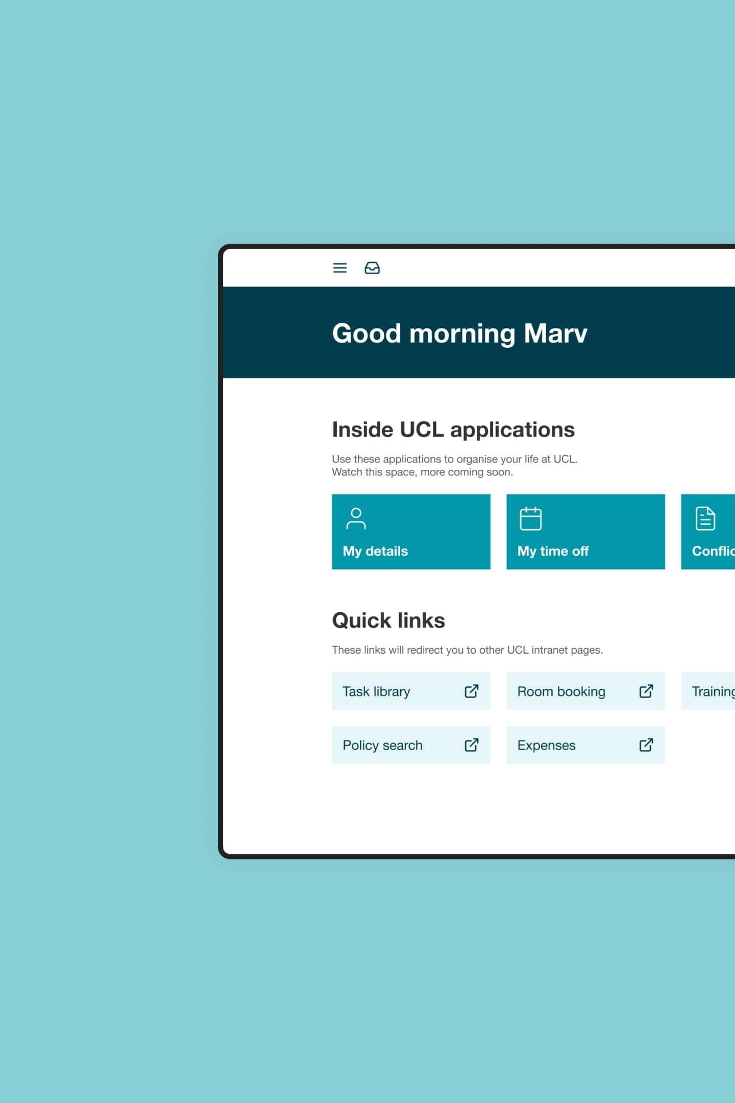
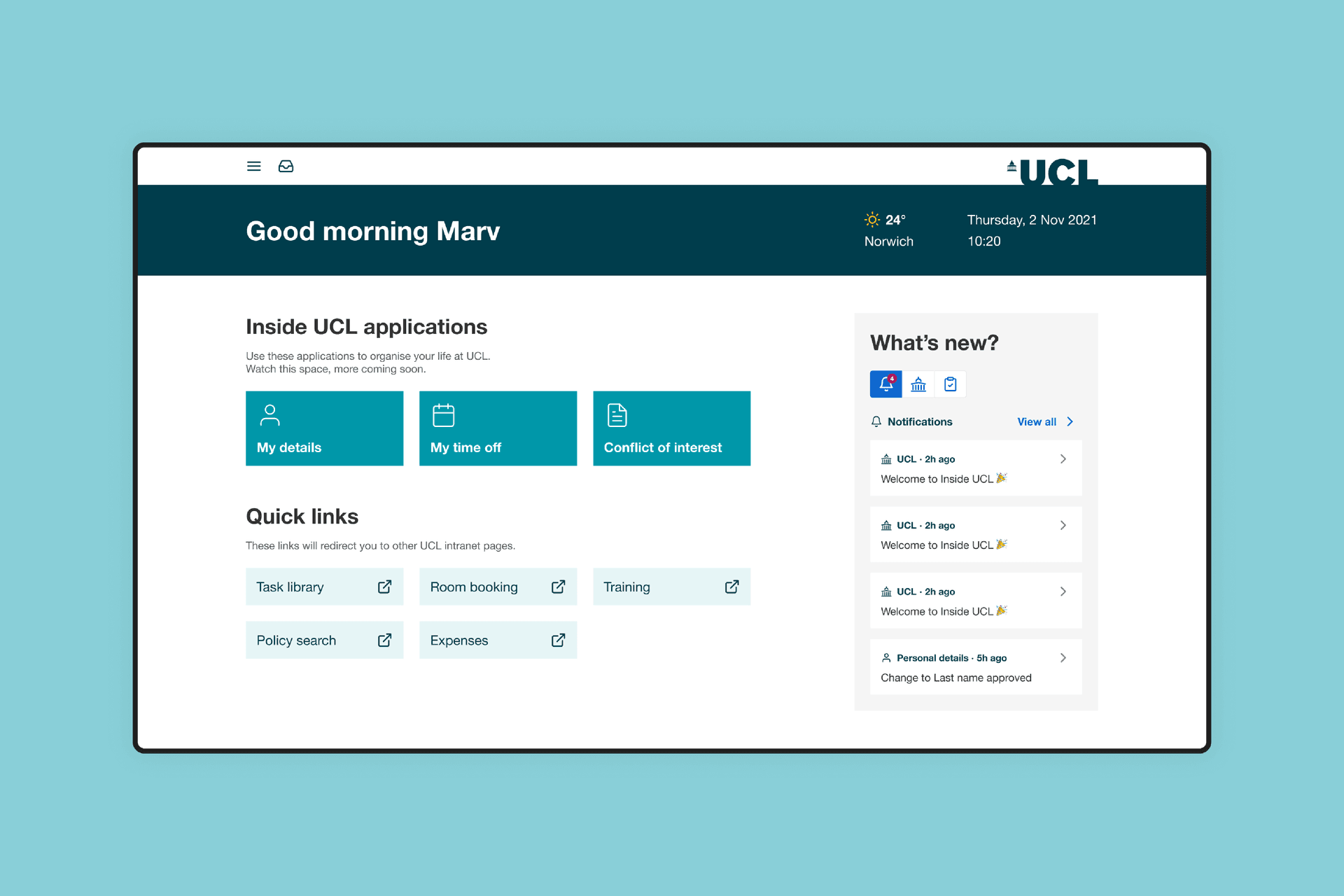
Foolproof and Zensar worked with UCL (University College London), one of the most esteemed universities in the world, to design and build a BIMA award-winning new employee experience platform.
The challenge
Create a flexible progressive web app platform (across mobile, desktop and tablet) for hosting admin activities, such as booking annual leave or updating personal details.
Promote engagement with the tool through intuitive design, removing the need for workarounds and explainers.
Marry great design with a low-code platform to bring the employee experience to life.
Enable a new channel (mobile), while strengthening operations with cloud-native, API-led digital platform that has high availability and fault tolerance.
The solution
Conducted three rounds of qualitative user research and testing with UCL staff members across different roles.
Defined the vision of the new app experience, supported by five principles to meet users’ needs consistently and effectively.
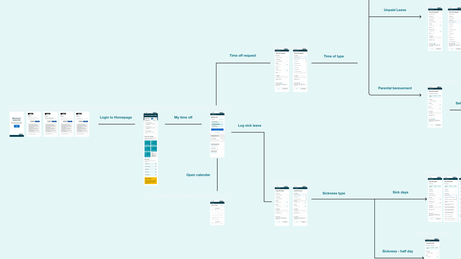
Created user journeys for the priority admin tasks such as updating personal details and booking annual leave.
Formed a component library and the foundations of a design system to support the new Progressive Web Application and other future applications of design across UCL.
Brought to life the vision for design using the low-code platform OutSystems to bring the experience to employees at speed.
Harnessed existing backend systems to develop new APIs and integrate data from other sources, enabling functionality within the new low code platform.
End-to-end employee experience
Staff members found the existing platform unintuitive to use. Simple tasks often needed PDFs or explainer guides to aide completion without errors, as well as signing into a local VPN to gain access.
This resulted in additional time and cost being invested and unforced errors creeping into what should be a smooth process. Among employees this caused frustration and detracted from their wholesale experience of the University.
Getting under the skin of a leading educational body
We knew our solution had to work for everyone at the University, so we ran successive rounds of qualitative user research and testing with staff members across the University - from lecturers to administrative staff and beyond. We also invited key stakeholders into workshops to capture their thoughts on existing processes and new requirements.
This helped us to immerse ourselves in the current system to understand the failings, opportunities for improvement and needs of different people in the institution.
Developing the visual direction
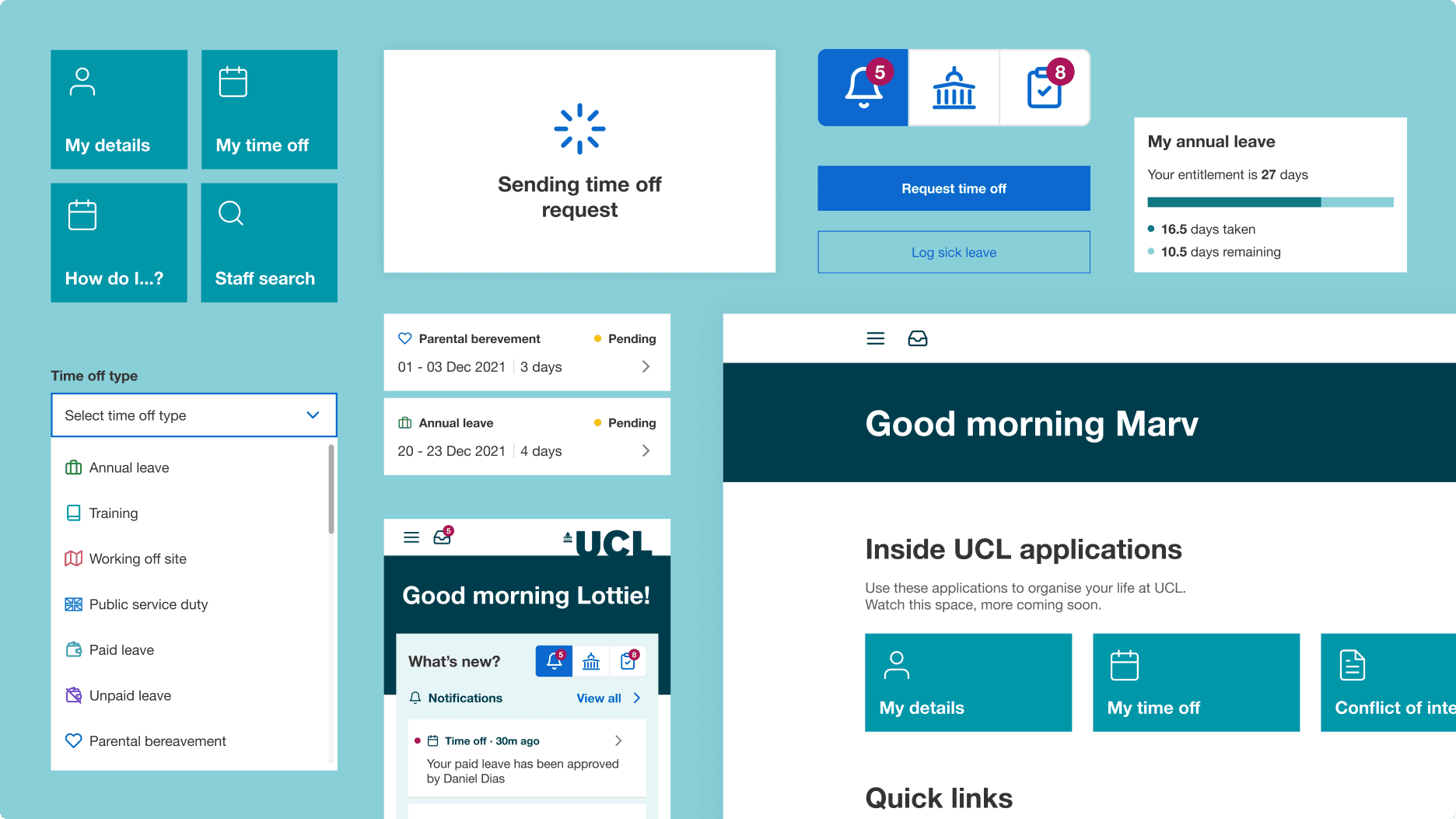
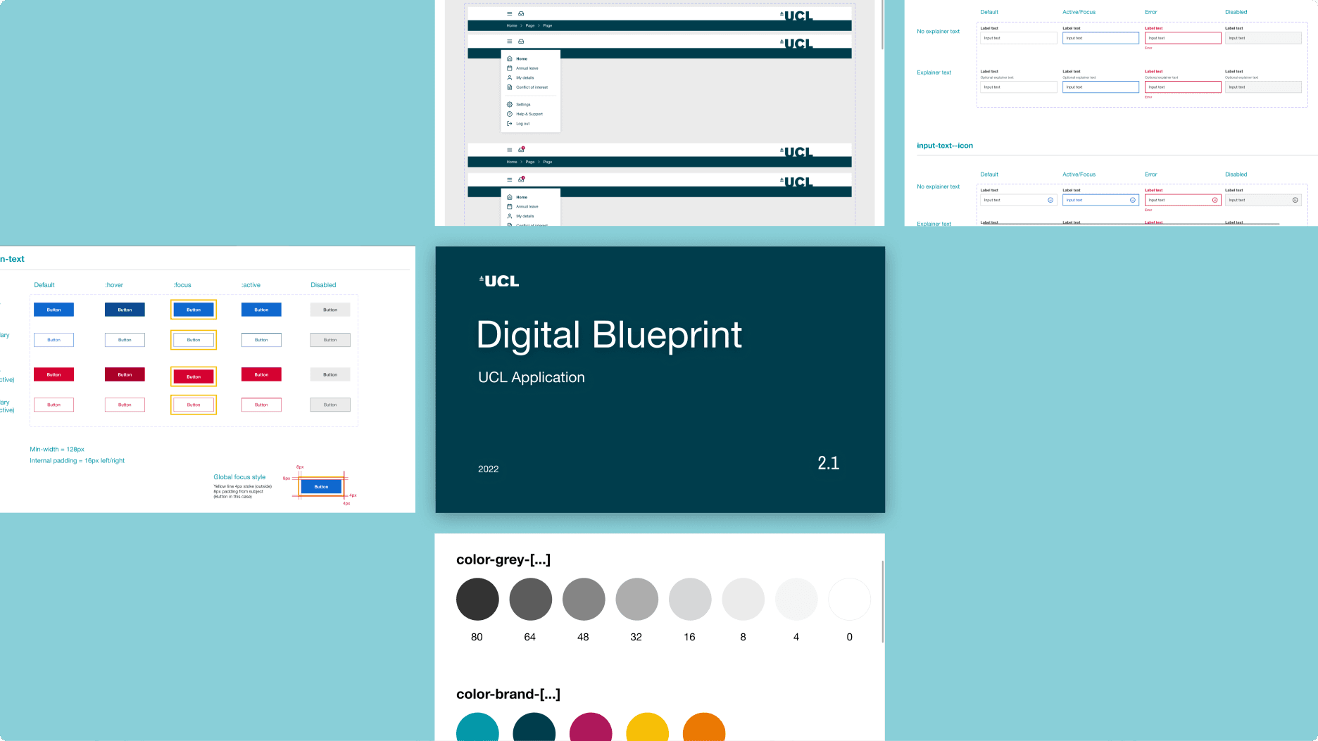
Supporting and scaling our design work, as well as promoting future reuse, we formed a component library and the foundations of a design system.

Flexible components and variants
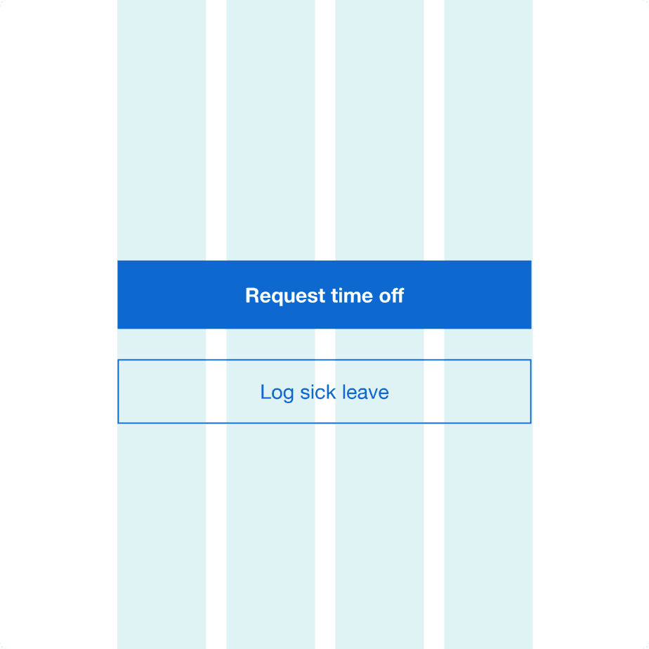
By creating just 15 highly flexible and efficient components, and defining set styles, we were able to create 100+ pages across three breakpoints. Defining breakpoints like this allowed us to understand whether a component was consistent across all screen sizes. And if it wasn’t, this approach made it easy to understand how its behaviour differed. This opened up conversations with our Zensar engineering team and UCL's technical team. We enabled a high degree of reuse in design and development, speeding up both processes exponentially.
We established a changelog page where details of changes to the design library were recorded. This created s a single point of reference for all changes to the library.
Designers and developers used this to keep up to date with changes and understand the decisions that had been taken. Each component also had a short description to offer a quick reference for designers when using the library. This ensured the correct components were used consistently across the current and future application.
This approach helped us balance the variety of tasks which employees need to complete, and the sometimes intricate inputs, with the amount of design and development effort required to create this functionality.

Employee experience: the intricacy of design
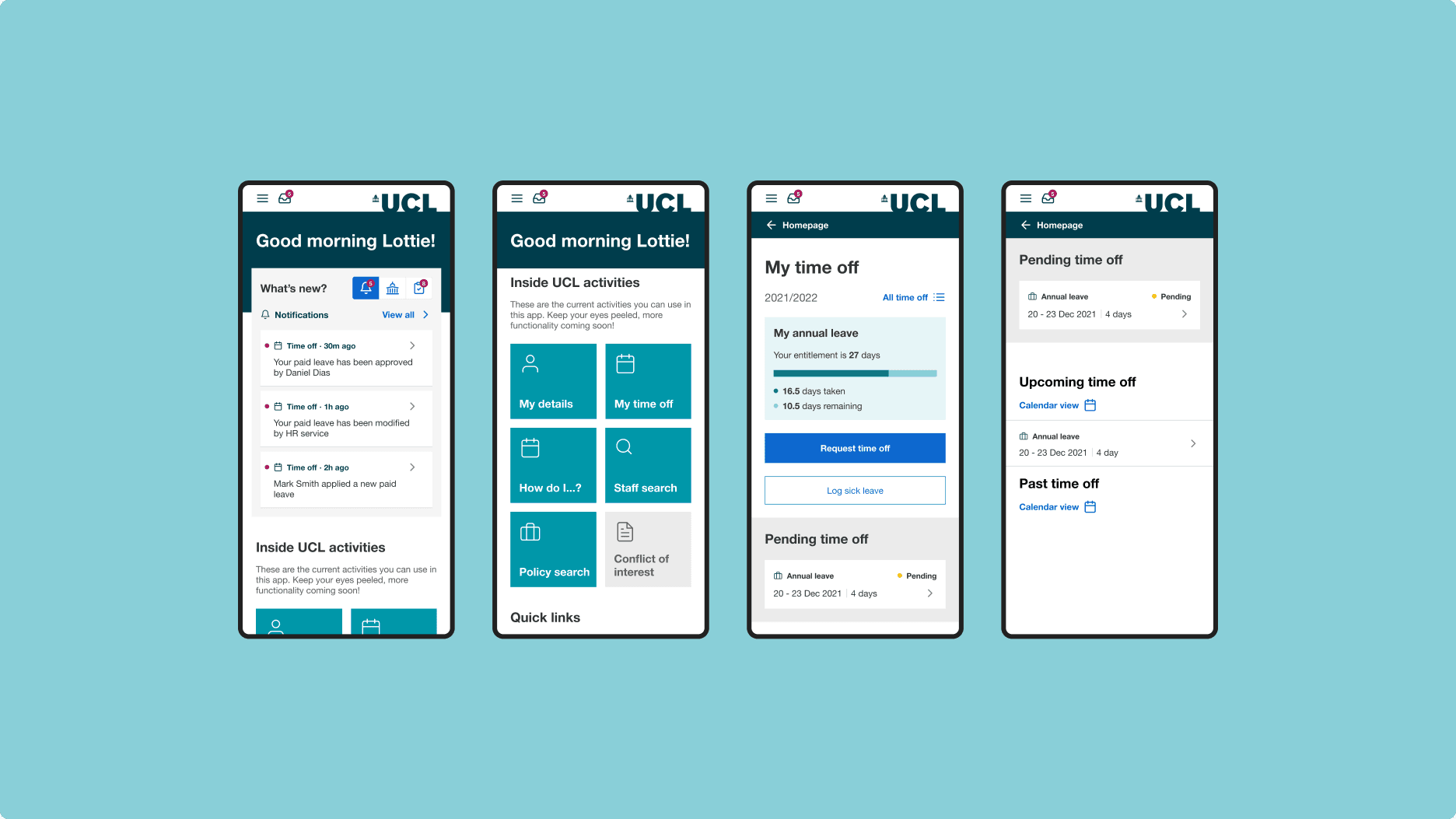
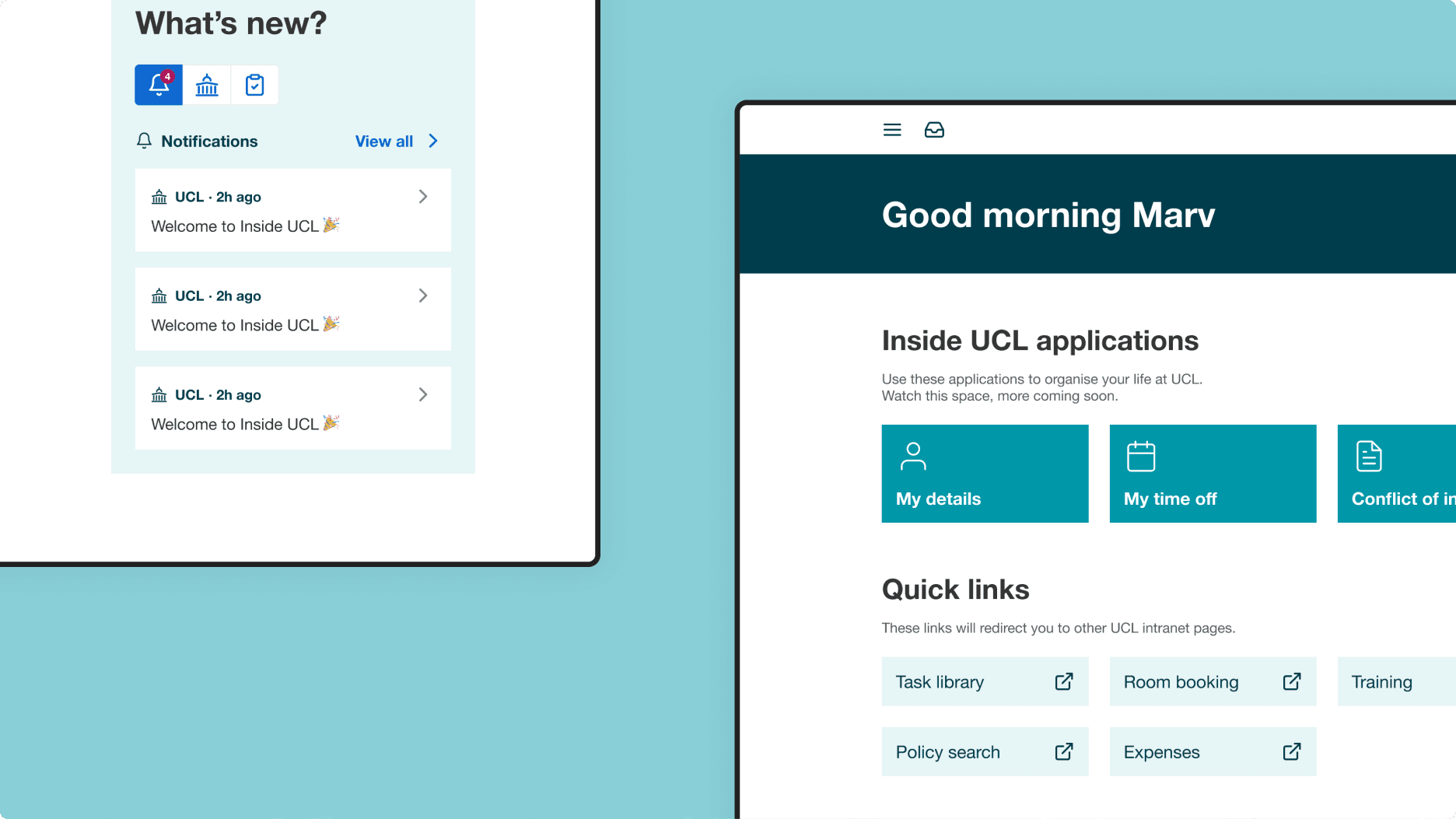
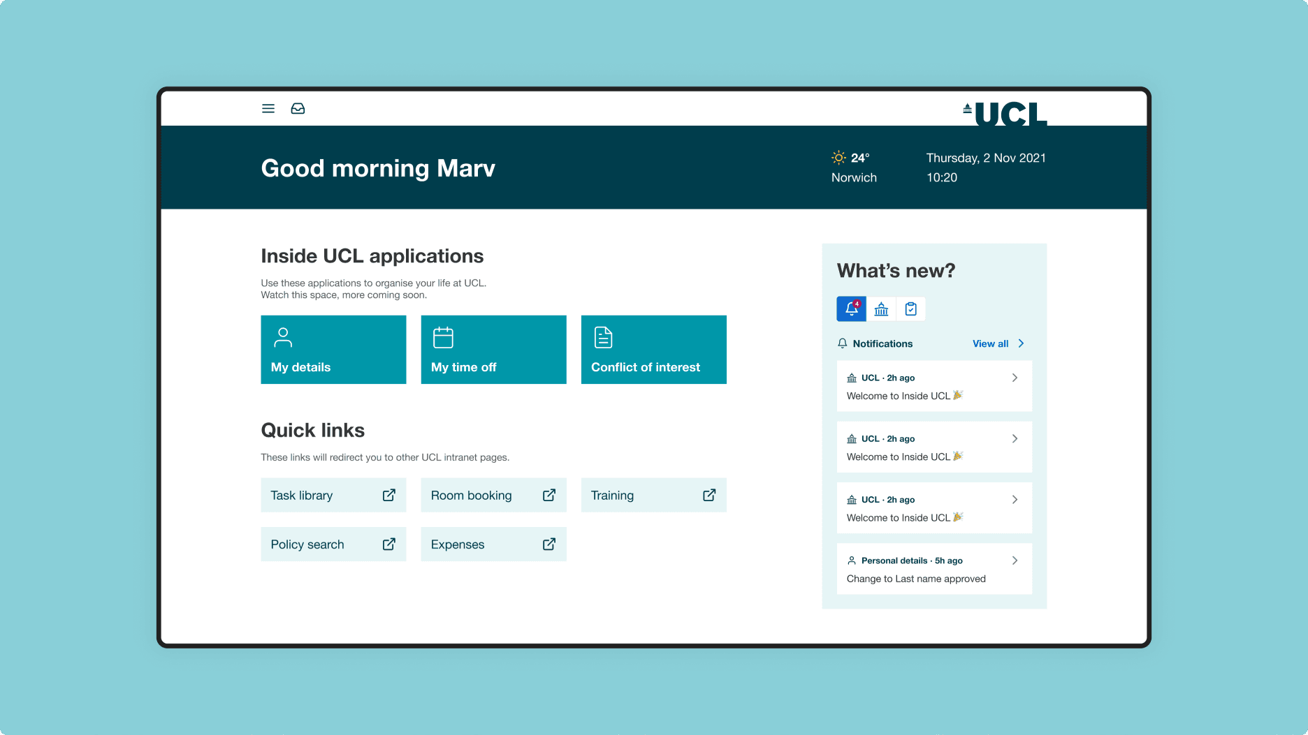
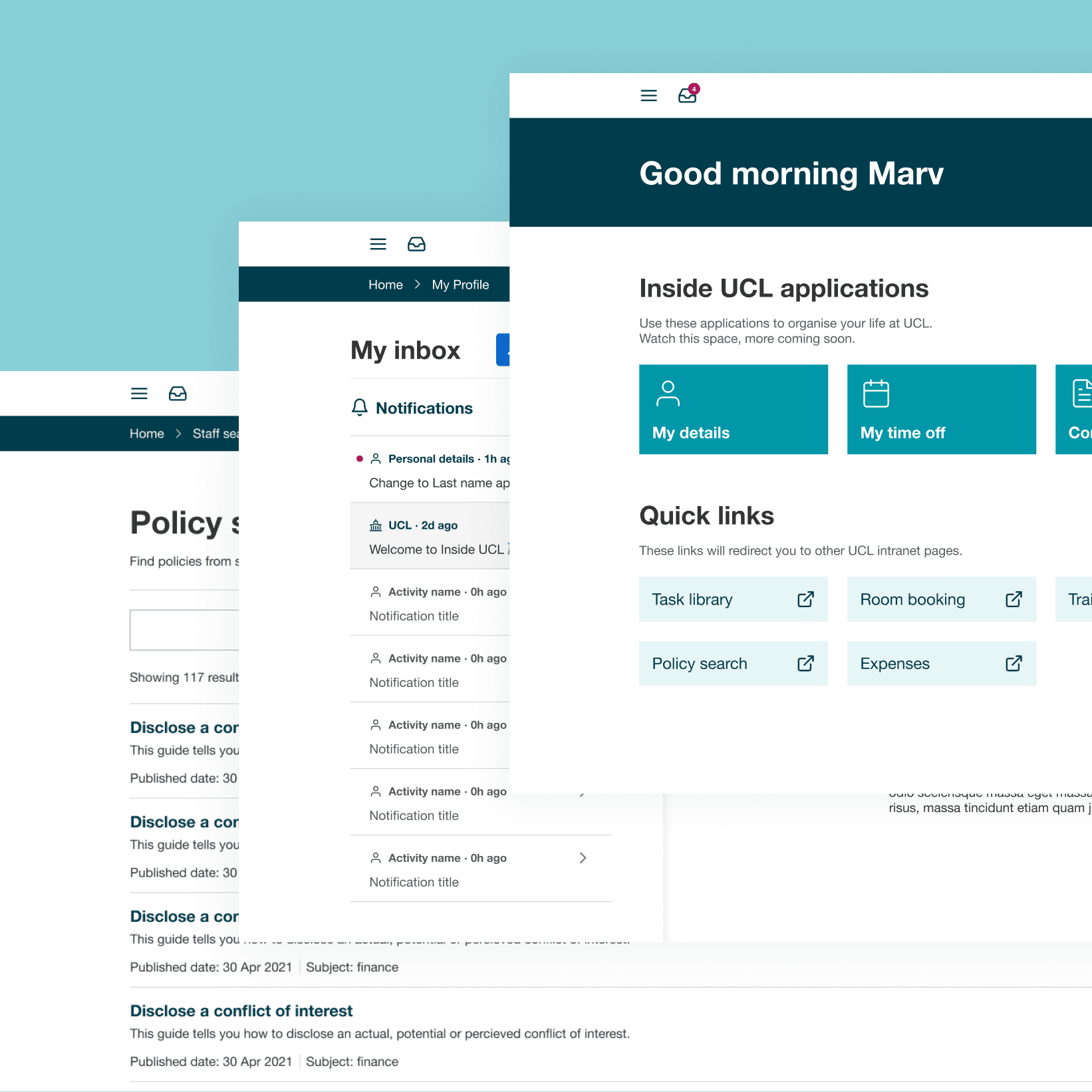
When designing the homepage we focused on simplifying the information architecture and clearly signposting different areas of the application. This provided easy and quick access to the most common tasks an employee would undertake. We also helped to define a system for organising the different types of notifications on the platform from both an employee and manager view.
Getting personal
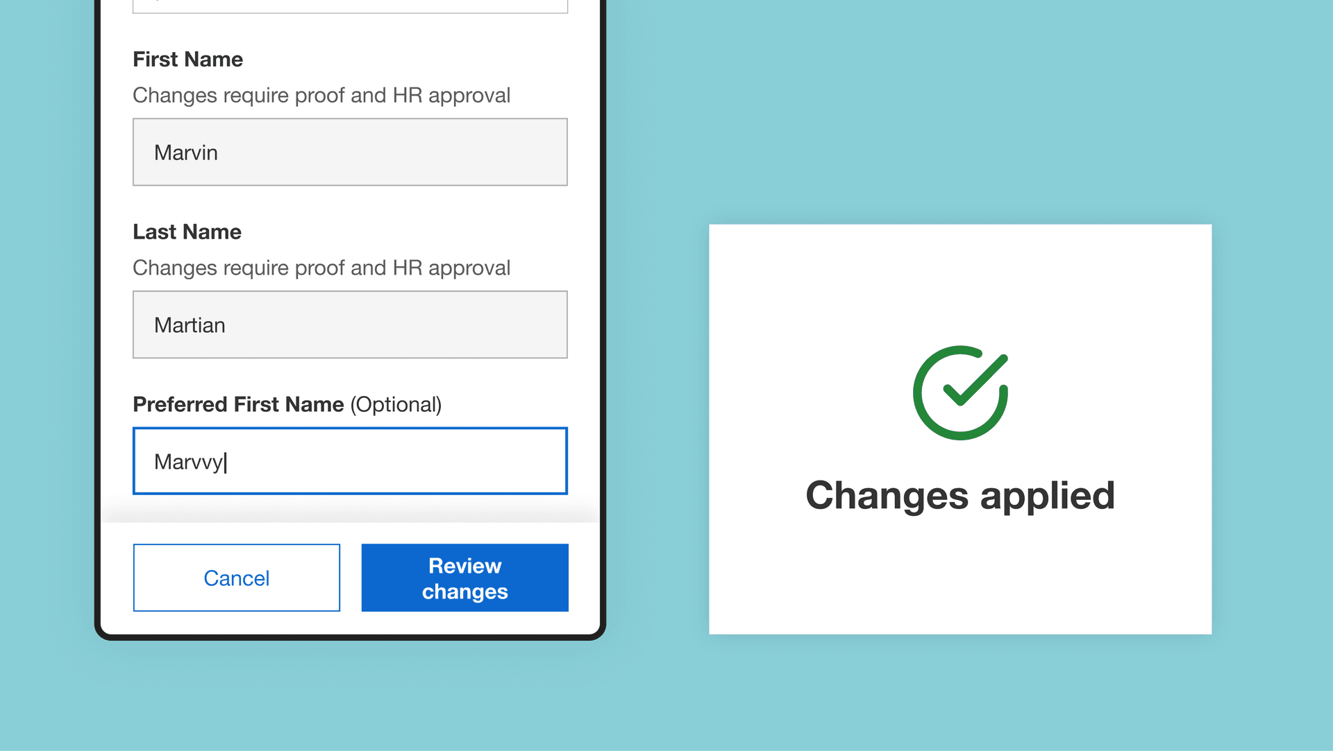
During our formative research with UCL team members on the current system, we found that employees weren't sure if their changes had been saved or not. We tackled this through design by using different active states in the form fields to indicate completion and saving. This helped employees easily distinguish between viewing and editing. We also provided a clear review step, which presented all information about the request, and a save confirmation notification.
Taking time off
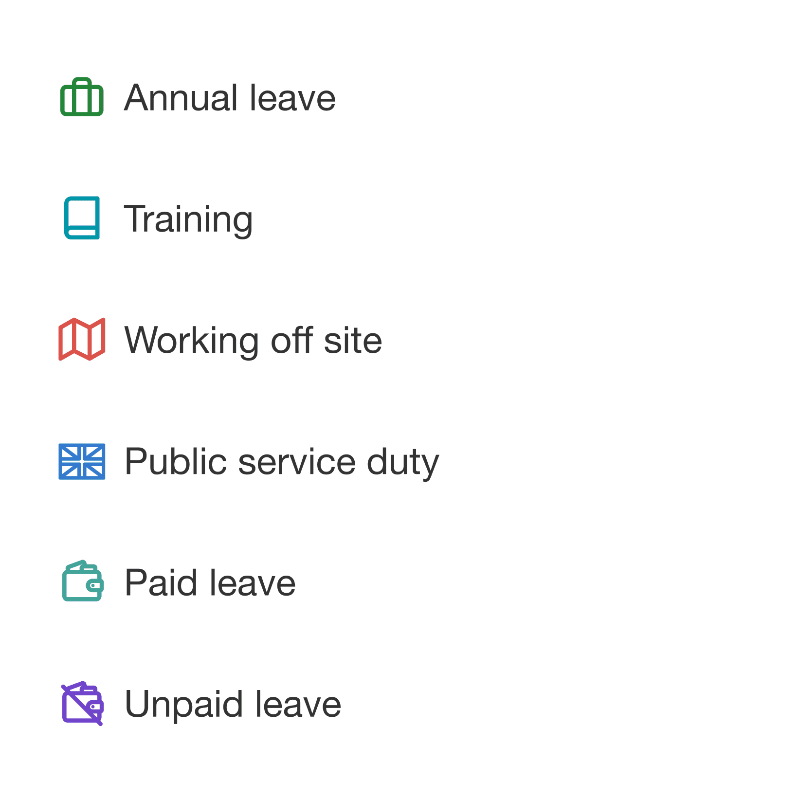
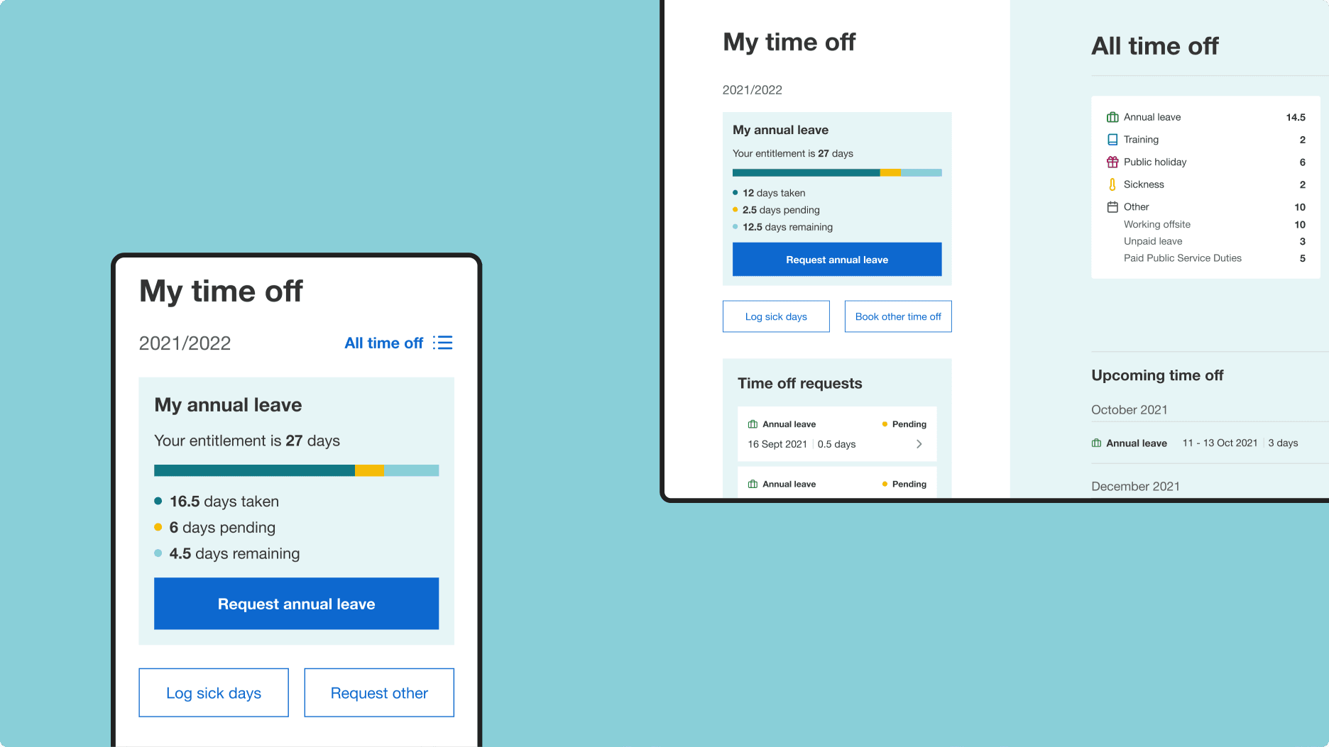
With booking time off we set out to only show relevant information. This meant only showing information about an employee's specific type of leave request. We structured the time off page to prioritise annual leave and sick leave as these were the most common requests. We renamed the section to ‘Time off’, to be more approachable and representative of all types of leave, and avoid existing confusion with annual leave being the nomenclature.
Before, during and after booking, we showed the user how much time off they are taking off and when. We also refined the approval process for the manager so they could see the information they needed. We configured the system to capture the right response, such as requiring a comment when declining a request.
Engineering employee excellence
The strength of our documentation and reusability of our designs were easily consumed by our engineers, who worked alongside us across the whole project. Strong documentation in Figma has made the shift from atomic components to OutSystems easy.
We regularly discussed any limitations from the perspective of design and engineering, and corrected in-flight, as one team spanning Foolproof, UCL and Zensar. Our work in OutSystems followed the same principles of reuse to help scale engineering velocity over time.
Next steps
We continue to work with UCL on their employee experience and beyond. Currently, this involves adding more tasks and activities to the platform. We’re also working to expand on the component library we defined and to build out the design system in full.
Activities
Qualitative research, design, proof of concept, UX writing, engineering, API build.
Delivery
Two-week agile sprints.
Contact us
Like what you see?
We'd love to partner with you. Contact Ed, on ed@foolproof.co.uk
