Transforming internal tools for a leading retailer to supercharge growth
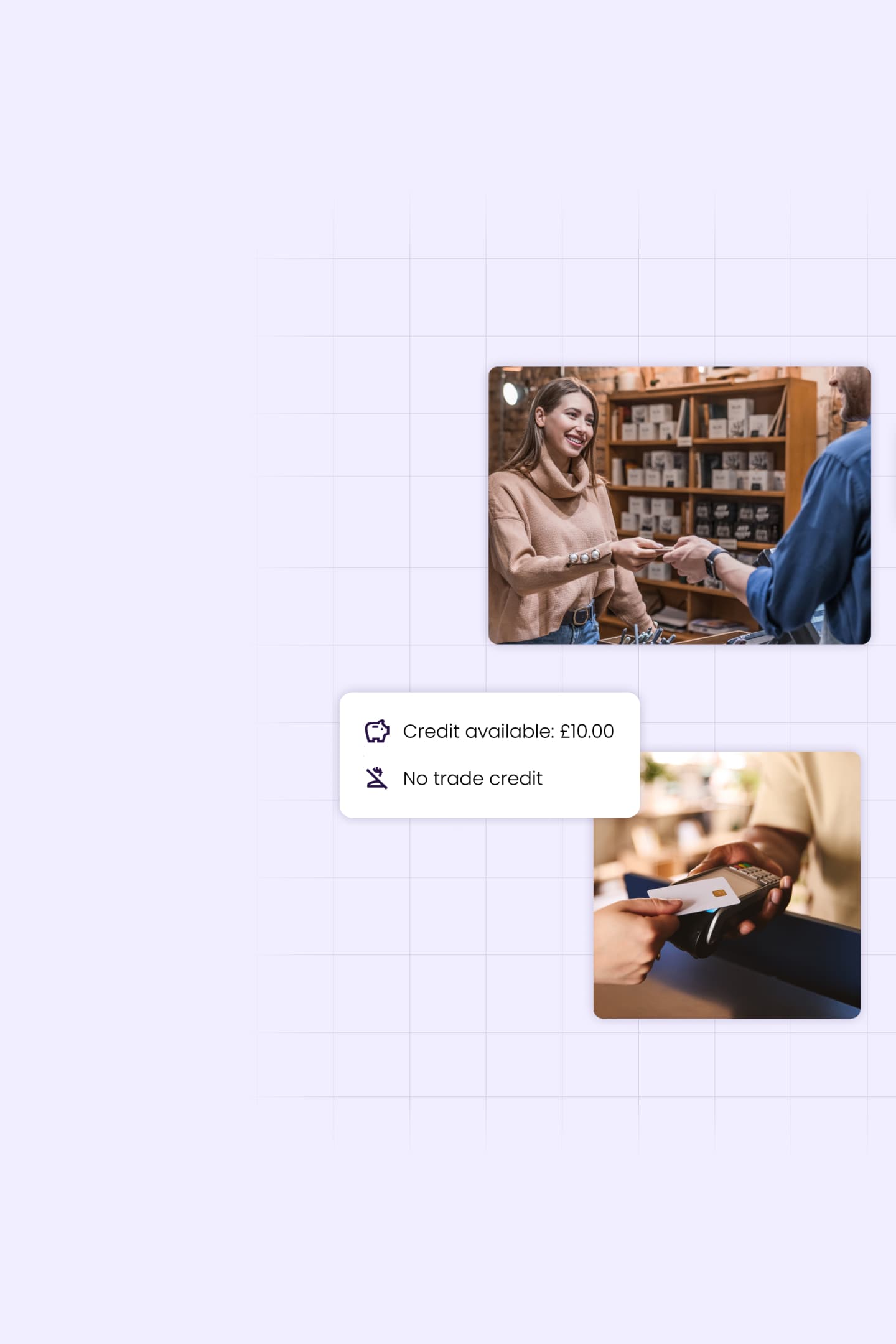
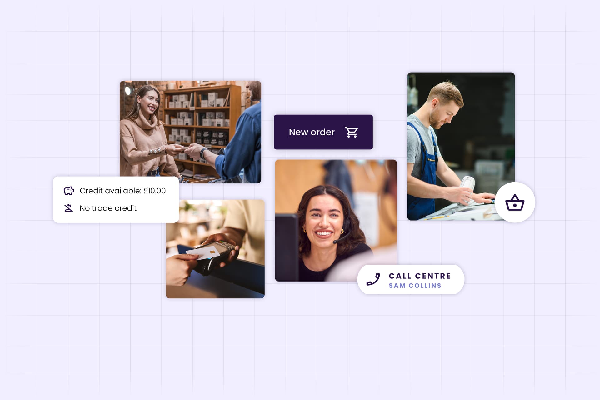
Our client is one of the UK’s most successful retail brands. We helped them to transform two internal tools, one used in branch and one in their central office. These tools help employees manage internal sales, stock control and customer management across the organisation. Our solution helped match the client’s appetite for growth while meeting business, customer, and employee needs.
The challenge
Understand the existing platform use in retail and office environments.
Uncover friction points that create inefficiencies in the sales lifecycle.
Identify workflows that could be improved through design to enhance employee and customer experience.
Design a system that was more flexible and connected to other applications.
The approach
On-site visits to understand the day-to-day experiences of Call Operators, Sales assistants, Store Managers to establish a shared view of existing customer/colleague platform interactions.
Define, prioritise and create user journeys and workflows that use insight and business needs to inform design.
Create a final design and component library that establishes a long-term vision for the future employee experience.

Collaboration is crucial
We established a collaborative approach right from the start. Our teams were intentionally small and agile to form a shared vision and understanding of the insight, systems, and dependencies across our work. We purposefully designed the engagement to avoid big reveals, we shared all insights and design in the moment, this facilitated informed decision making at all levels. Our role was not to overhaul the entirety of the existing ecosystem and its tools. With that said, both existing tools had constraints in terms of connectivity and flexibility. The systems struggled to reflect the complexity of work practices and failed to meet employees’ heightened expectations of user interfaces in the workplace, based on digital interactions they were having outside of work.
Immersion, understanding, action
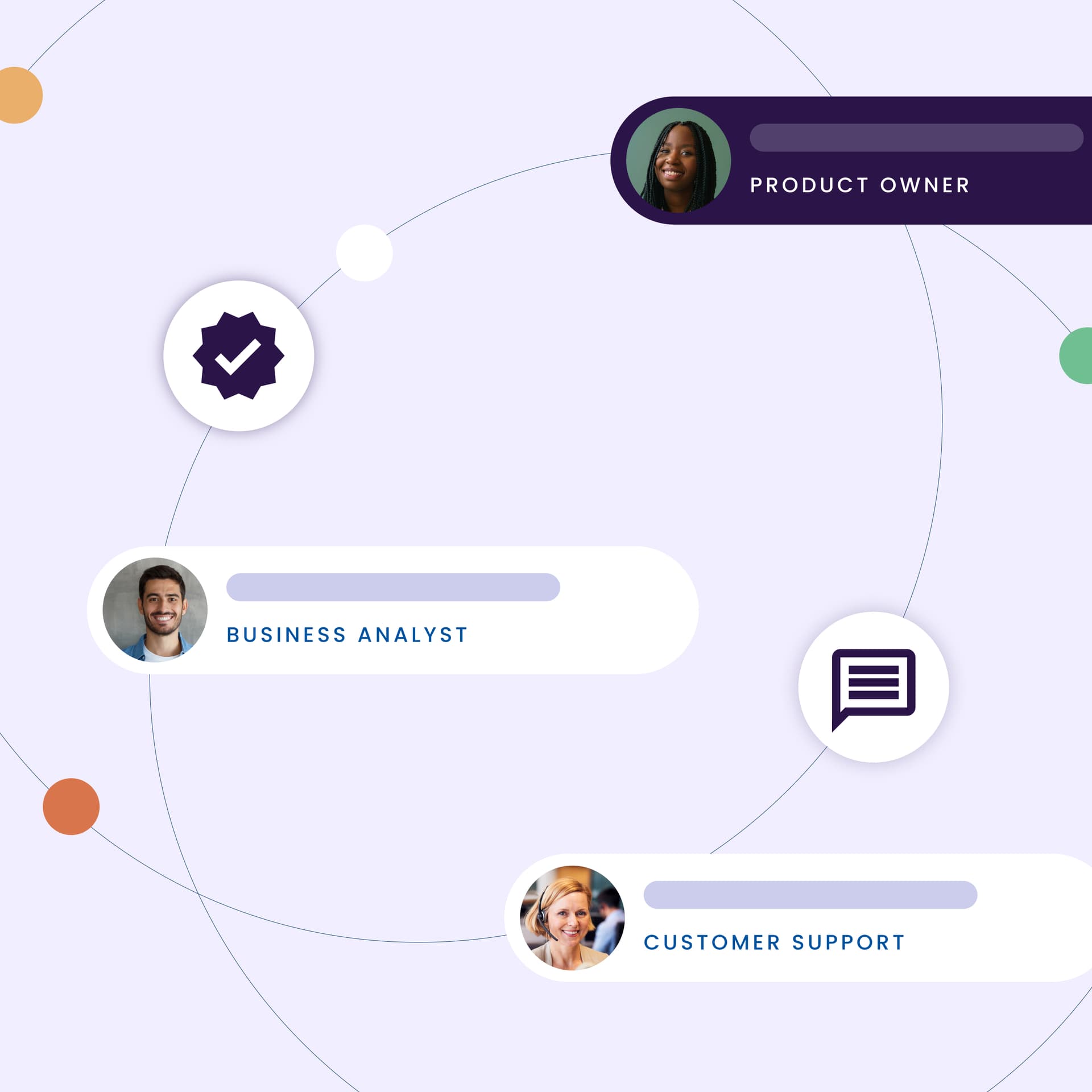
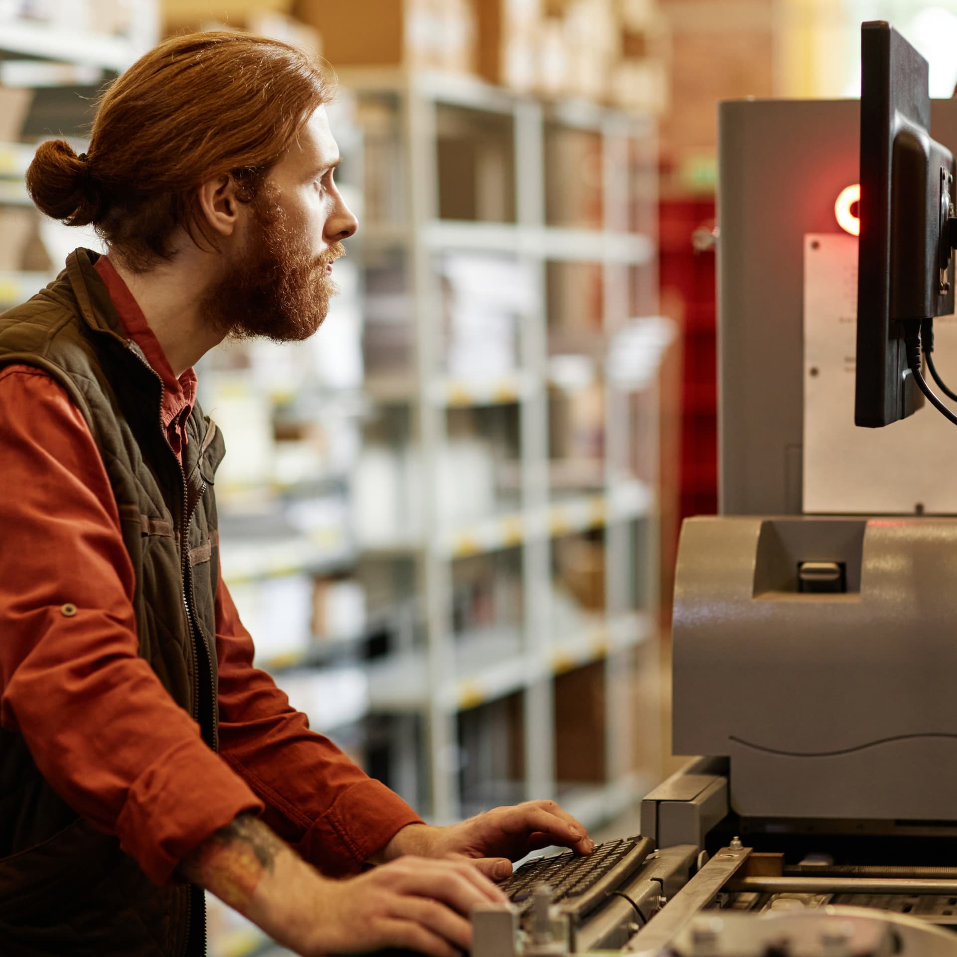
We initially immersed ourselves in the working practices of the business. Strategically focussed stakeholder interviews were quickly followed by more tactical face-to-face and remote sessions with frontline employees. In tandem, we undertook ethnographic observational research in the call centre and stores. This helped us to form a complete picture of the current pain points and link them together.
Deep dive
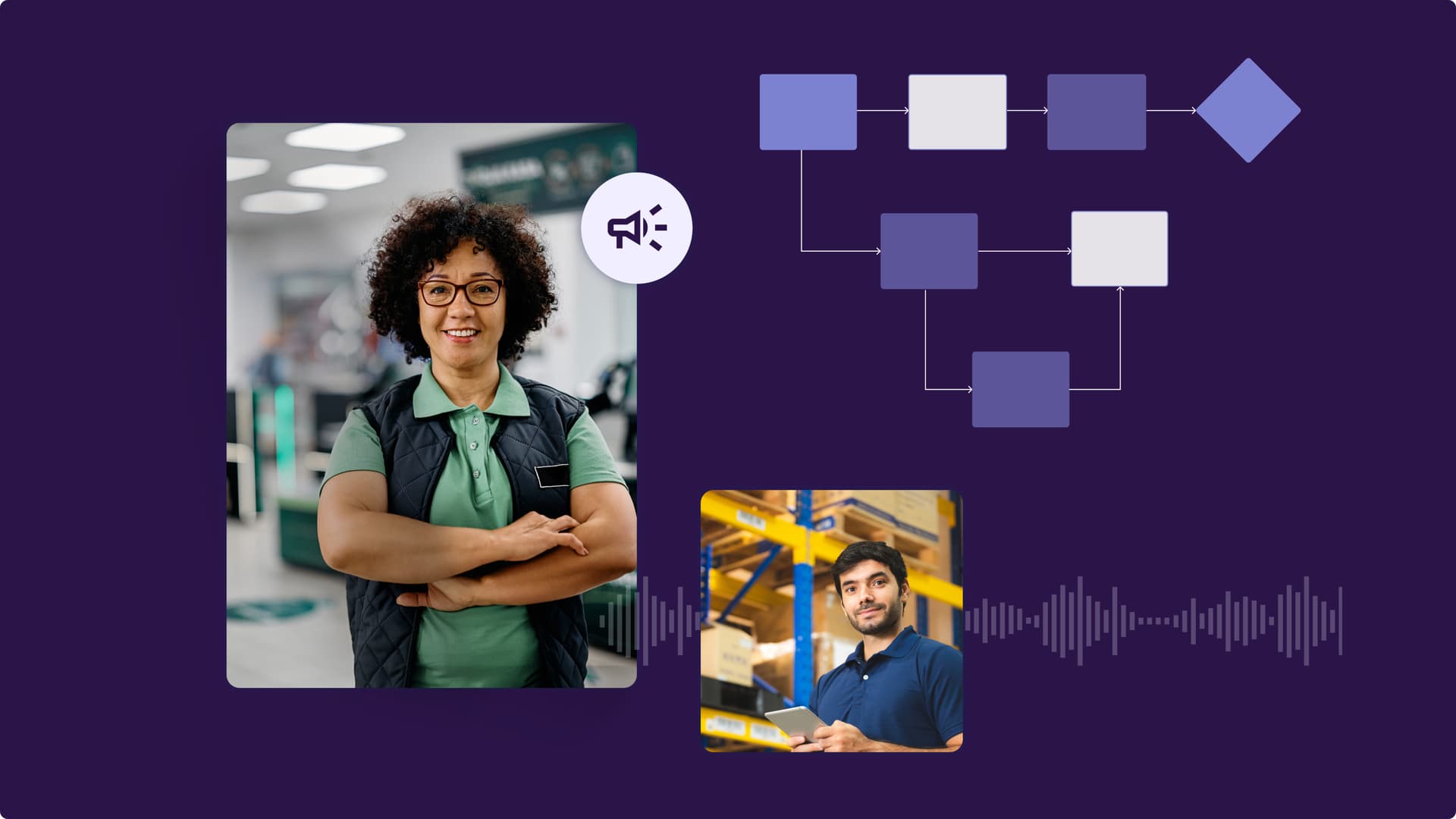
The existing platforms serving staff in the client’s headquarters, as well as in-store employees, has done a brilliant job. However, it did lack some of the required flexibility and interoperability afforded by the applications of different technologies. At any one time, there are 500 people using one of the sales management systems as the start and finish point to calls with customers. However, over time, it was being undermined by work being done, and data being listed, on other internal systems and third-party sites. This was creating gaps in the customer information team members had available to them which could potentially reduce service levels. There are also thousands of in-store employees across the country using the other system - a simplified and more retail focussed version. Here, the constant expansion of the service offered to customers in-store has created the need for processes that were incompatible with the core technology, resulting in too many tasks being paper-based or processed outside of the core system.
Employees as problem solvers
Our client has many employees with a passion for their work, who go above and beyond to solve difficult problems. Although beneficial to the business at large, this meant that many of the issues discovered during immersion had been previously unreported as employees found workarounds, shortcuts and increasingly relied upon external systems to support their work when helping customers. When onboarding as a new starter, or reacting to changes, employees had to invest time in learning the system and working through its usability issues.
From insight to action
Our client embraced the findings from our discovery, together we established a supportive environment that encouraged creative thinking. Our joint aim was to enhance the digital experience for all, establishing a solution that maintains the existing systems’ functionality whilst creating an interface that captured modern design, the client's brand, and optimised process flows. The insight captured from our immersive research allowed us to understand the working dynamics of both the call centre and in-store operations. This, combined with our own inquiry, helped us to create a blueprint of the services offered. Providing the foundation for high-level hypotheses which fed the formative creative process of designing lo-fi prototypes.
The crux of design
At the heart of the design process were two principles:
Design, test and iterate with employees in mind, ensuring all creative decisions stem from the observational research we conducted in the retail and business centres.
Embrace best practice from modern web and app solutions and the expertise from the team to create a solution that is insightful, predictive and one that empowers employees.
A modernised design solution
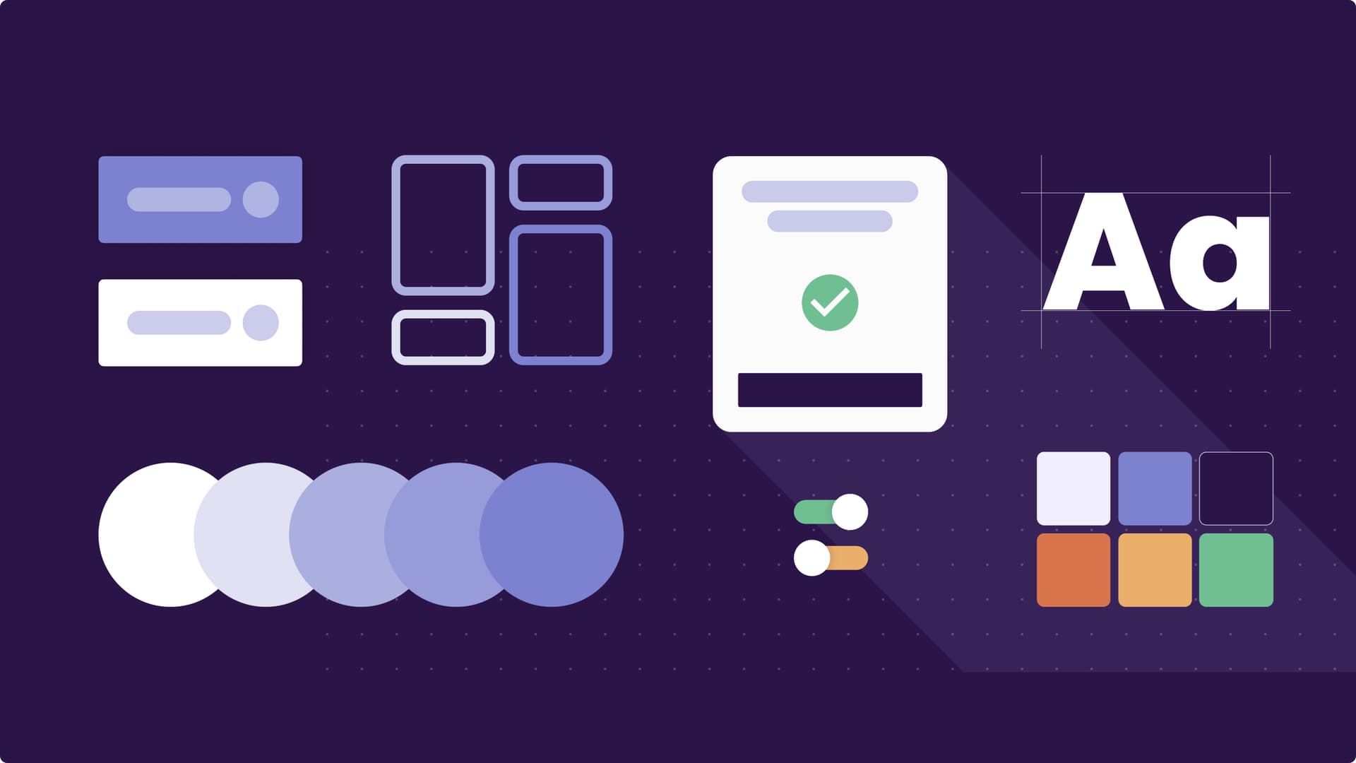
A design library was created that aligned all digital tracks promoting consistency and consolidation across workstreams. The system uses the enhanced features of Figma; auto-layouts, variants and flexible components to ensure the design solutions can be edited easily and scaled appropriately. As part of this library, documentation captures every key process in detail. From an overarching information architecture map down to the micro interaction of flows and single screens. We embodied simplification as a guiding principle across design. This ensured that only the most necessary information, fields and jump-off points were surfaced to reduce noise and friction and enable quicker task completion. This helped to ease confusion and anxiety for employees as they moved through complex processes and created a design language that can be used to improve and align all future touchpoints.
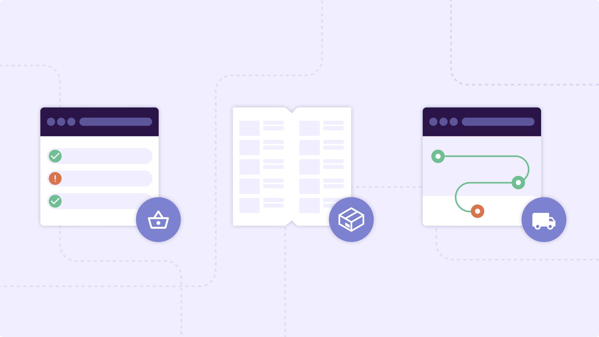

We carried the warmth and simplicity of the in-store experience into the user interface of the systems. Our use of minimalism, clear sign posting, improved readability and simplified visual and information hierarchy combined with softer shapes, warm colour and labelled icons made lighter work of difficult tasks, saving colleagues stress and energy. Design highlights include a new dashboard and a tab-based workflow which recognises and supports multitasking for employees through design. We also created new and improved search with faster learning and predictive behaviour, and an intelligent customer profile screen, providing a snapshot of customers at a glance and jump-off points to the additional functionality needed for some sales and resolution tasks. This made tasks like checking stock, searching for product details on the website or looking up delivery information simpler.
Moreover, adoption and utilisation of accessibility guidelines are at the very core of the design, while the use of dark mode that helps in brightly lit in-store environments, text sizing and positioning for additional readability, journey flows and iconography are some of the elements we included to improve the customisation and usability of the tools. In parallel, we developed a new note taking system that acts as an audit trail for customers, ensuring that the sales and resolution history can be easily recorded and acted upon quickly and easily in branch or over the phone.

Next steps
We continue to discuss the adoption and implementation of our work with the client to empower thousands of employees across the business to create better customer outcomes.
Contact us
Like what you see?
We'd love to partner with you. Contact Ed, on ed@foolproof.co.uk
