Delivering a world-class enterprise solution with Shell
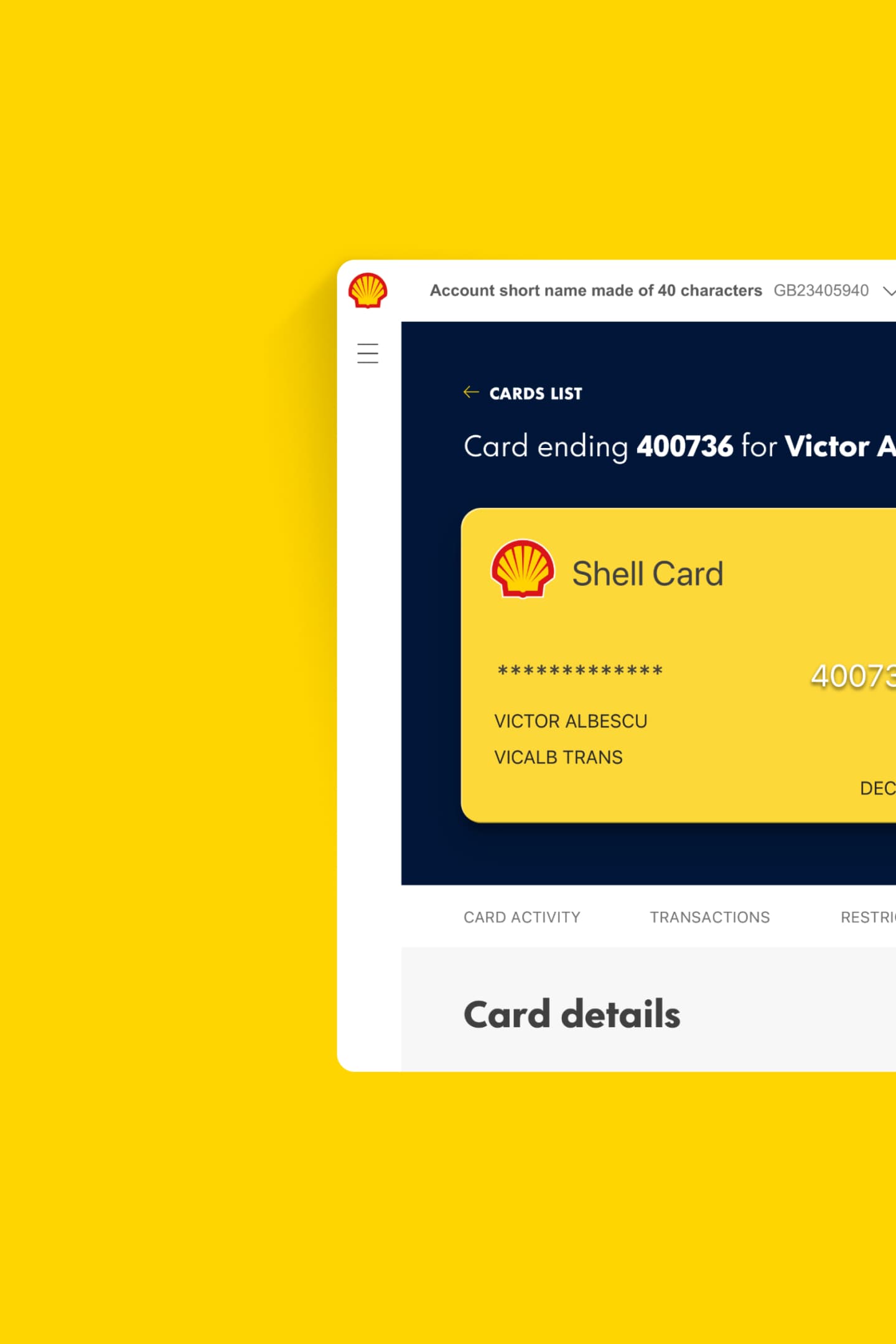
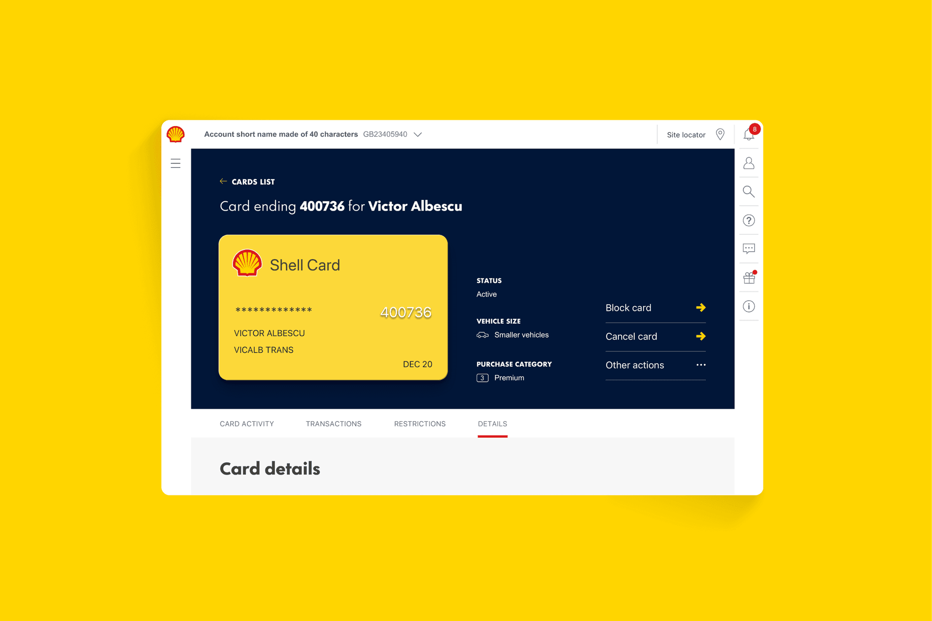
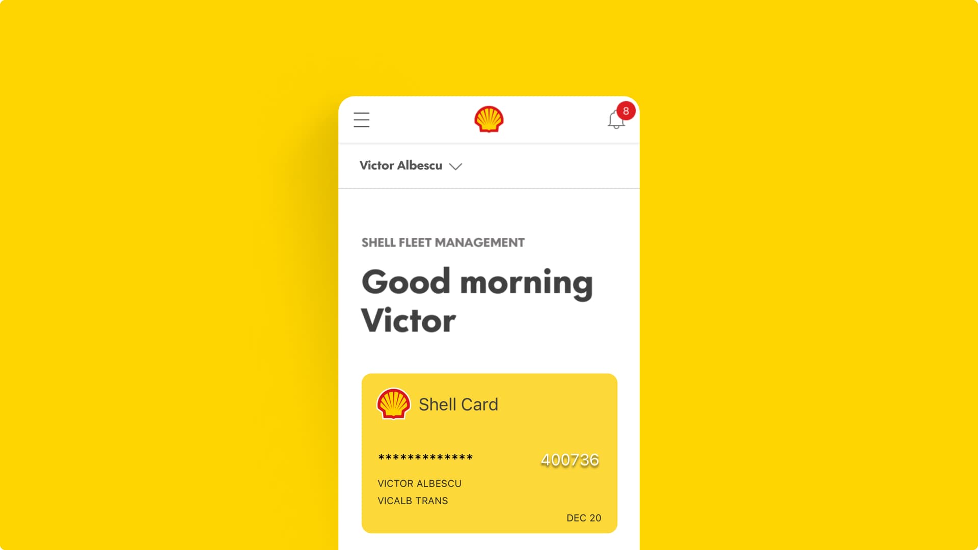
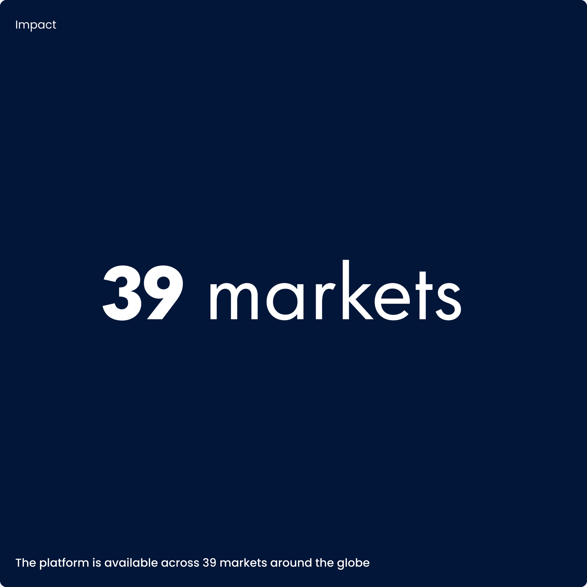
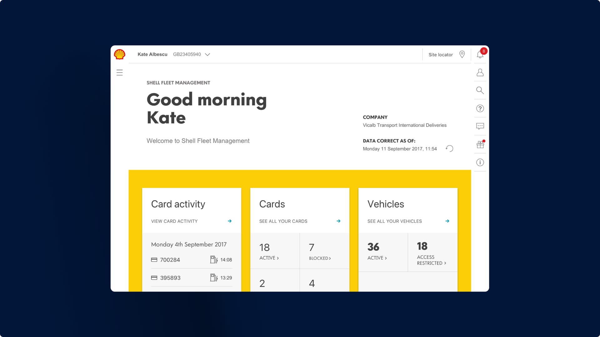
We designed and delivered an end-to-end enterprise solution with Shell and multiple partners across geographies. This was deployed globally, across 39 markets to millions of customers. It replaced Shell’s existing system and transformed the interaction that fleet managers have with their online card management platform.
The challenge
Deliver on Shell’s vision for their place in the future of the mobility space for Fleet Solutions: diversify revenue streams through innovative products and services that are reliable, relevant and rewarding.
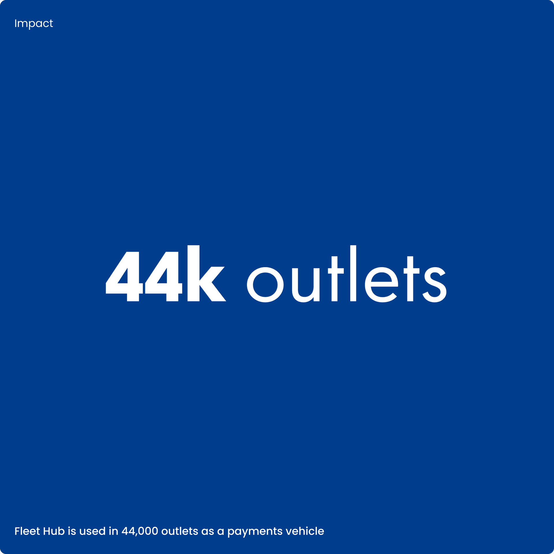
Design, develop and deliver a Fleet Management portal that supports millions of drivers globally, across 44,000 retail outlets.
Set the benchmark for user experience and end-to-end agile development across retail transformation initiatives at Shell.
The solution
Created business change that was grounded in user-centricity.
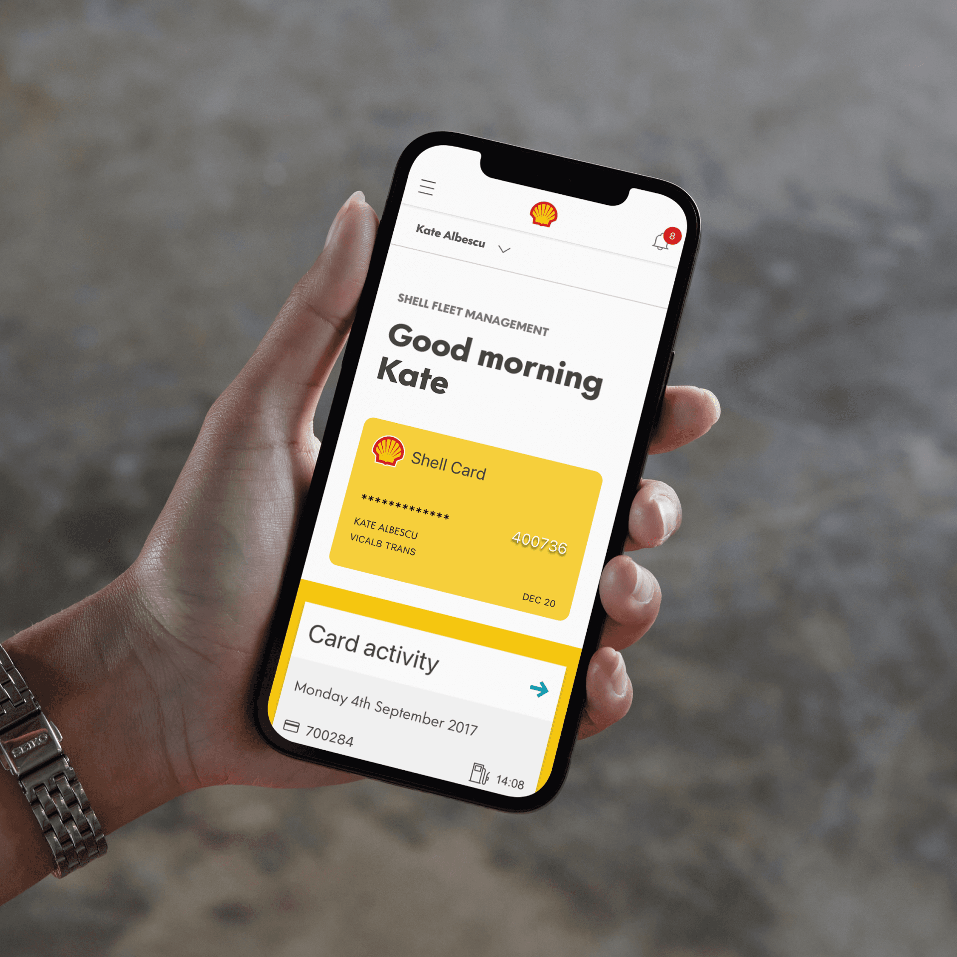
Designed, developed and delivered a Fleet Management platform as the stepping stone for a digital ecosystem of integrated mobility services – Shell Fleet Hub.
Embedded new software solutions that created a world-class user experience in a B2B context.
Visual identity
Addressing shifting customer attitudes
Shell recognised the need to reimagine their place as a Fleet Solutions provider. Unsuitable platforms, competitors moving into the market and changes in customer experience expectation drove this shift. Shell needed to move from being a fuel card company to a connected service that can scale to meet their customer needs. The vision was to be a fully fledged mobility services platform.
This new business strategy meant focusing on products and services with customer experience at their heart. This made our work on Shell Fleet Hub about more than just fuel cards. It paved the way for Shell to become a market-leading provider of mobility solutions, including tolls, telematics and other non-fuel services.

Visual identity
Envisioning the ideal experience
We defined an experience strategy that included an MVP, which brought the possible iterations across the user experience to life. It was a compelling picture of the future state, which allowed stakeholders to understand and support the ambition of the programme. This meant that further investment was secured to build the experience as part of Shell’s retail transformation plan.

Visual identity
Research informs design
The legacy platform offered an outdated user experience and we wanted to discover what needed to change. Our design research, with core user groups, identified pain points and user needs that needed fixing. It also helped us understand the competitive threat from smaller, more agile organisations that were entering the market. This competitor analysis work allowed us to differentiate Shell’s offering through our design direction.
By defining design principles that were grounded in design research, we directed our design process to meet and exceed the fleet managers’ expectations. We designed the platform to be insightful, predictive and empowering. Each of these principles guided the visual design, development and implementation across the programme.
Visual identity
Every customer, every time
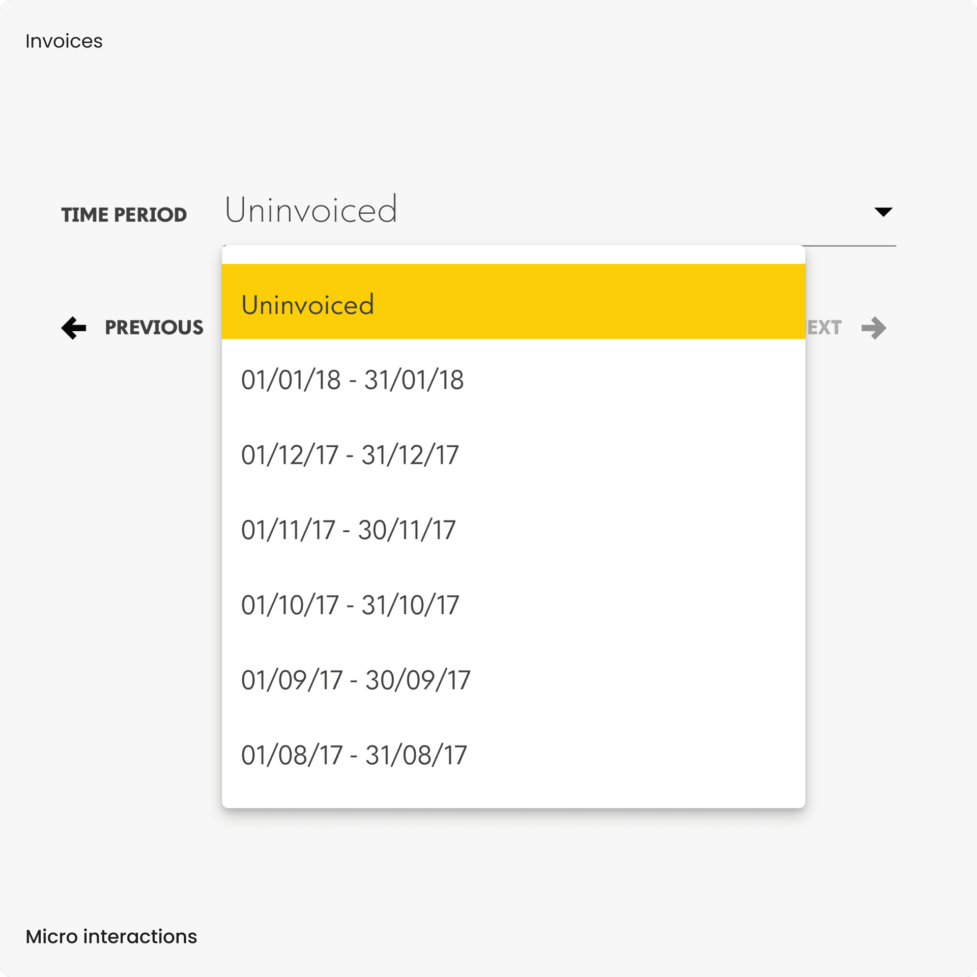
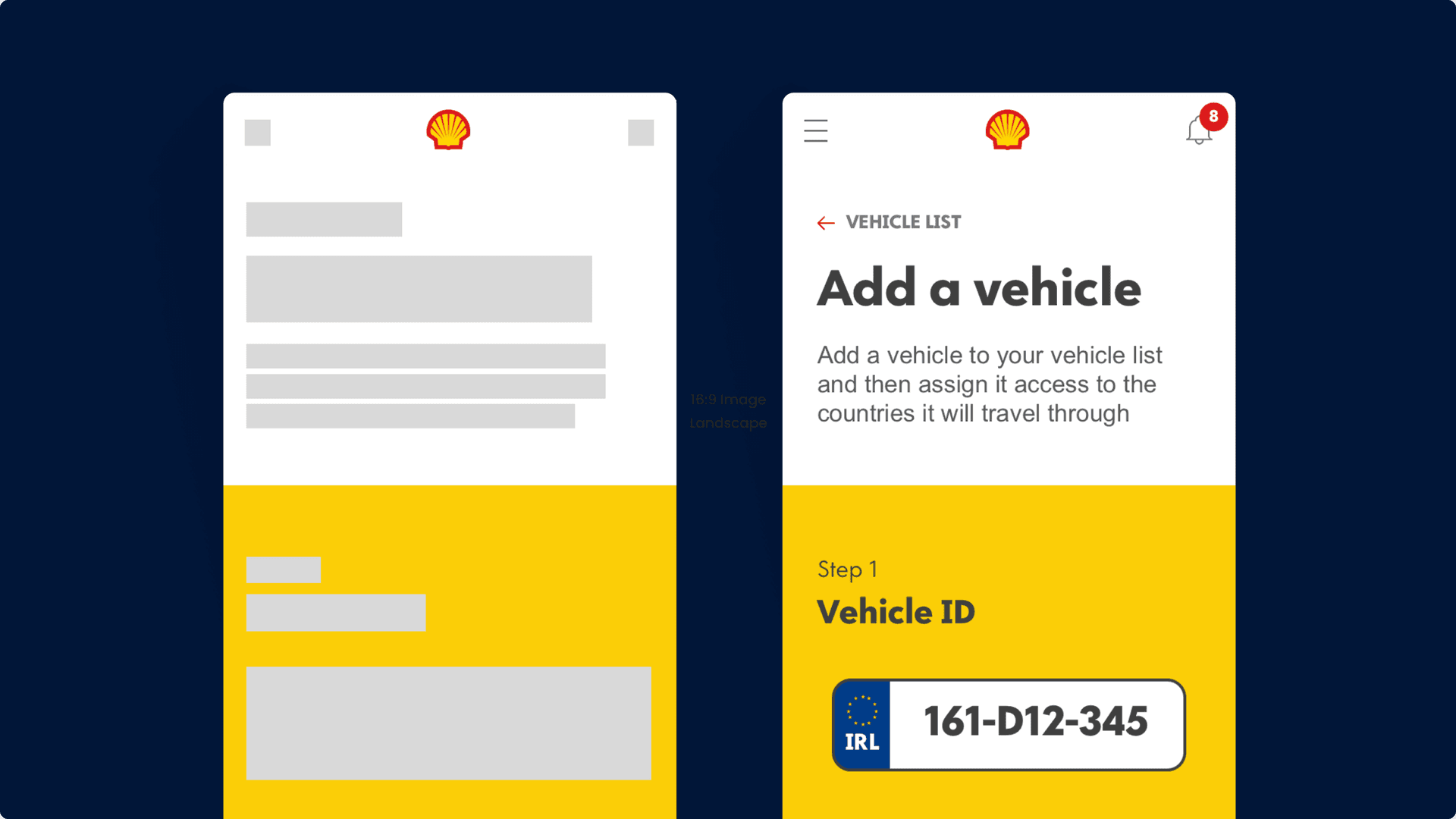
The onboarding experience on the legacy platform was poor and required significant upfront effort from the user. This meant that many users resisted interacting with the platform, with those who remained preferring to email or phone to manage their fleet. Shell’s goal to treat every customer like a guest, which reaffirmed the need to create a product rooted in best-in-class design in a B2B context. Our biggest design wins came from creating micro-interactions, which gives cues to the user about how the platform works.
We focused on the simplest, high priority tasks the fleet managers carried out. Over time, we ramped up our efforts by designing for greater complexity. By validating our design iteratively through research, we fed back changes into the sprint cycles. This helped us align with our client-side partners' expectations and boost our design, development and integration effort towards successfully launching the new platform.
Visual identity
Co-creation at scale
Alongside designing the platform modularly, we delivered it with our parent company, Zensar, and Shell’s API partner. This meant following modern development techniques and building a delivery culture across the teams.
From the get-go, we immersed ourselves in the design and technical delivery process. This meant together we had an entire picture of the technical landscape at Shell and the vision they had for the platform. We knew what could and couldn’t change on the road to delivering Fleet Hub. It also meant that, when we hit challenges, we found solutions and wins together, as one team.
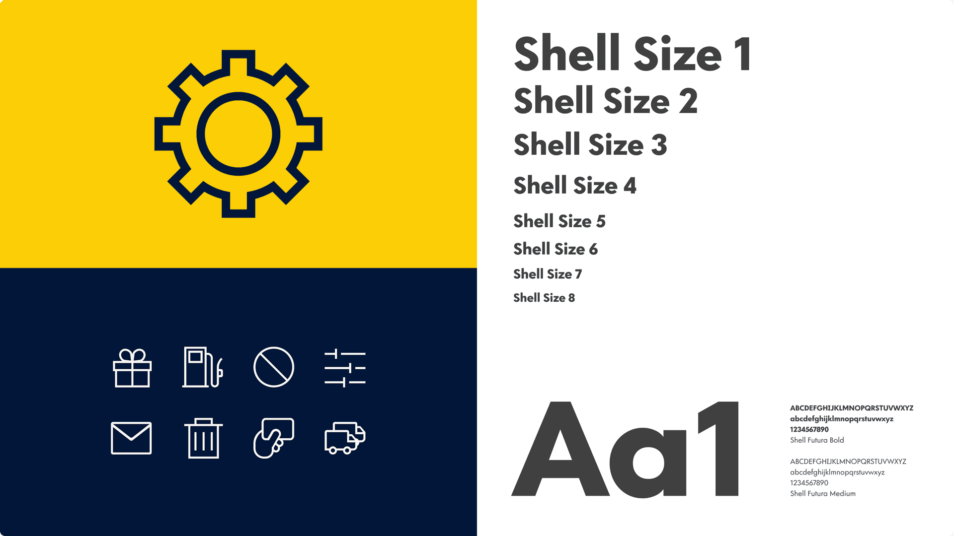
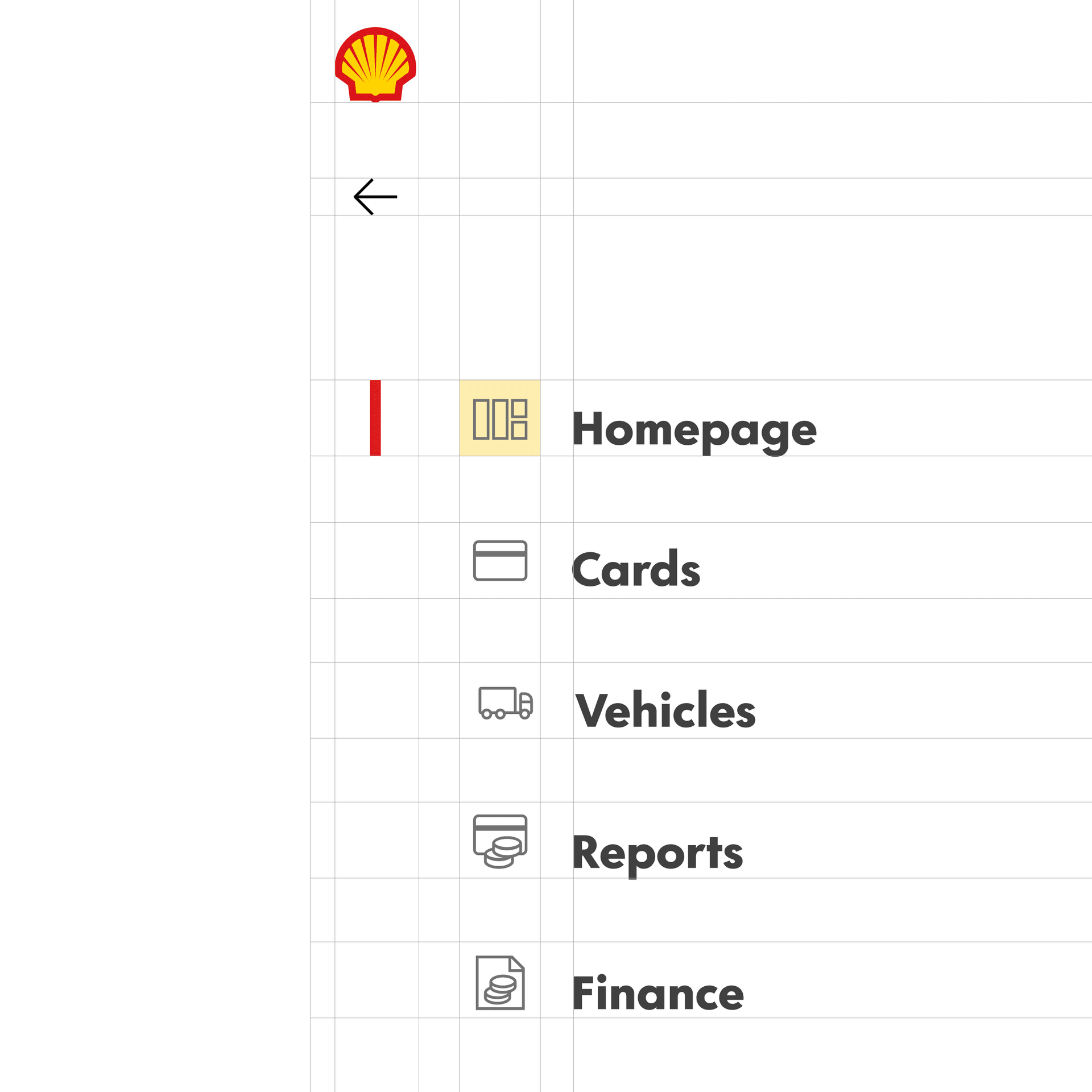
By working collaboratively at scale, we designed and delivered a solution that protects the intricacy of the user experience and the moments which make a difference to fleet managers. We proved that world-class experience design can be executed on complex B2B systems. By distilling the UI that formed the platform into a pattern library, we helped Shell create a baseline for future design and development. This has been used to inform a future enterprise design system, ensuring efficiency and cohesiveness to all services that are part of Shell’s Fleet Hub vision.
Visual identity
A future empowered by data
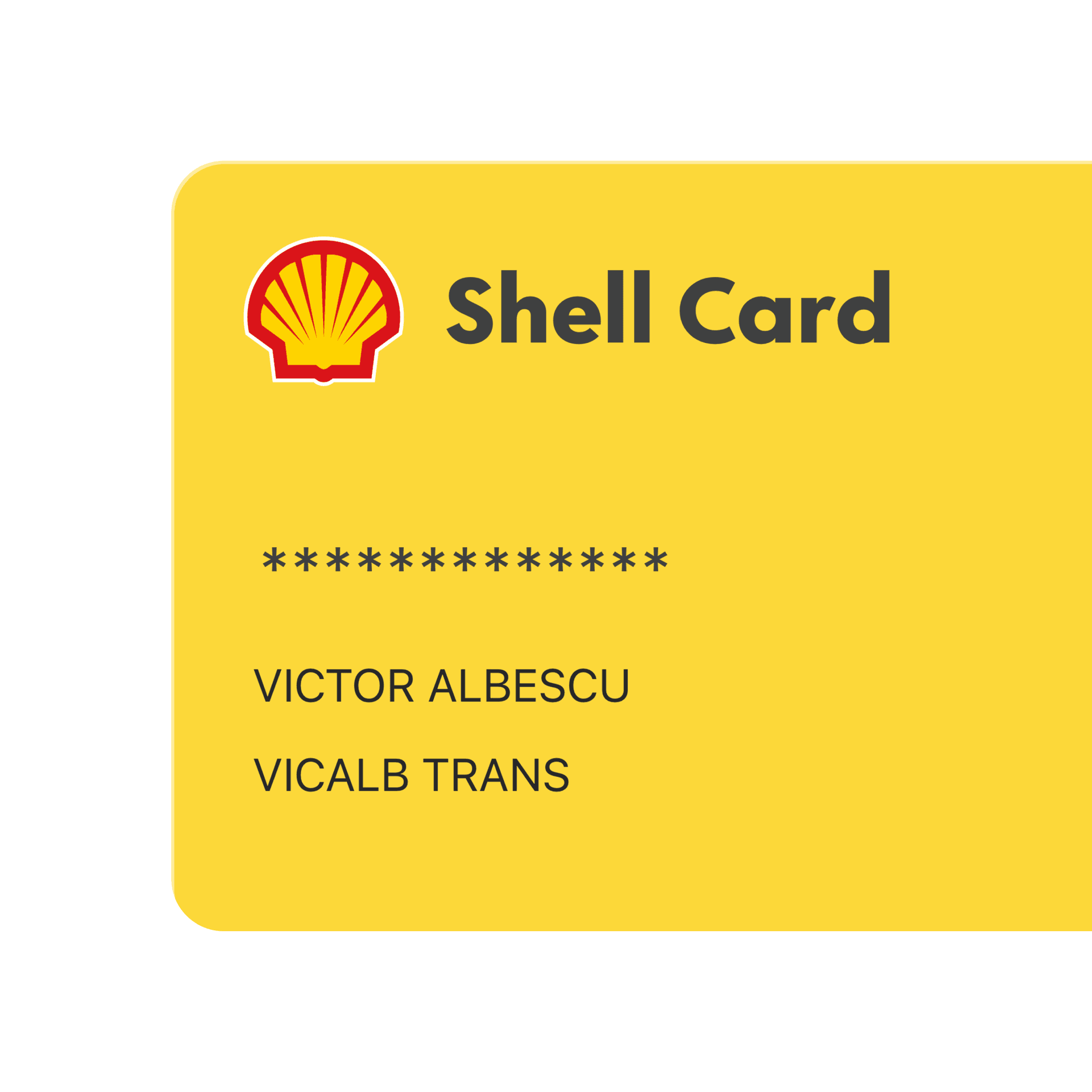
This platform was the first big step in Shell's journey to becoming a provider of best-in-class customer experience. Fleet Hub has served as inspiration for other propositions Shell are considering. In particular, the pattern library built for the online card management platform significantly sped up the ideation and delivery of a tolls system. We're glad that our work helped to drive down time-to-market and cost-to-serve, whilst also increasing revenue for Shell.
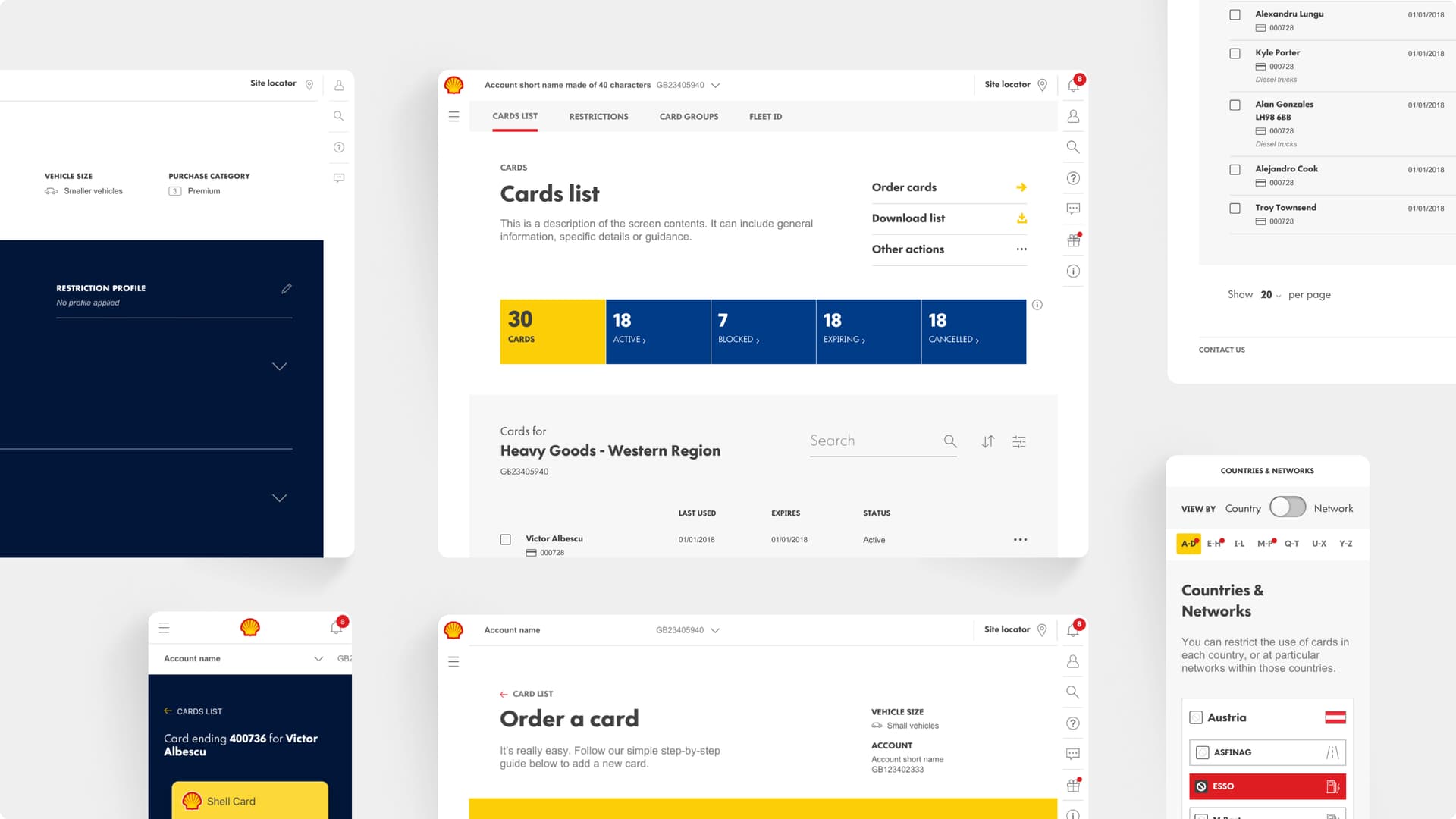
We're immensely proud of what we've achieved by helping Shell to deliver this platform. It represents how we can help businesses design, develop and deploy next-generation platforms rooted in user-centred design and agile methodology at scale.

Activities
Personas, MVP, Proof of Concept, visual design, experience strategy, design standard definition, front-end development, back-end development, technical integration, UAT, platform roll out and localisation.
Deliverables
Iterative research, design, development, and implementation over 2+ years through a full Agile (SCRUM) methodology involving 30+ team members distributed across 2 regions.
Contact us
Like what you see?
We'd love to partner with you. Contact Ed, on ed@foolproof.co.uk
