Creating the Eat Drink Meet brand with Mitchells & Butlers
Brand creation and architecture
An identity to house multiple brands
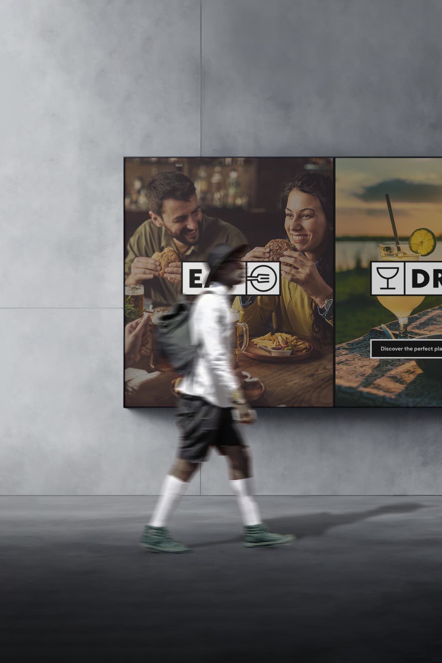
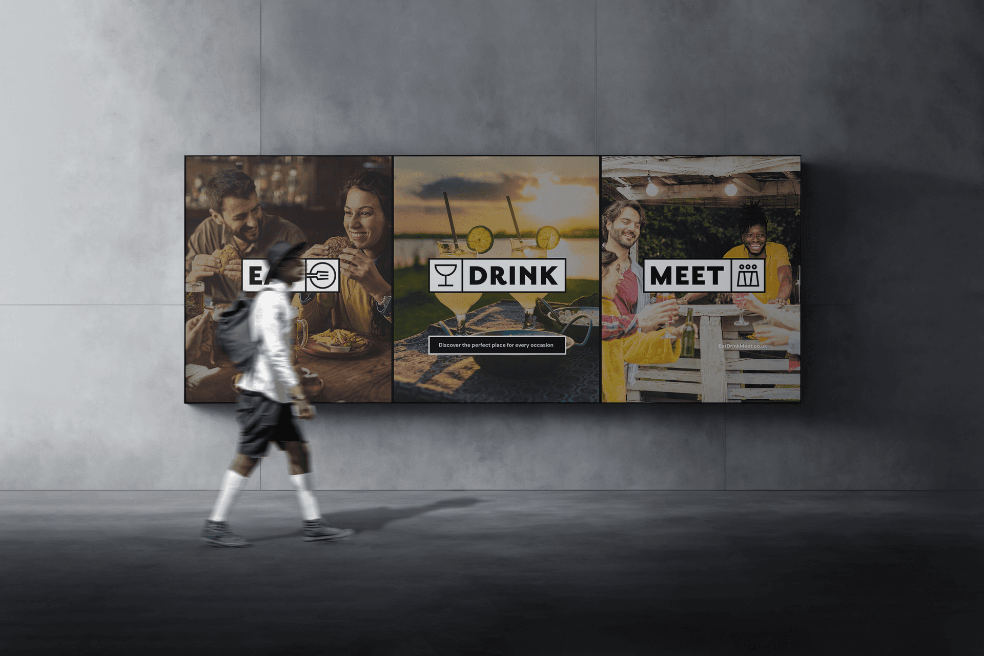
Mitchells & Butlers owns a wealth of food and beverage brands across the pub and restaurant market. They wanted us to create a stand alone brand for a venue booking app that stands out from the crowd and gets them noticed. The identity supported the launch of a new digital product that empowers customers to search all Mitchells & Butlers facilities based on their unique needs. Mitchells & Butlers identified the need to be able to bring together all of their estate into one place for the purpose of supporting all their brands and their visibility as venues. We embraced the challenge of creating an architecture that brings together a mix of larger brands that are well known and established and softer brands that don't have an outward brand identity.

Modular design language
An identity for different brands and venue experiences
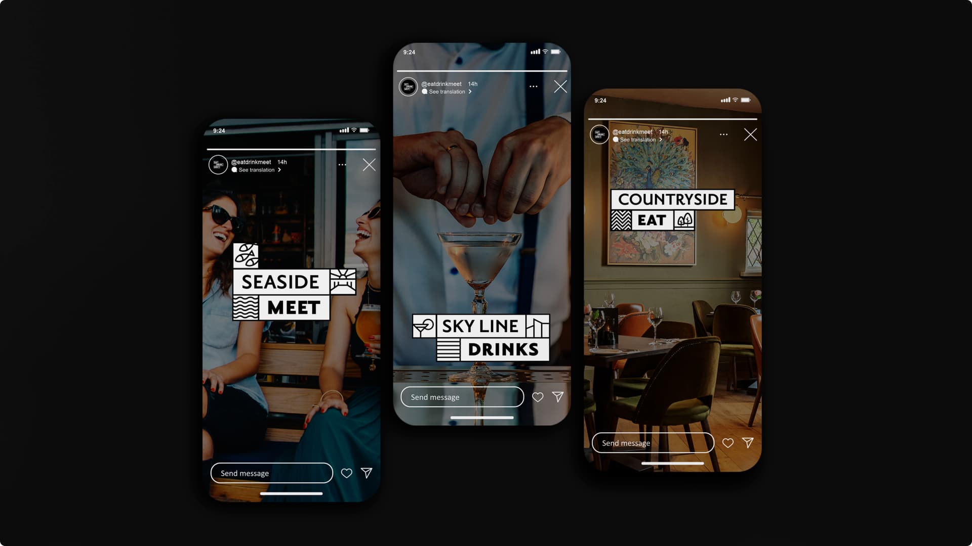
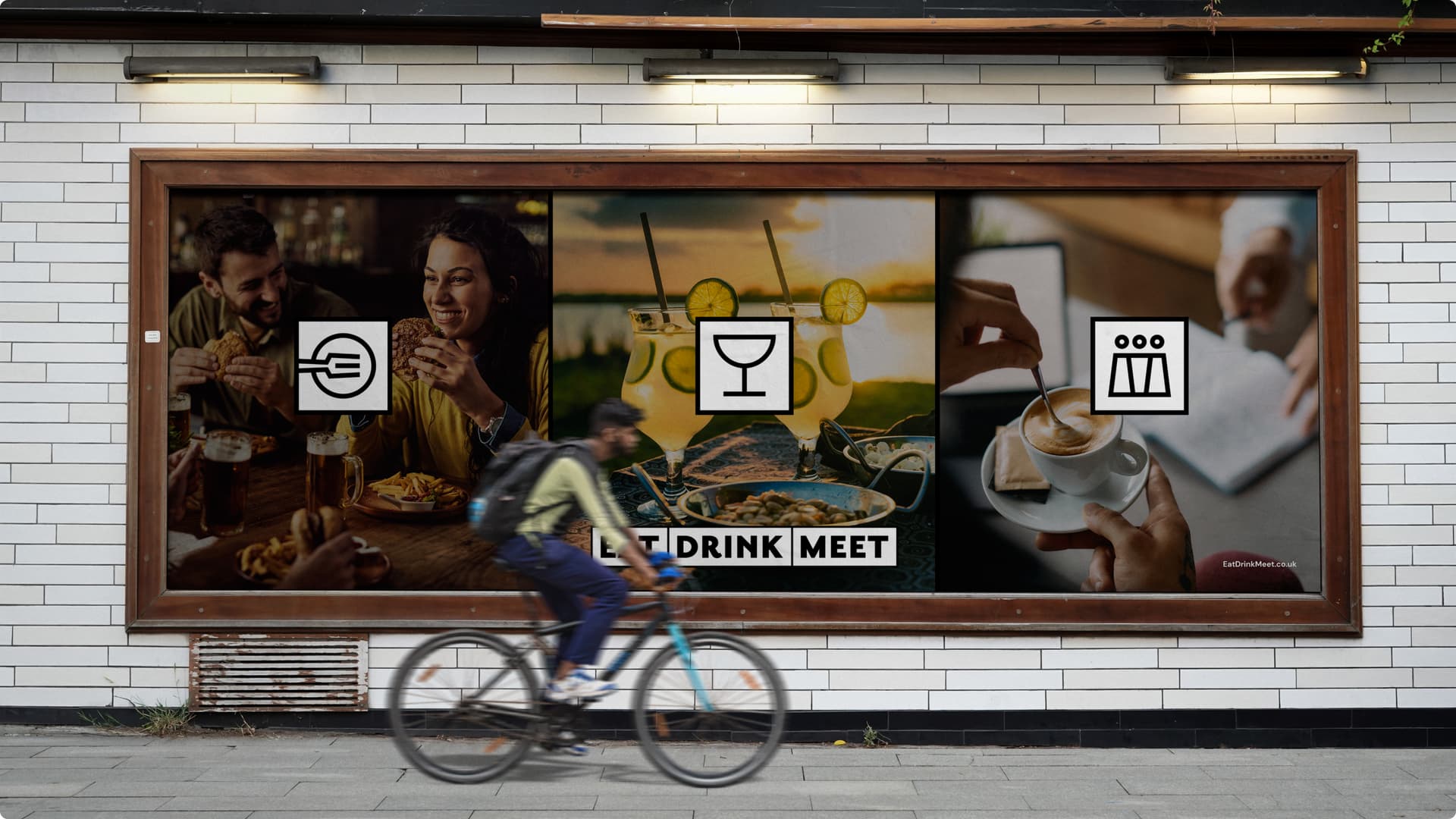
We created a modular design system that allows Eat Drink Meet to showcase venues not just for food and drink but also for experiences; think restaurants by the seaside, rooftop city bars, countryside classics, event spaces and more. This modular brand identity system works across the digital ecosystem; it allows customers to look for the experience they want and the business to showcase their brands, locations and offerings.
Images speak a thousand words
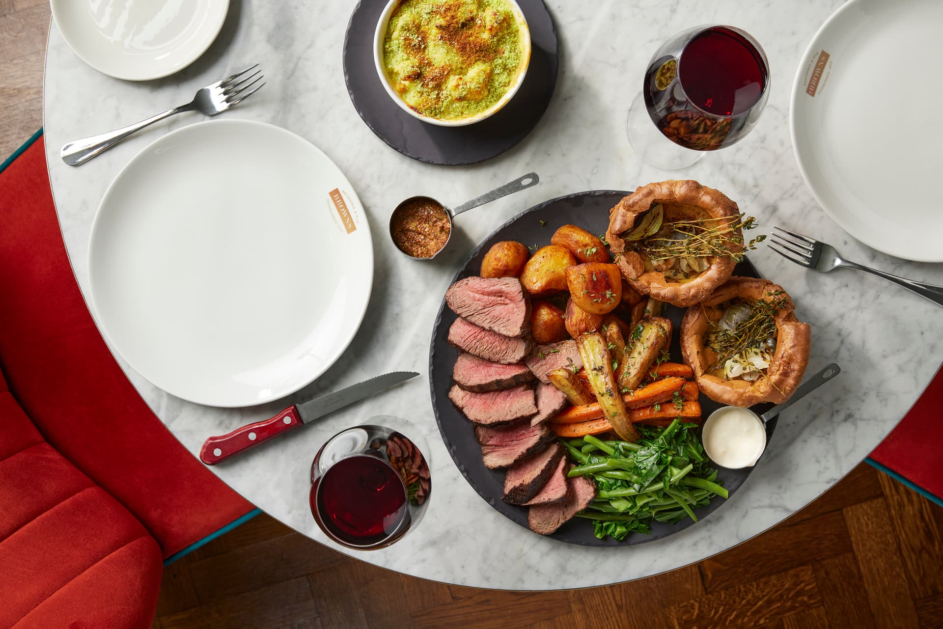
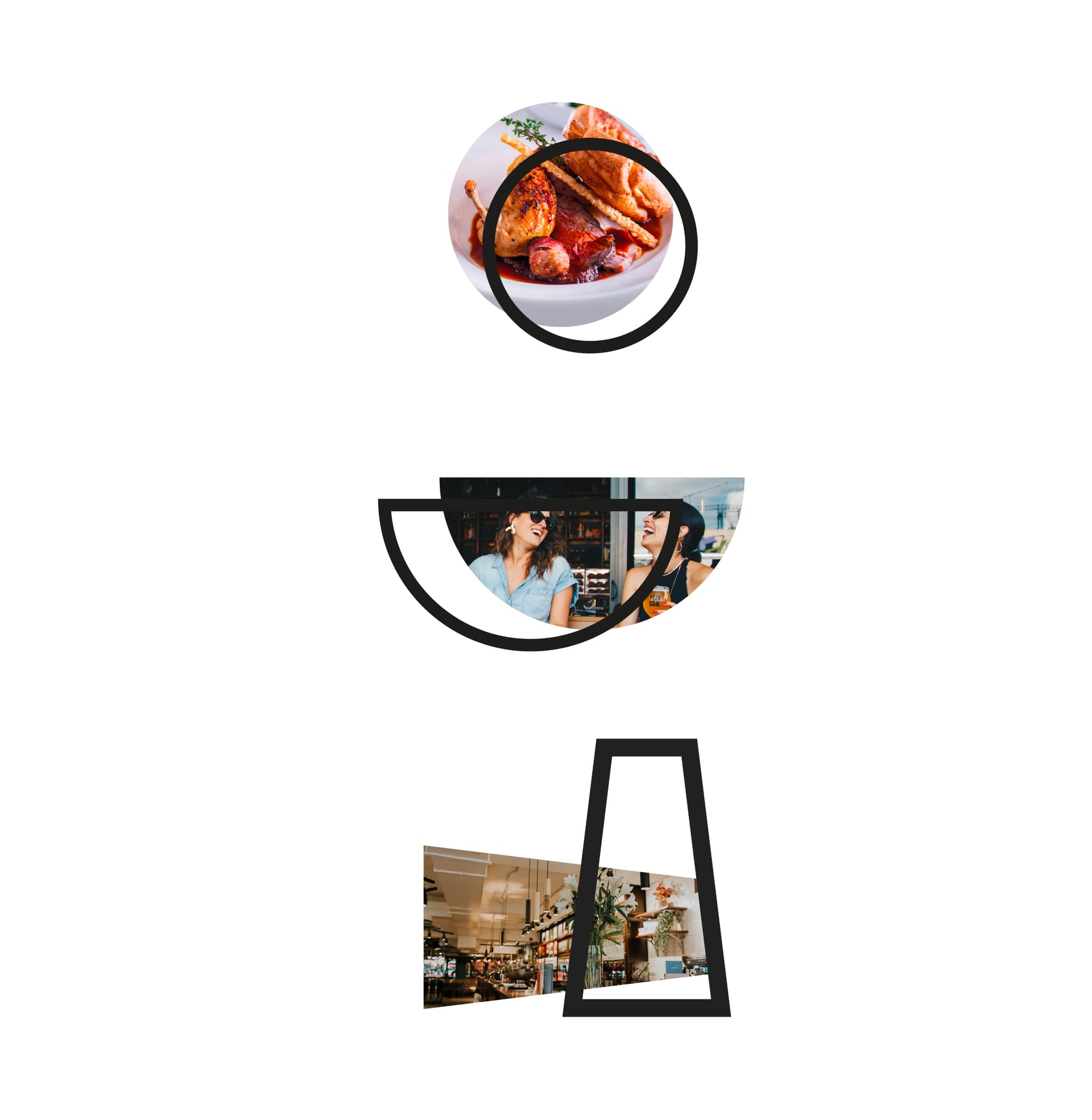
We discovered that imagery was crucial - customers need to see the experience to feel it. Alongside a modular messaging system, sits a creative way to showcase the food, drink and venues. Using the associated shapes of the icons to frame and bring focus to imagery, we tied subject matter and sub-brands to the main brand identity.
The value proposition
Understanding the audience and validating the proposition
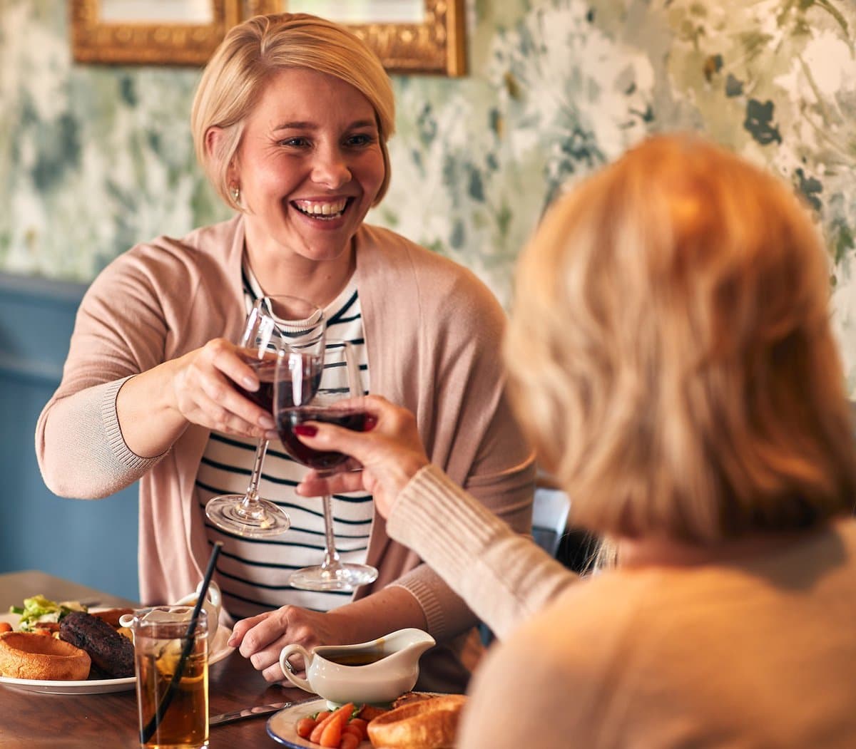
In order to build a proposition and gain market validation, we worked with internal stakeholders and conducted external customer research. Who are the products and services for? What experiences are they looking for? What’s missing from competitor experiences that could give us the edge? These were some of the insights that came from research, allowing us to create a better brand story and proposition.

Brand archetypes
The sage
Comprehensive: show breadth-of-knowledge, expertise and trust.

Brand archetypes
The ruler
Confidence and assurance: proudly promise to provide experiences that are right.

Brand archetype
The everyman
Here for everyone: authentically stand for human connection and bringing people together for an inclusive experience.

Brand language and identity system
Refining and expanding the identity system
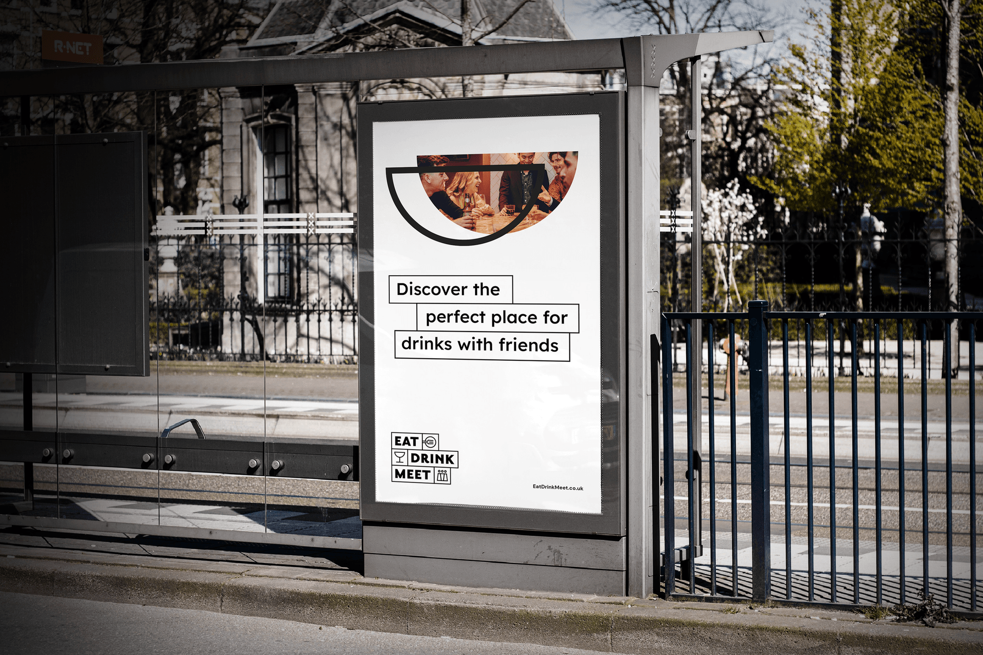
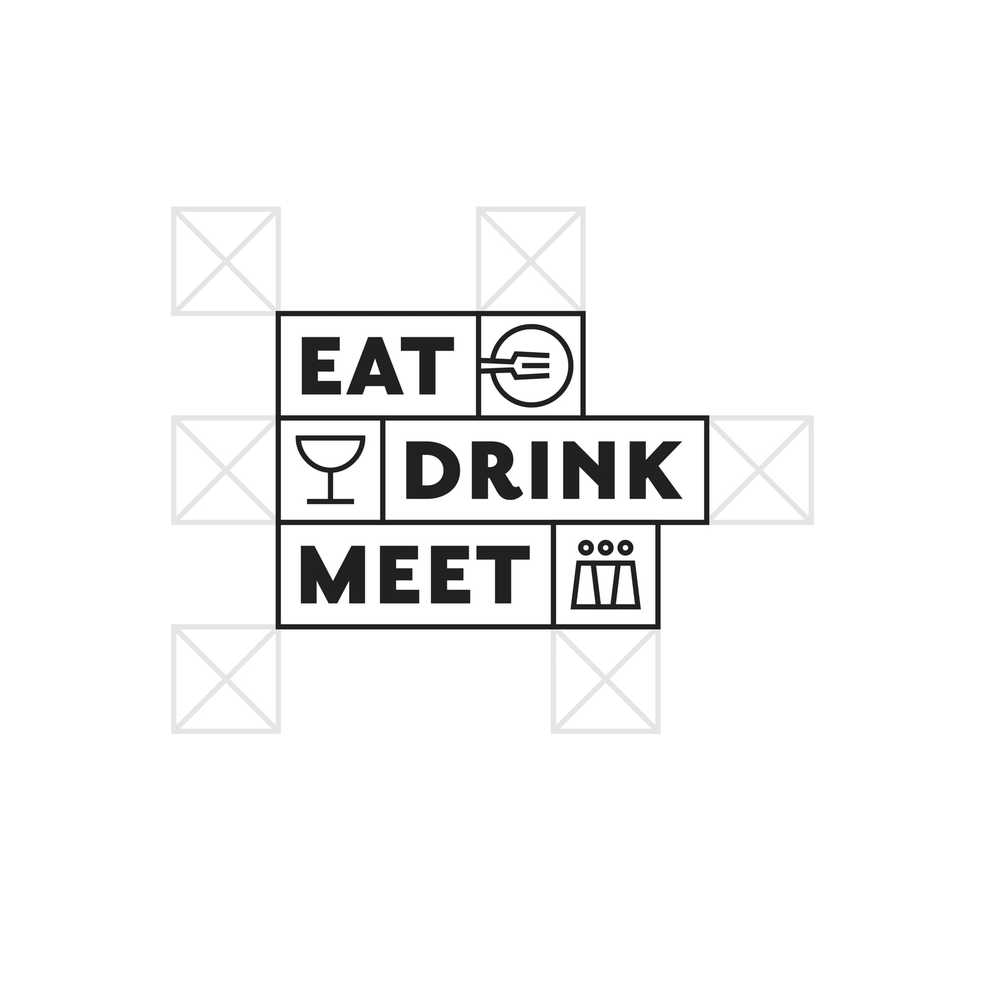
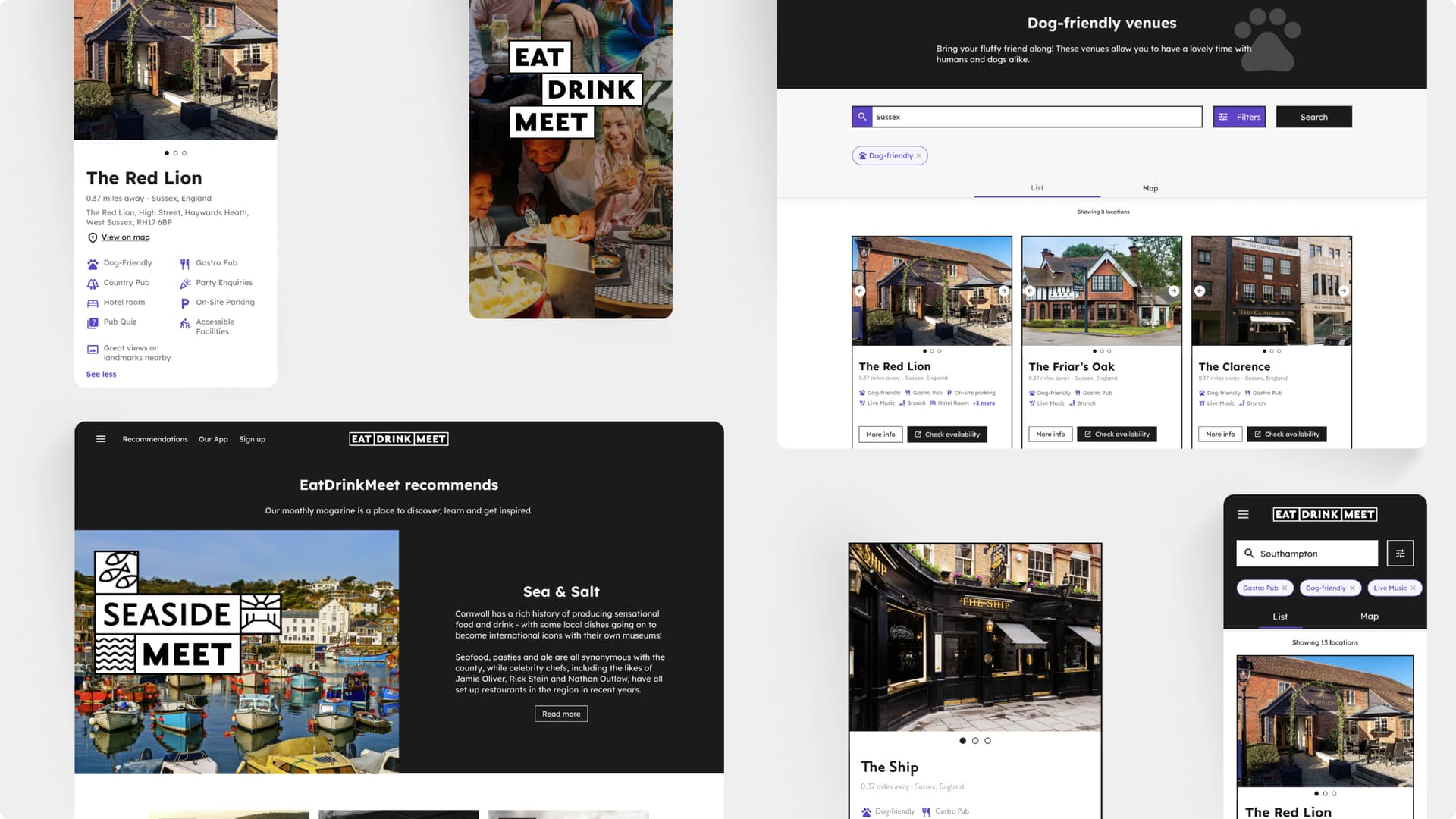
By leveraging the brand story, we created a design language that worked across the entire digital estate; it provided a holistic view of how the identity can work across both print and digital marketing, as well as the flexibility to be refined for digital applications. It also ensured that the language was consistent across the entire experience.
Digital first identity
Brand and product in harmony
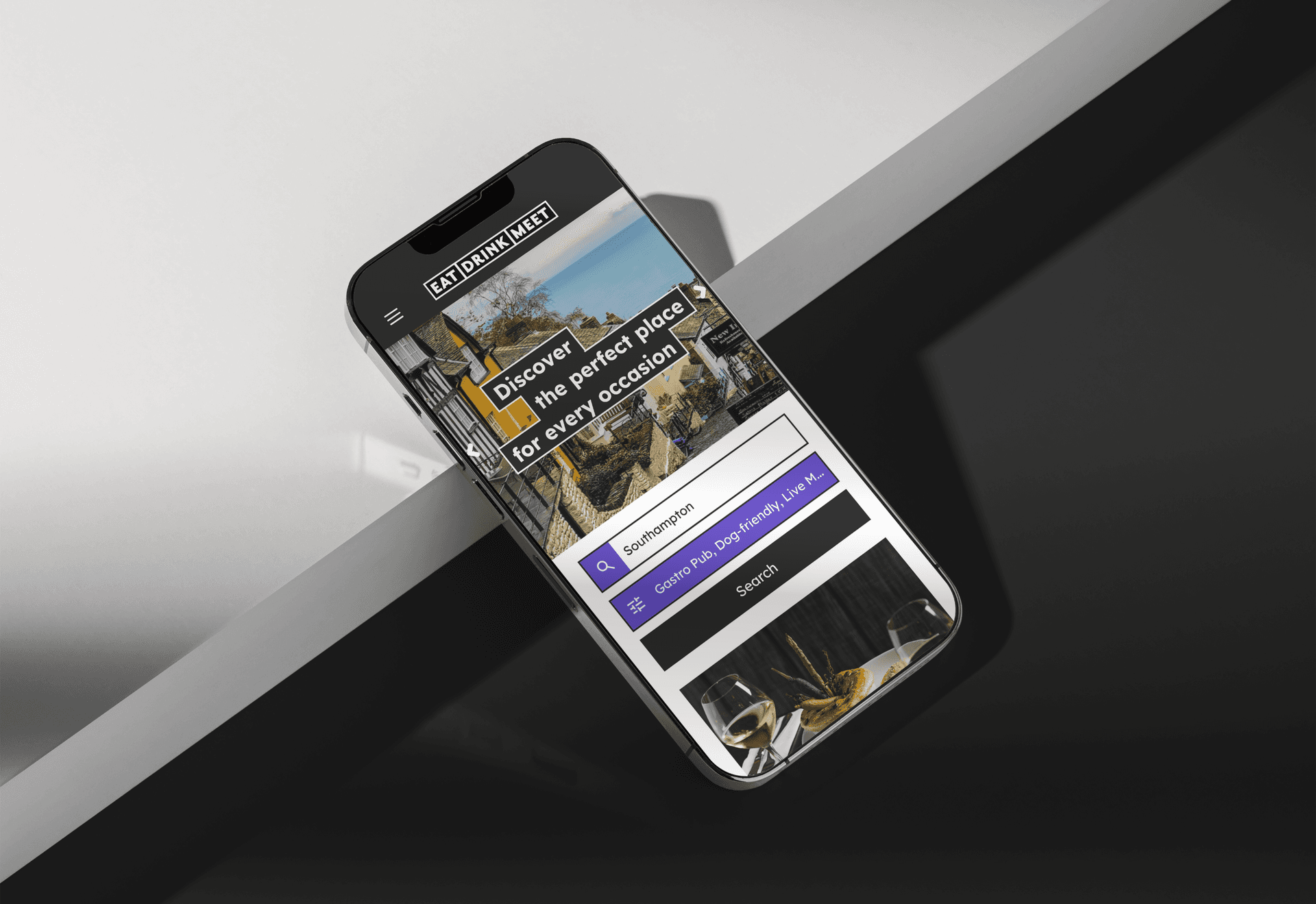
Together with our product design teams, we worked to cross-pollinate insight and research. This helped to evolve thinking about the digital domain that would house the proposition. By working in sync, our product teams could make sure they were adding the right styling to components, plus make sure the copy matched the right voice and tone. They could also highlight any opportunities to explore, in terms of functionality and customer needs.
Colour psychology
Defining the brand palette
Thinking differently about colour
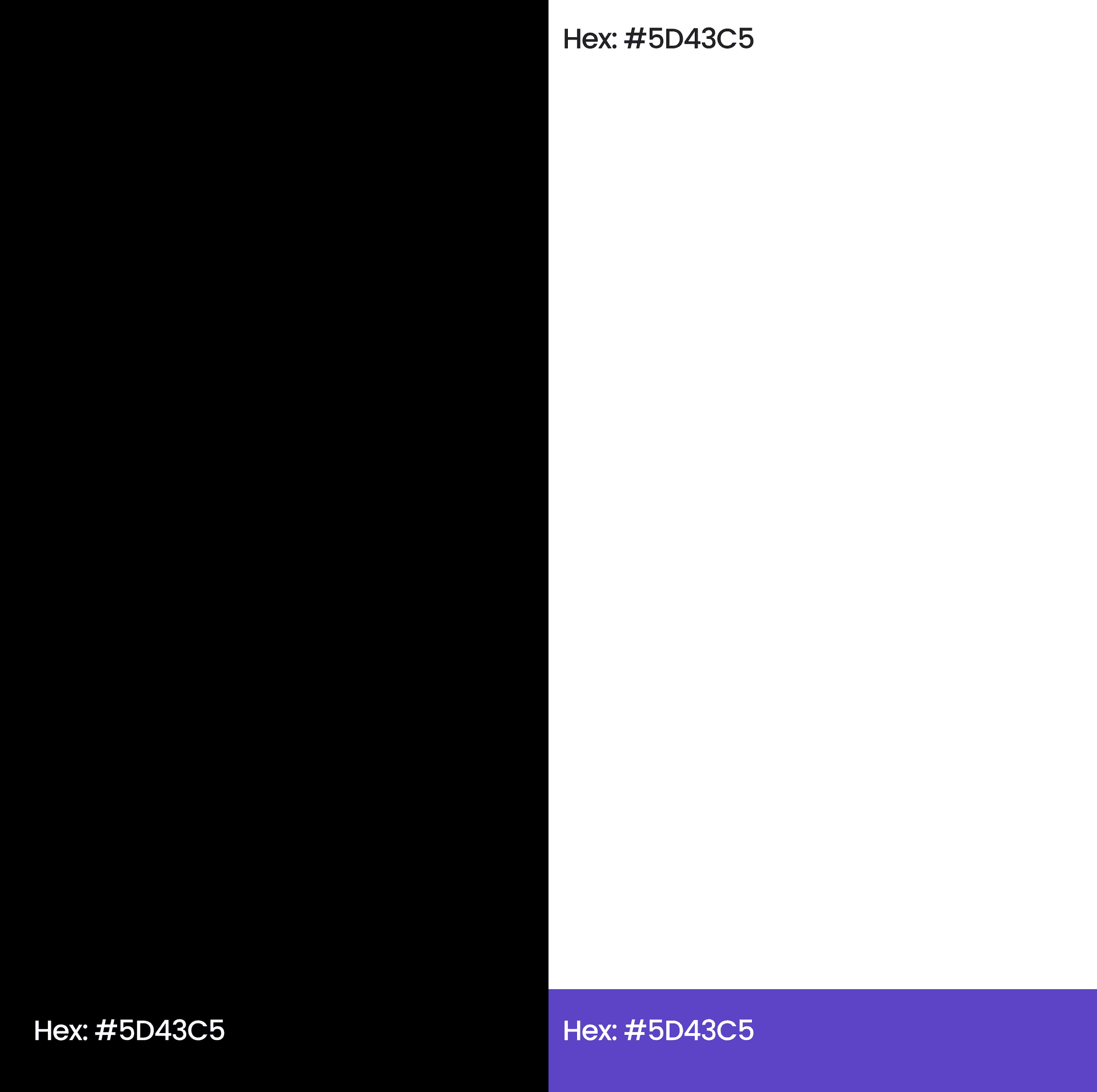
To avoid competition, allow the sub-brands to shine and hold multiple brand colours within it, Eat Drink Meet needed an agnostic palette. For this reason, we chose a predominately monochromatic palette of black and white. The food market is saturated with reds and greens as a primary palette, so we needed something to differentiate our design above-and-beyond the competing brands. We opted for blue as an interactive highlight; we chose it to represent calmness and creativity, a feeling we wanted to conjure across the discovery experience.
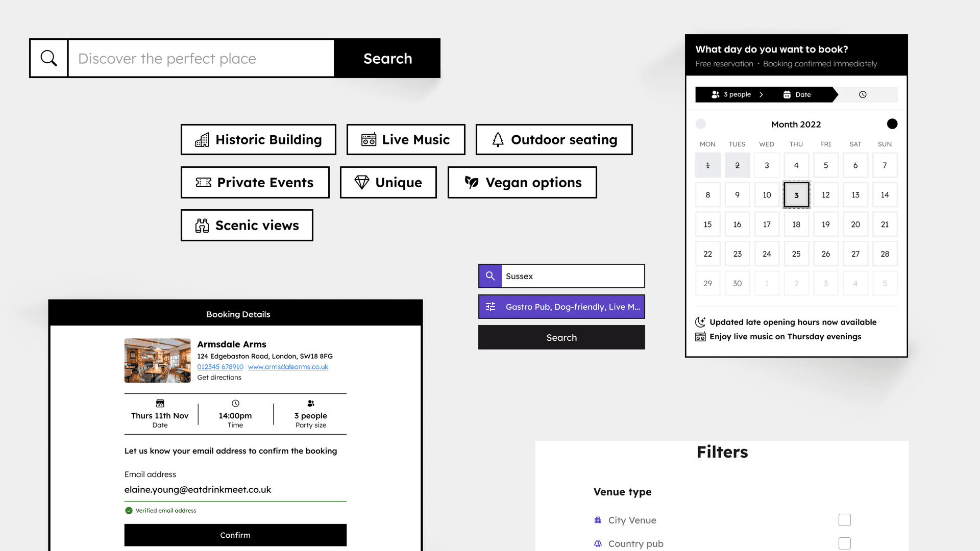
Brand and style guide
Providing clear guidance for brand consistency and scalability
We created guidelines for colours, logos, placements, typography, CTAs, copywriting guides across digital, and many more applications. We also produced a full brand playbook, which included a guide on the brand story, what it stands for, who it talks to and why it has the character and tone it does, as well as how and where this should be applied. After the narrative about the brand, the playbook moved into clear visual design guidelines, specifying how and where to apply the visual styles.
Contact us
Like what you see?
We'd love to partner with you. Contact Ed, on ed@foolproof.co.uk
