Only on Wednesdays is a community-focused initiative created to inspire collaboration, conversation, and positive change among female leaders. The platform was designed as more than just an events program; it was developed as a space where professionals could share experiences, discuss industry challenges, and build meaningful connections. Foolproof was responsible for creating the brand proposition, strategic direction, visual identity, and supporting design assets that would establish a memorable and scalable brand experience. The project focused on creating a distinctive identity rooted in communication, collaboration, and empowerment while ensuring the brand could evolve alongside future events and initiatives. The result was a versatile and digitally focused identity system capable of supporting both online engagement and real-world experiences.
Only on Wednesdays: more than just an events platform
Only on Wednesdays is a creative outlook that encourages female leaders to collaborate, discuss industry topics and provoke change. Foolproof engaged the opportunity by creating the brand proposition, strategy and design.
An identity born from the concept of time
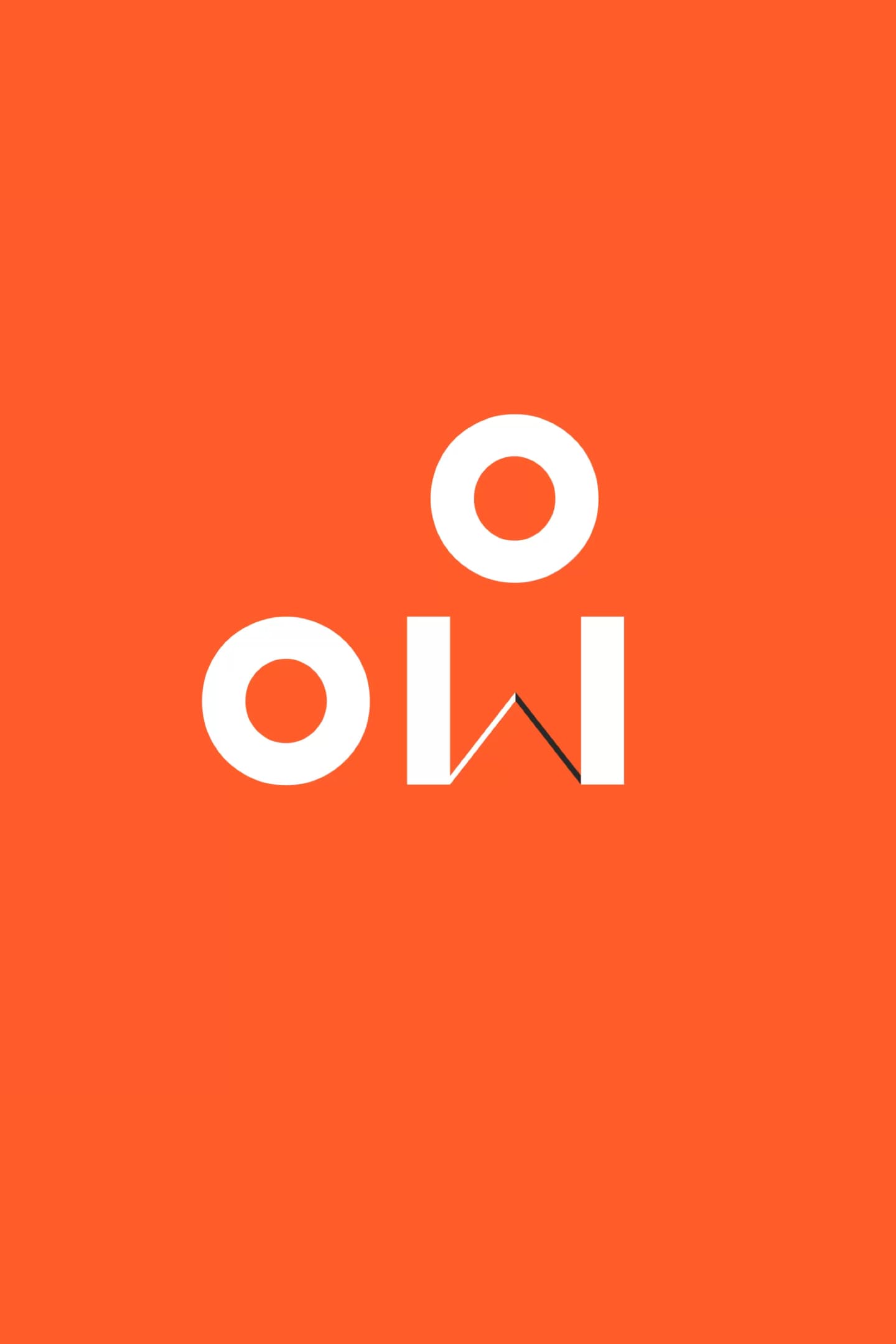
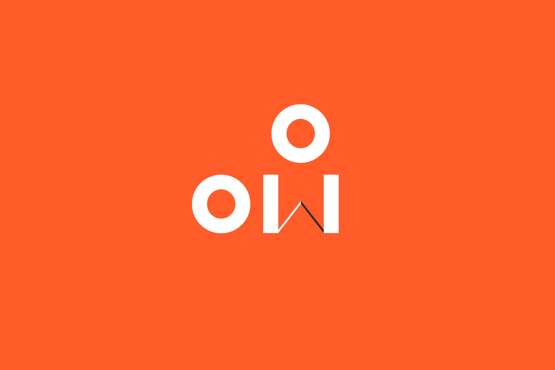
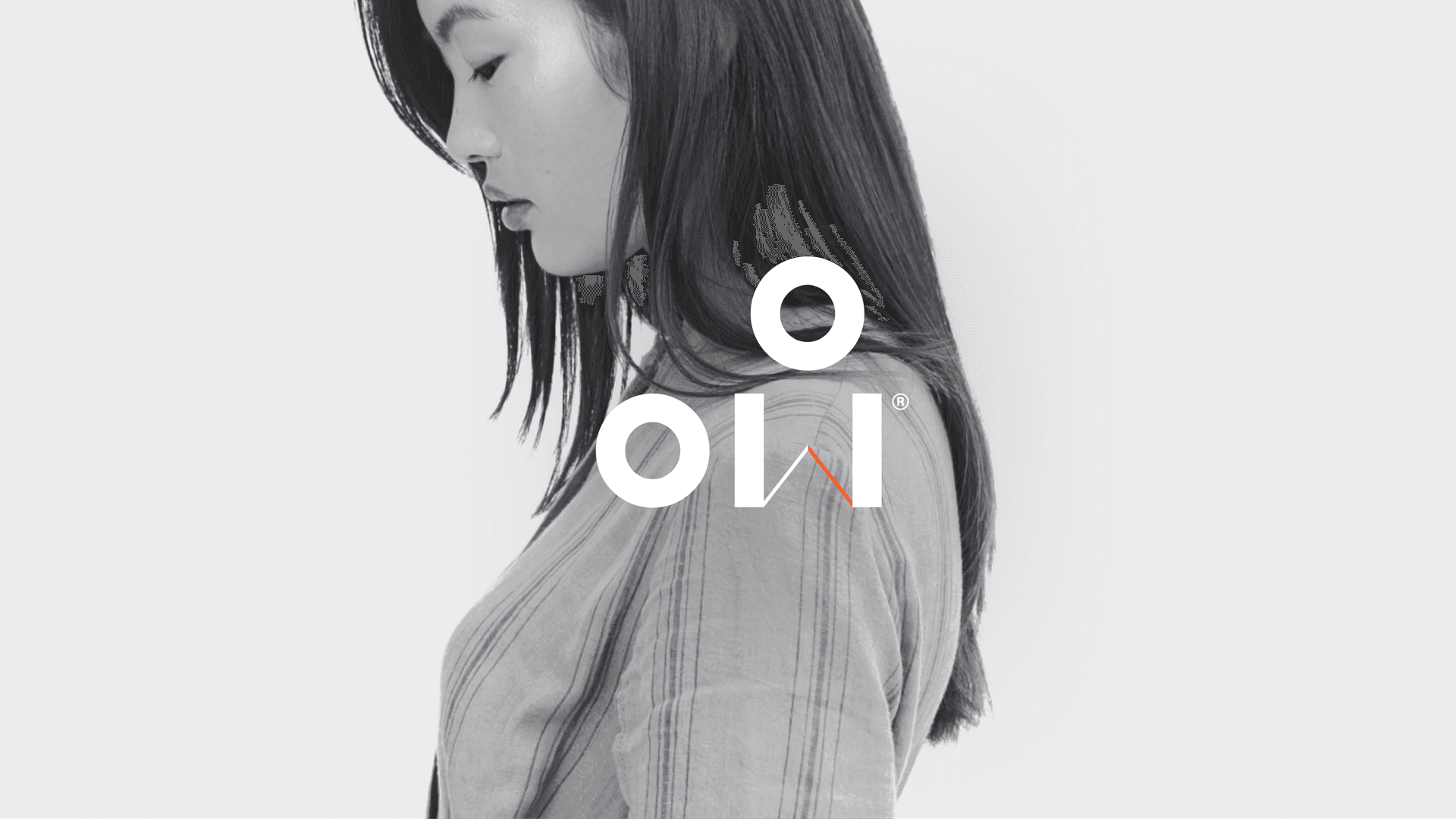
The logomark was born out of the concept of time and space, combining minimalist letterforms with motion to evoke the idea of shifting perspectives. The typographic approach allowed for a flexible mark that can be used creatively across the various media and applications of the brand.
A space for change
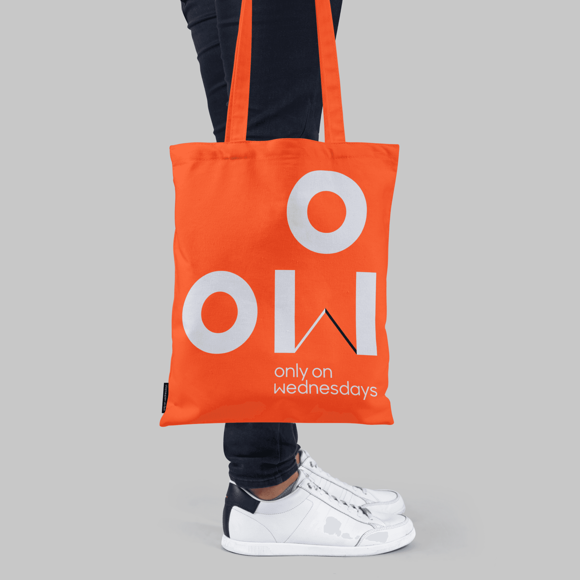
Each letter in the logomark is symbolic and loaded with motion. The W’s diagonals spin from its apex like clock hands, locking a specific time into place. Each o, representative of female personalities, congregate and move positions around it, just as leaders would shift their perspectives during an event.
The spirit of the written word
The design language is formed from the spirit of communication. Typography — the written word — is the main focus of the identity which takes the form of individual themes, timeslots and personalities. Set in a clean, contemporary sans serif, Sharp Sans Display no.1, its circular and symmetrical form provides a system for words and letters that flow harmoniously.

A flexible and creative toolkit
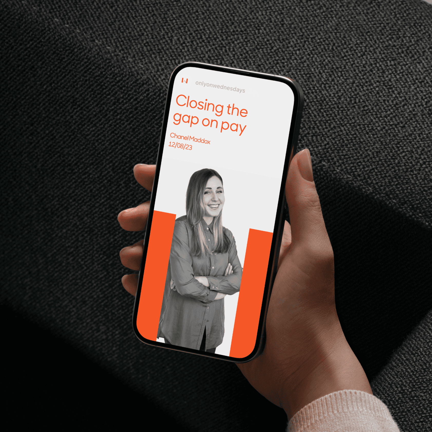
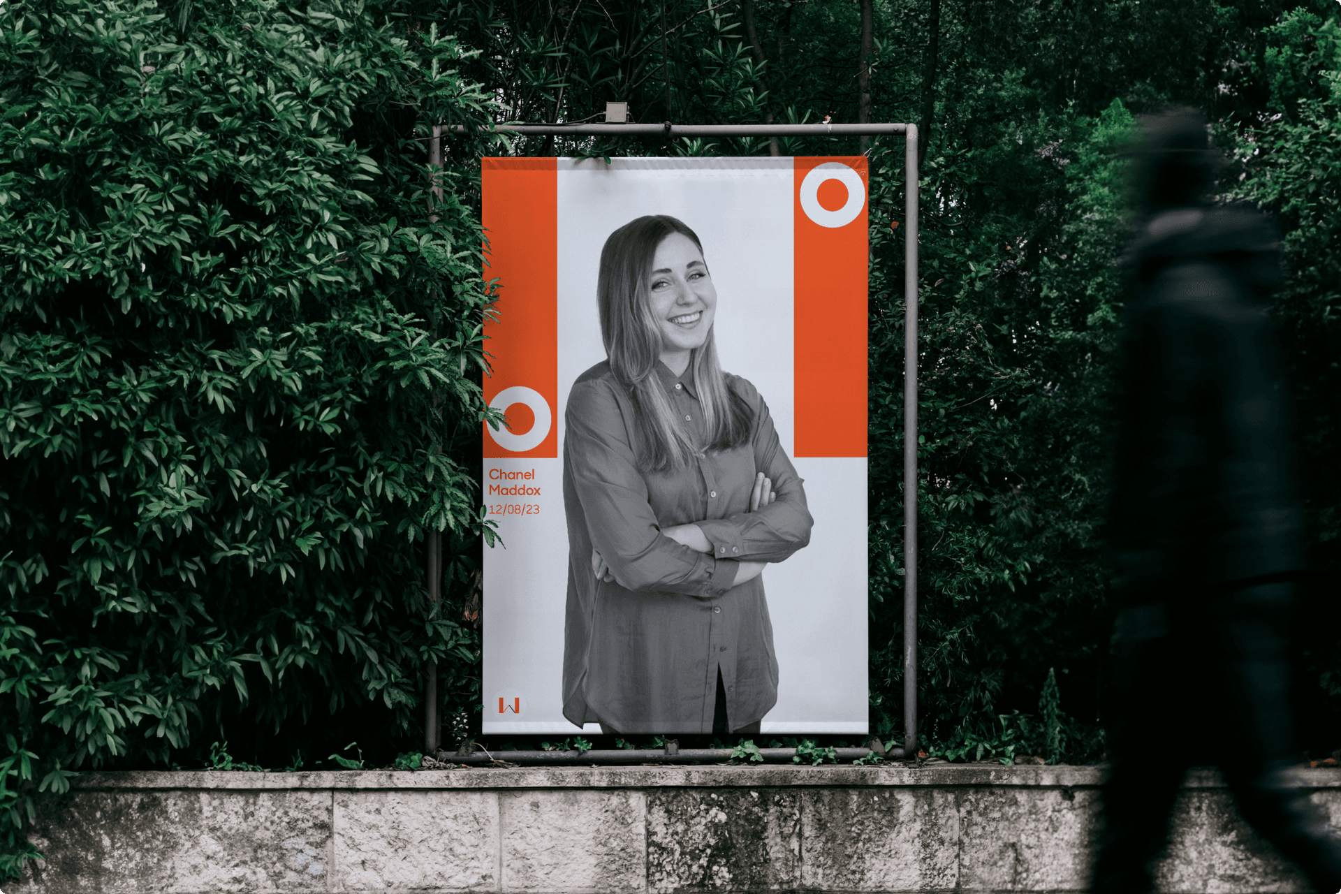
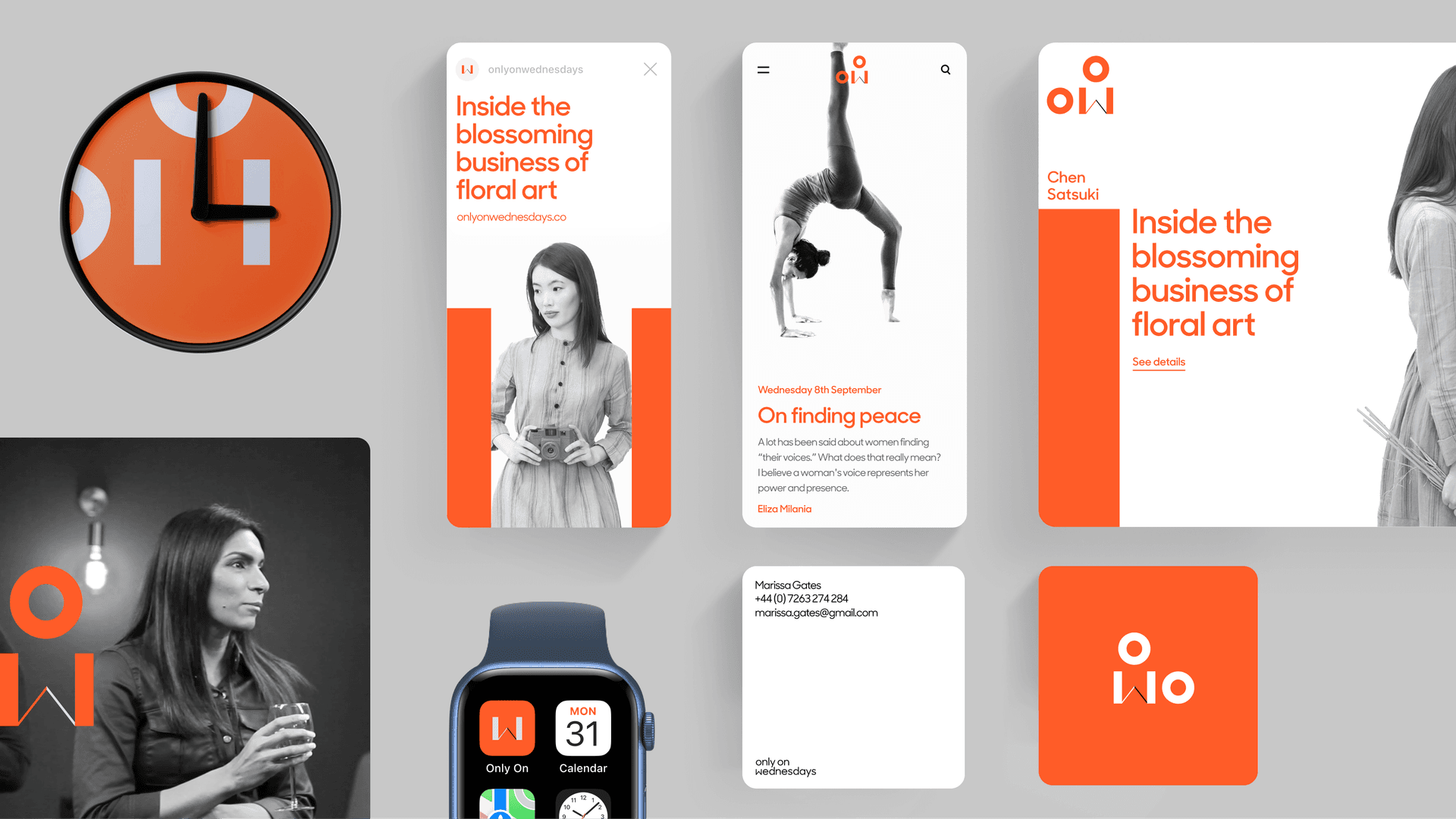
A flexible combination of design assets were created to allow for tailored combinations across digital and physical. The design language weaves beautiful black and white imagery with a rich palette and a balanced type system in striking layered compositions.
A suite of apparel
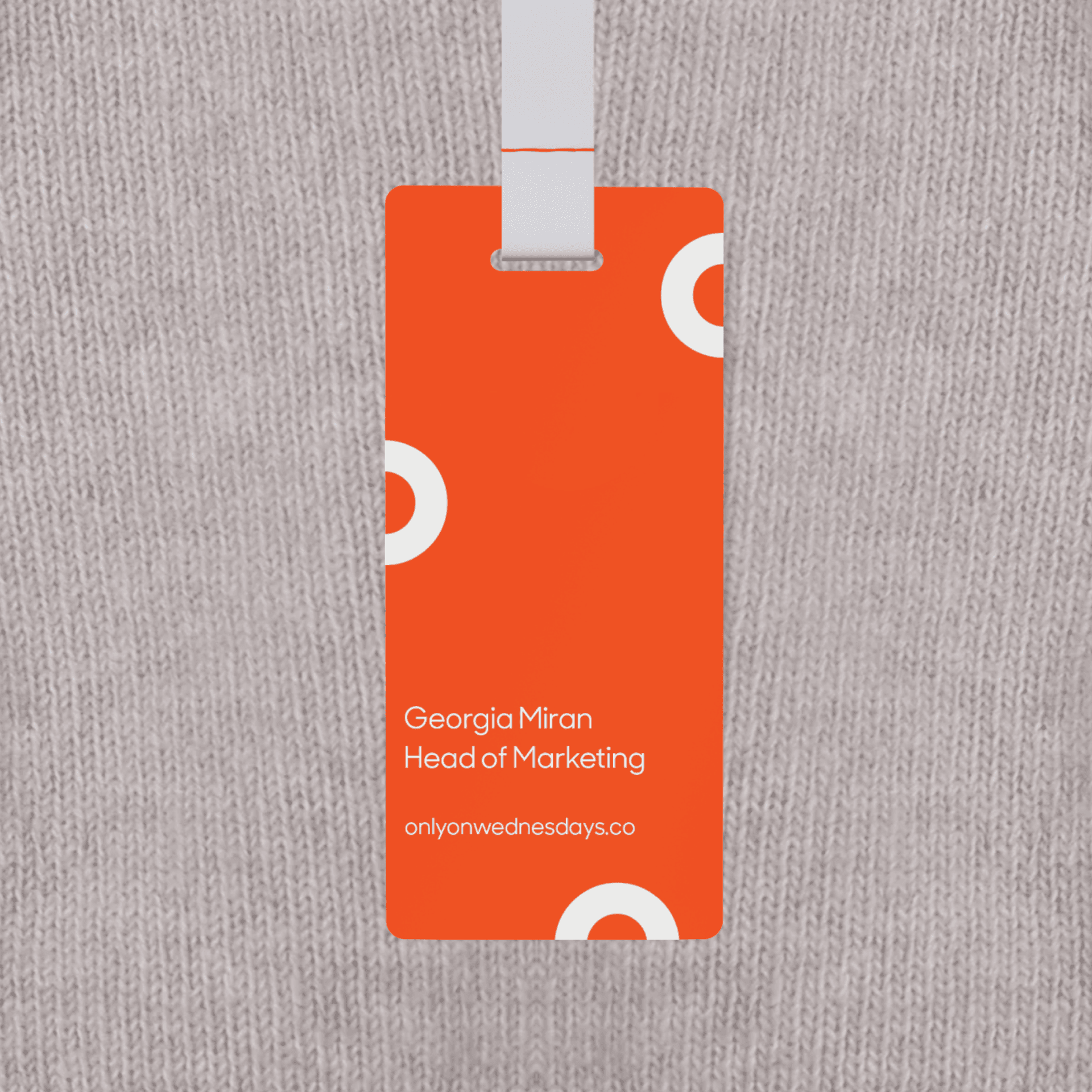
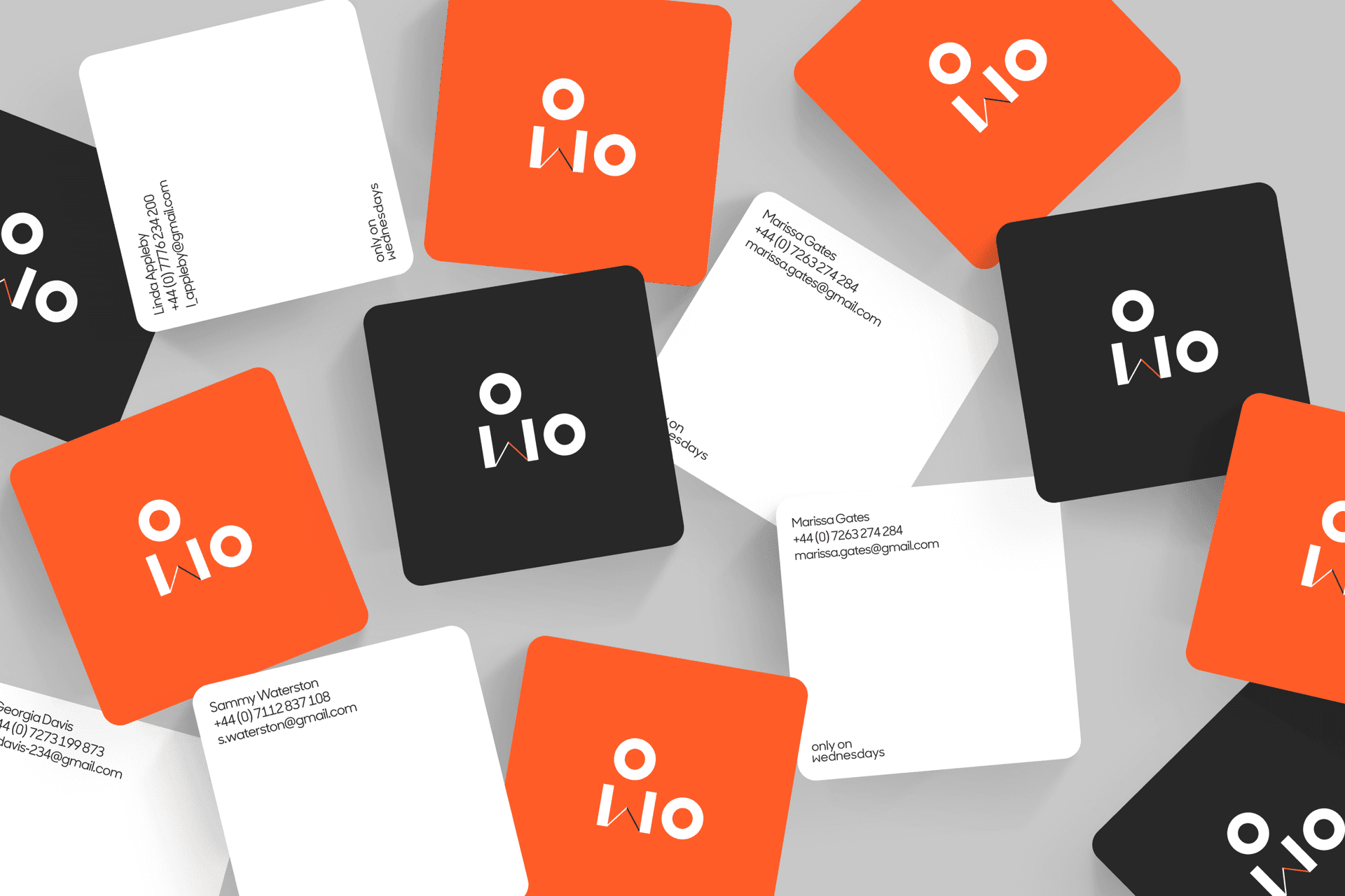
The identity was used flexibly across a whole host of apparel and accessories. They enrich events and provide memorable takeaways for the female leaders who attend.
Life beyond the screen
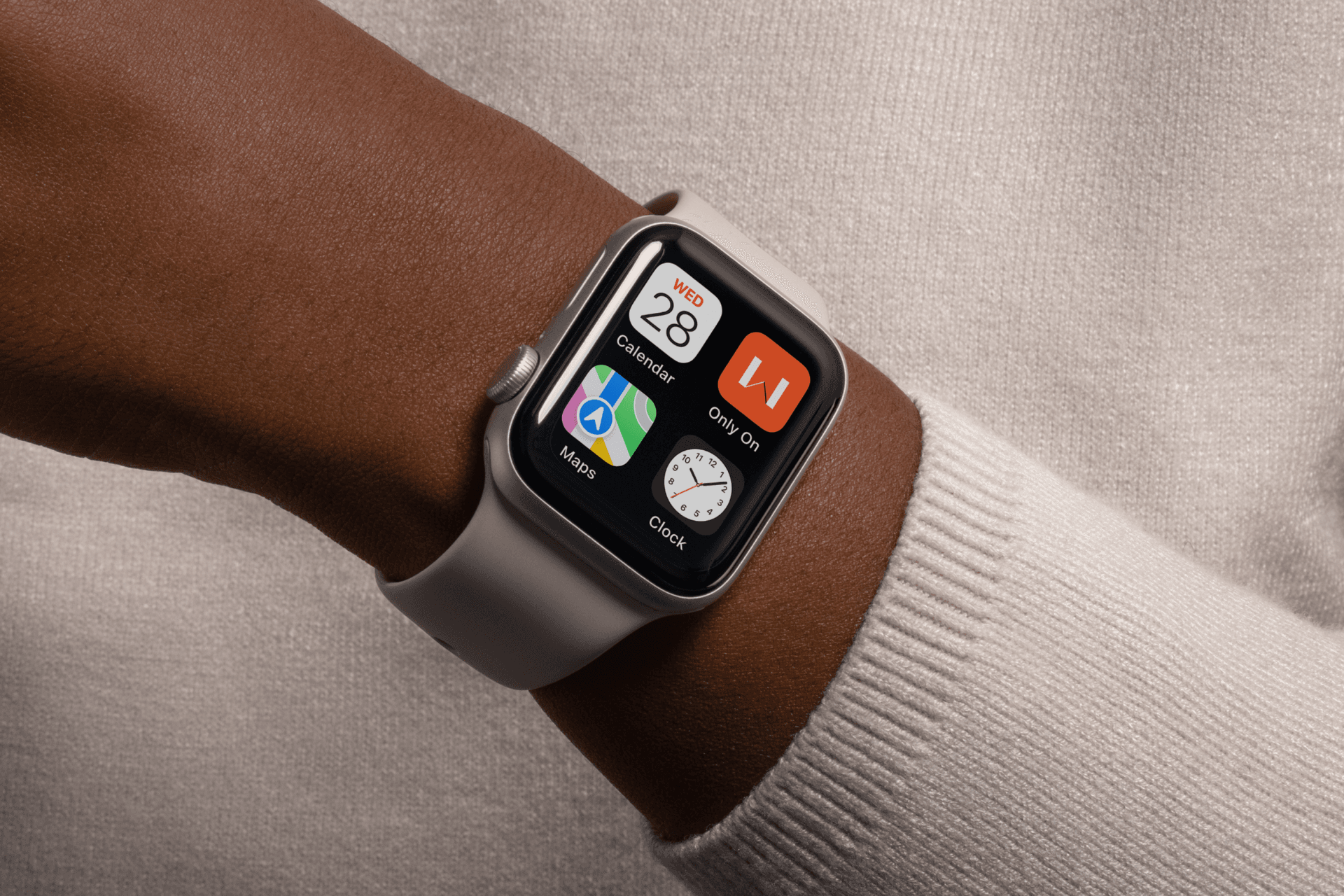
The visual identity closes the gap between the screen and the real world, providing a doorway to physical pop-up events — uniting places, personalities and topics into spaces where big ideas take shape and bright futures can shine. Our goal was to provide a window to London and the wider community.
Modular and infinitely editable
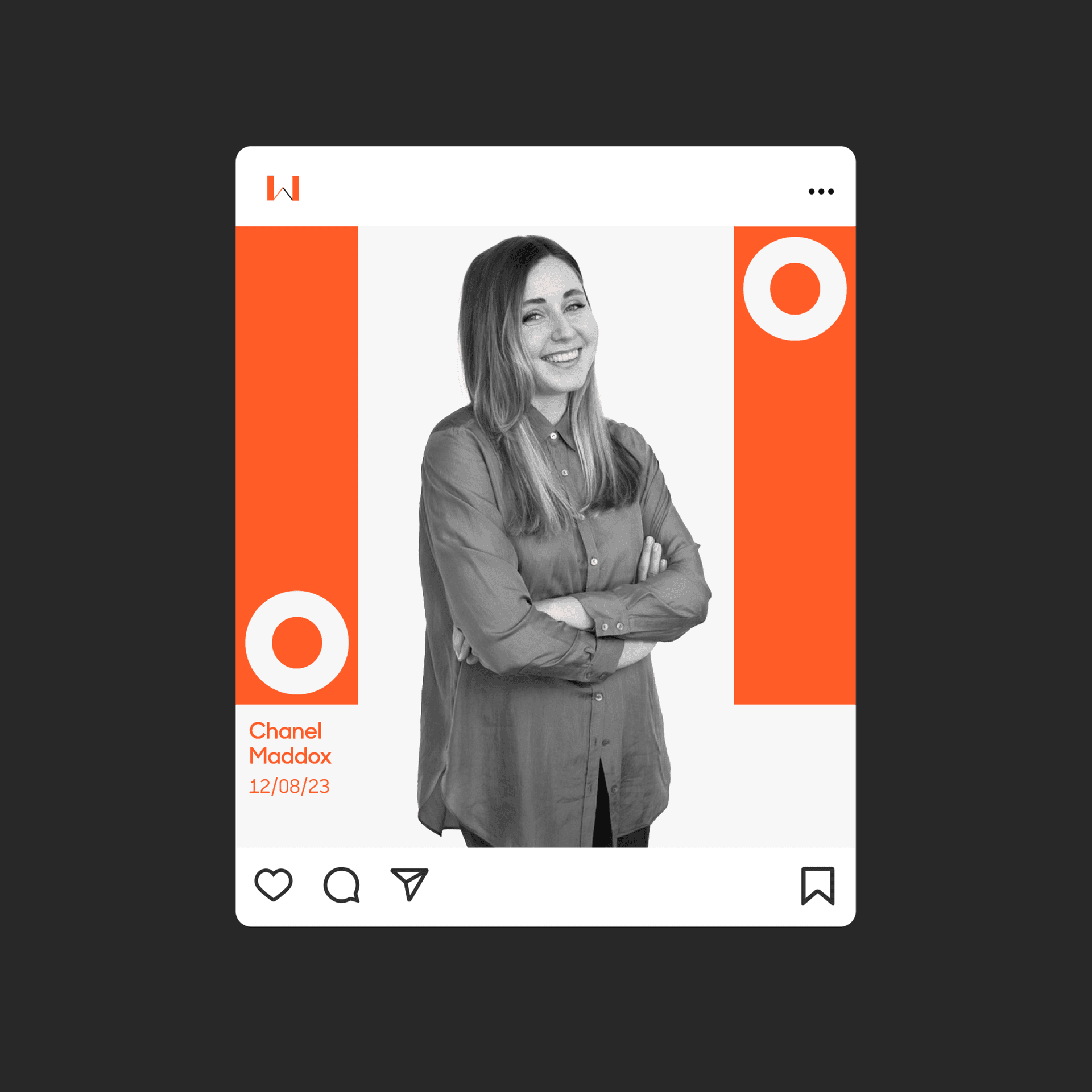
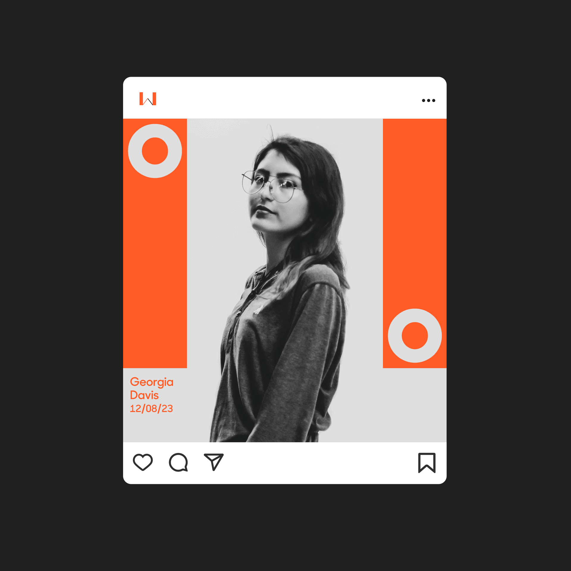
Only on Wednesdays is modular. Letterforms are playfully abstracted - a stretched out ‘W’ creates a negative space between the diagonals where photography and words can be shown. Using the ‘O’ as a container for profile imagery provides a structured, yet playful framework for rich content to sit within.
Digitally future-proofed
We built a design library to house the Only on Wednesdays brand. The library empowers future creatives with the resources they need to create an effective, digital-first experience that enables them to govern the ever-changing nature of hosted events.
Only on Wednesdays - FAQs
Strong branding helps professional communities create recognition, trust, and emotional connection among members. A clear brand identity communicates purpose, values, and vision while making it easier for people to understand what the community stands for. For leadership networks and industry groups, branding creates consistency across events, content, digital platforms, and communications. It also helps attract new members and encourages ongoing participation. Through carefully crafted visual design and messaging, organizations can foster engagement and create a sense of belonging that strengthens the long-term success of the community.
A flexible visual identity allows organizations to adapt their branding to different channels, campaigns, audiences, and content needs without losing consistency. As communities grow and evolve, they often require new formats, event materials, social content, and digital experiences. A modular design approach makes it easier to introduce these changes while maintaining a recognizable brand presence. The identity created for Only on Wednesdays was designed to be dynamic and reusable, providing a foundation that could support future events, communications, and creative initiatives.
Successful community brands combine a strong purpose with memorable visual design and engaging experiences. They create opportunities for people to connect, share ideas, and participate in meaningful conversations. Effective event branding goes beyond logos and graphics by establishing clear messaging, consistent experiences, and emotional resonance. For communities focused on leadership and networking, these elements help create stronger engagement and encourage long-term participation among members.
Modern audiences interact with organizations primarily through digital channels such as websites, social media, virtual events, and online communities. A digital-first branding strategy ensures the brand remains effective and recognizable across these touchpoints. It improves consistency, accessibility, and scalability while supporting changing audience expectations. By developing a flexible digital design library, Only on Wednesdays was able to establish a future-ready brand capable of supporting evolving content and engagement needs.
Design plays a critical role in making communities feel welcoming, accessible, and engaging. Inclusive design considers diverse audiences, communication styles, and interaction preferences. Through thoughtful branding, content, and user experience design, organizations can foster participation, encourage collaboration, and ensure members feel represented. This helps create stronger communities where ideas can be shared openly and relationships can grow naturally over time.
Related work
Contact us
Like what you see?
We'd love to partner with you. Contact Ed, on ed@foolproof.co.uk