Re-inventing the Time 2 Eat brand with Compass
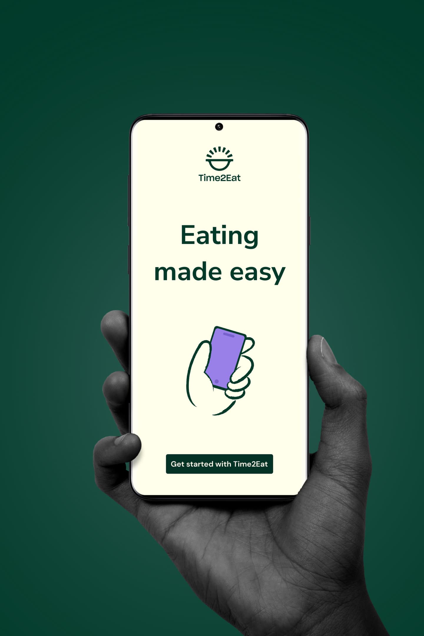
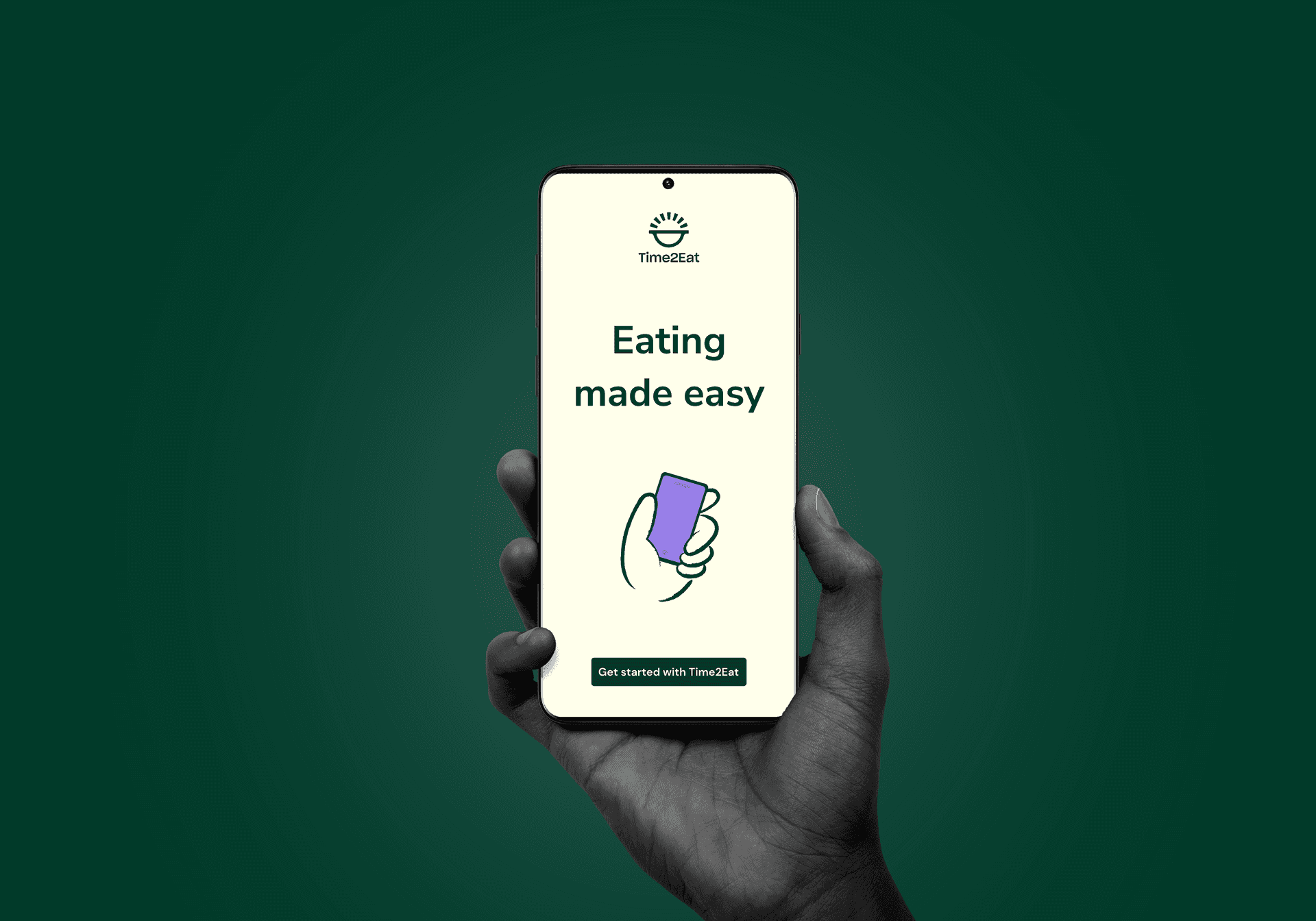
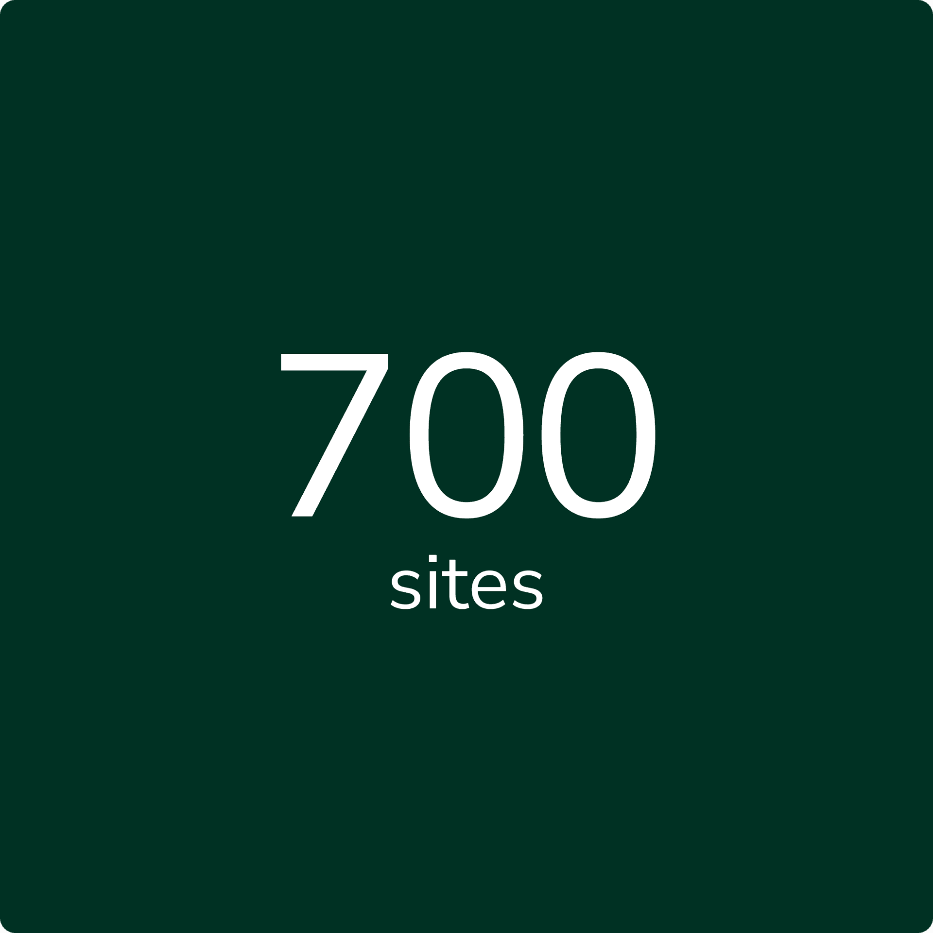
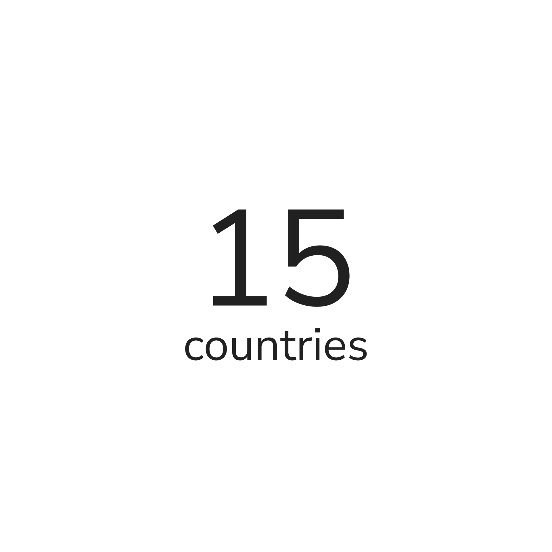
Compass is a global conglomerate operating food services in more than 40 countries with over with 600,000 employees. They run cafeterias, counters, self checkouts across offices, stadiums, factories, airports, universities and countless other locations.
They have a digital B2B2C suite built for the employees and customers of its corporate clients to use in their cafeterias and food halls. People can use this to browse menus, pay bills, order ahead and manage orders and even the kitchens themselves.
A new identity and proposition
Our client made a strategic shift to move from acquiring sites to focusing on usage. Compass identified that in food halls, cafeterias and self service venues, there was a lot of food waste. They decided to re-think the entire service flow in order to cut down this waste.
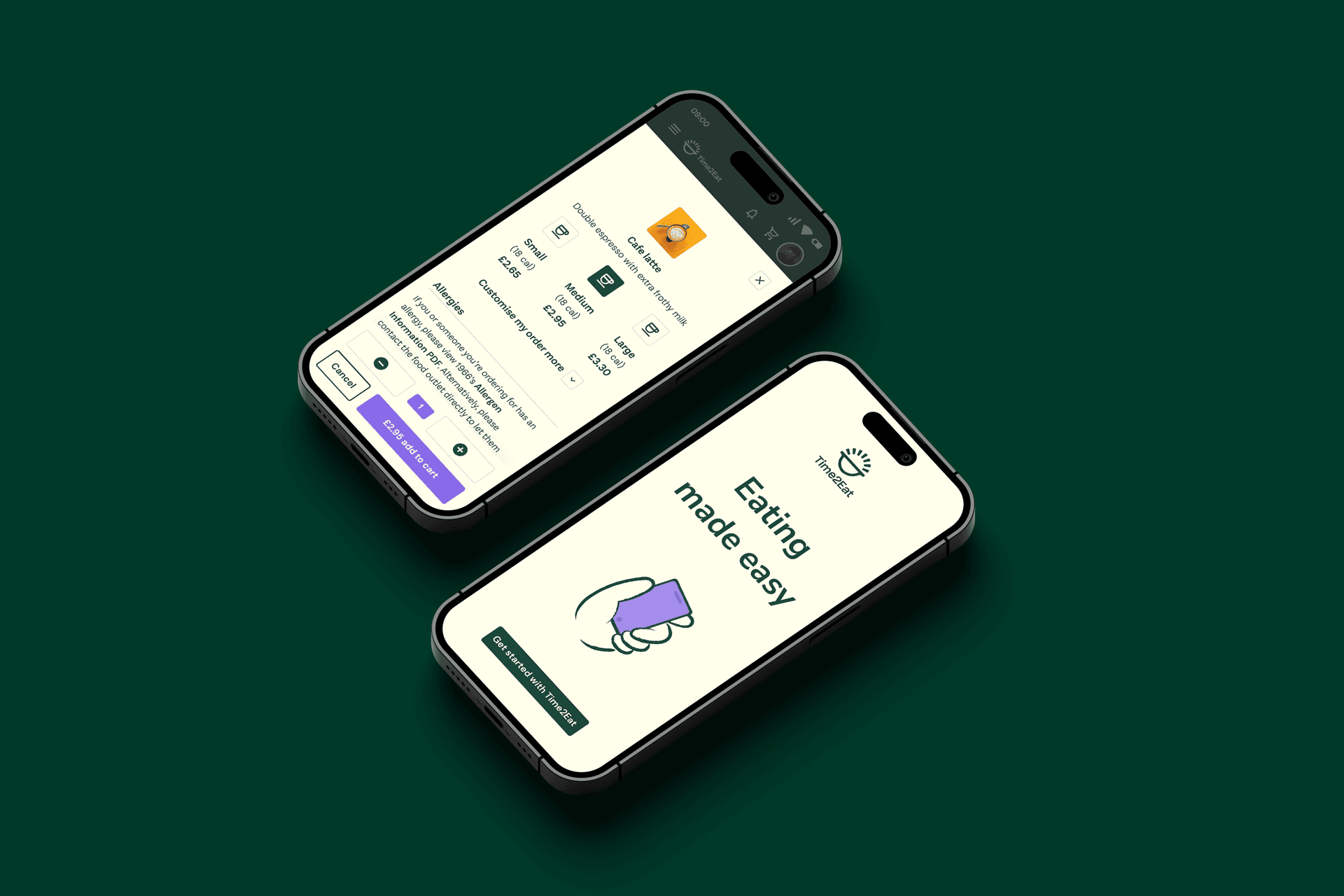
Part of this was the translation of a newly created brand identity into digital properties to communicate the new value proposition in order to gain traction. We were asked to re-invent the existing mobile customer facing interface along with the kiosk solution building upon the brand work that had been done. This work built on and evolved the brand for digital, and involved the creation of a design library.


Stress testing
Making things right for digital
A new brand identity often meets high level propositional needs can but miss a trick on making things work for digital, including for accessibility and usability. Through testing the flows, interactions and scenarios, we discovered gaps in the identity that meant we needed to re-think or build upon the existing elements to make it fit for purpose.
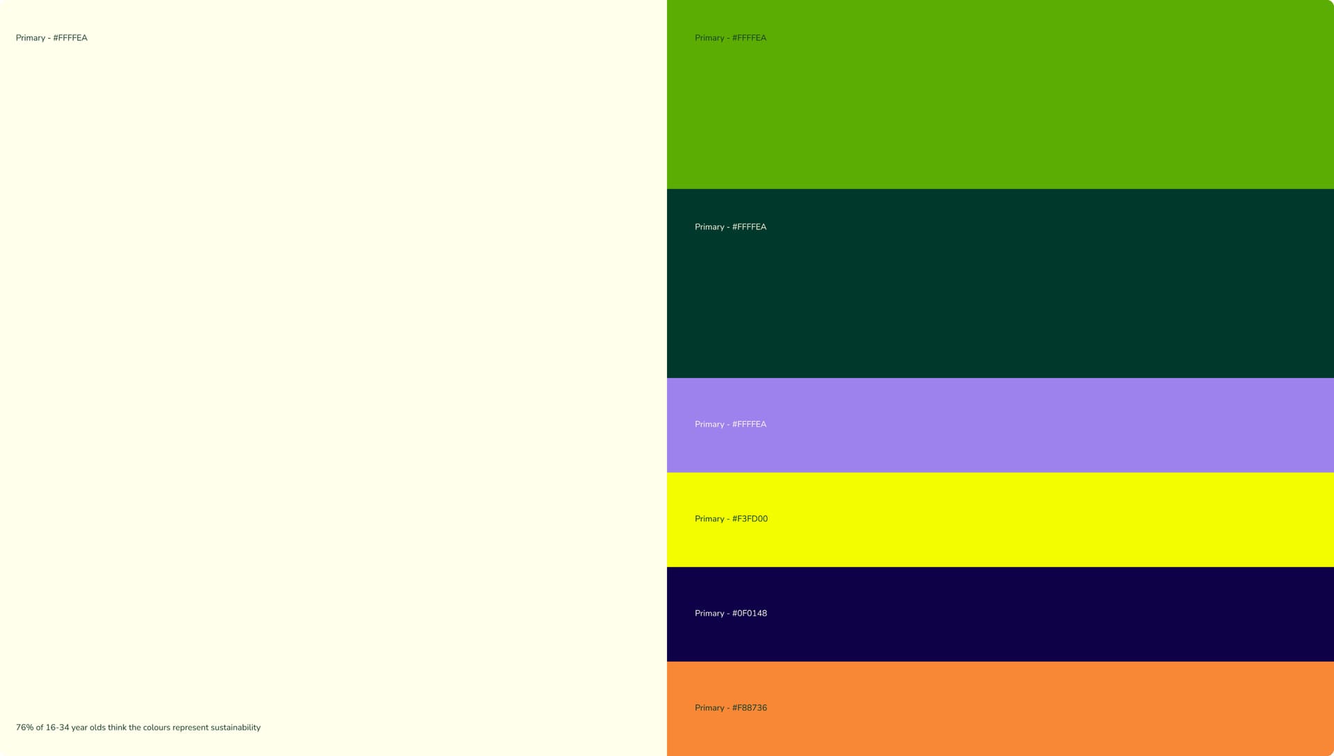
Brand language and identity system
An identity fit for interactivity
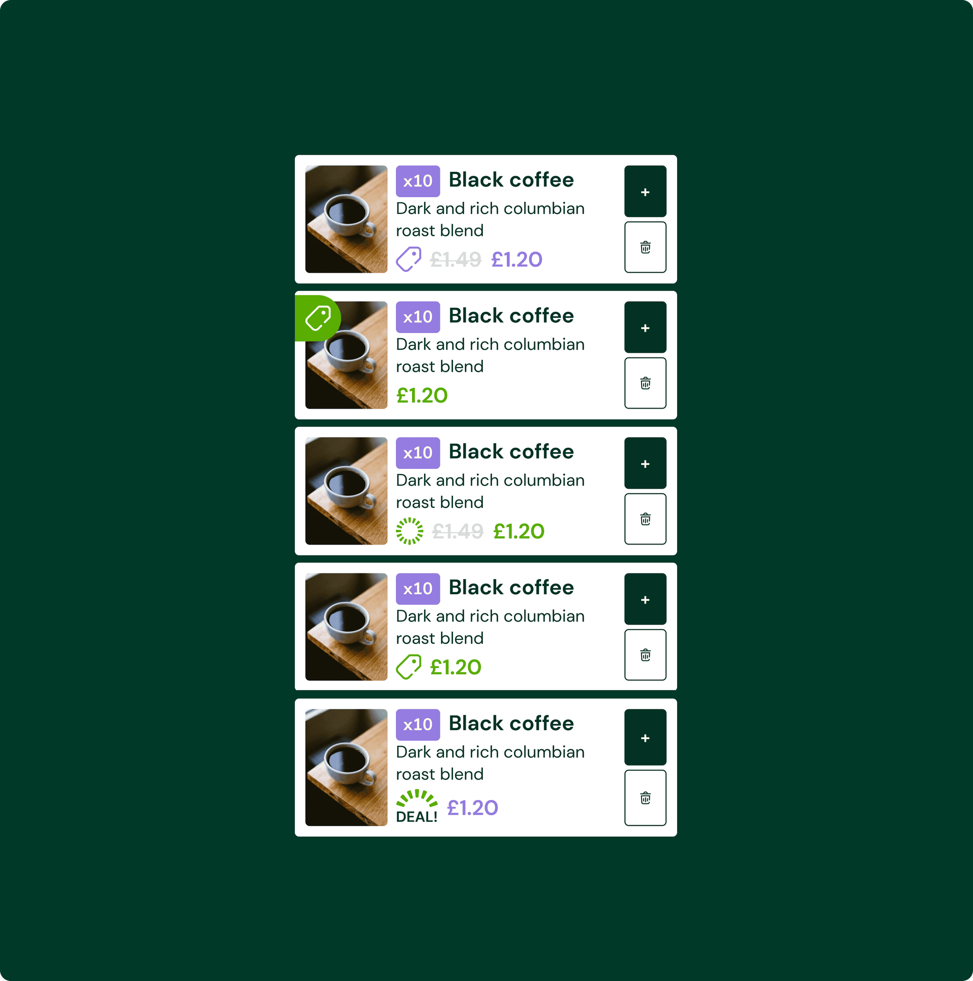
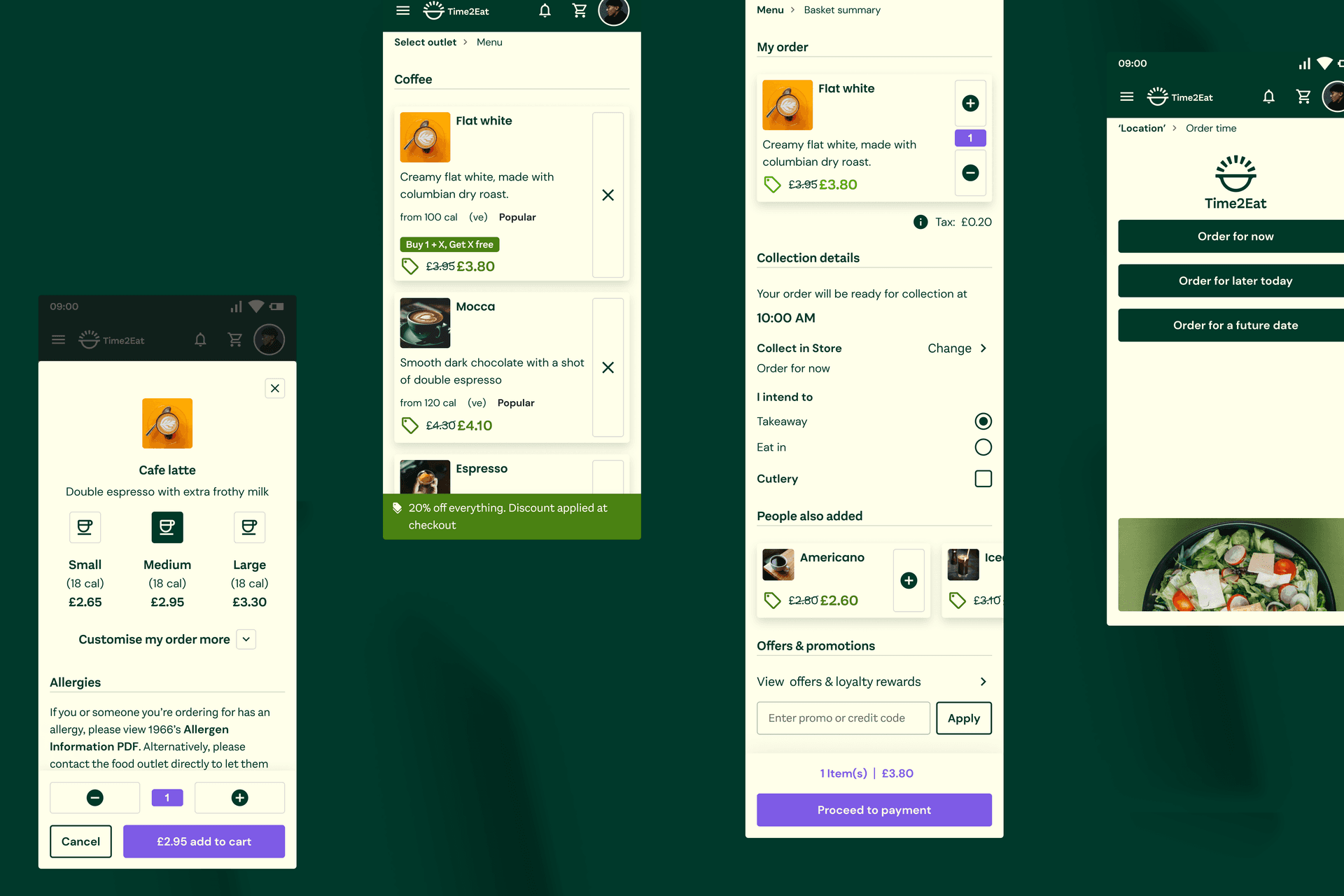
To make sure that a new brand works for a wide range of digital applications, we test it through real world scenarios. This included basket and checkout patterns, deals and offers and ordering flows. We checked that it catered for all the necessary interactions and states required for engagement and clarity, so that a customer can use the product with ease. This involved building out heuristics and patterns based on the brand to make the brand application easy to use by anyone, anytime.
The product proposition
Evolving the product offering within the value proposition
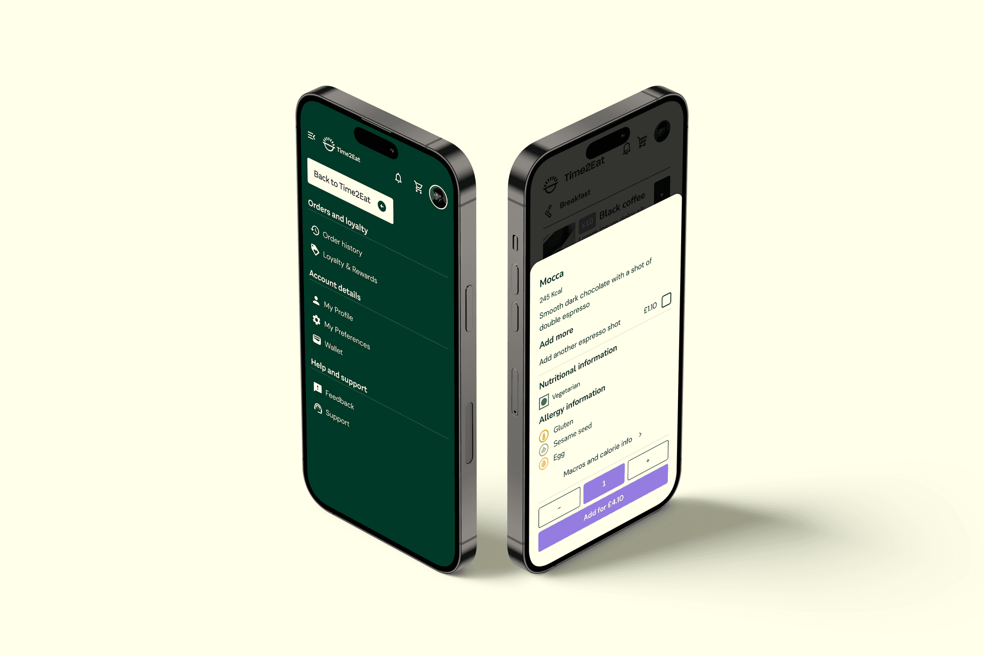
During the process, we uncovered ideas that, paired with customer insight, prompted us to develop improvements to the platform’s functionality. We created a backlog and roadmap for future enhancements that tied the brand proposition together with promotional activation ideas.
Design system
Creating a design system
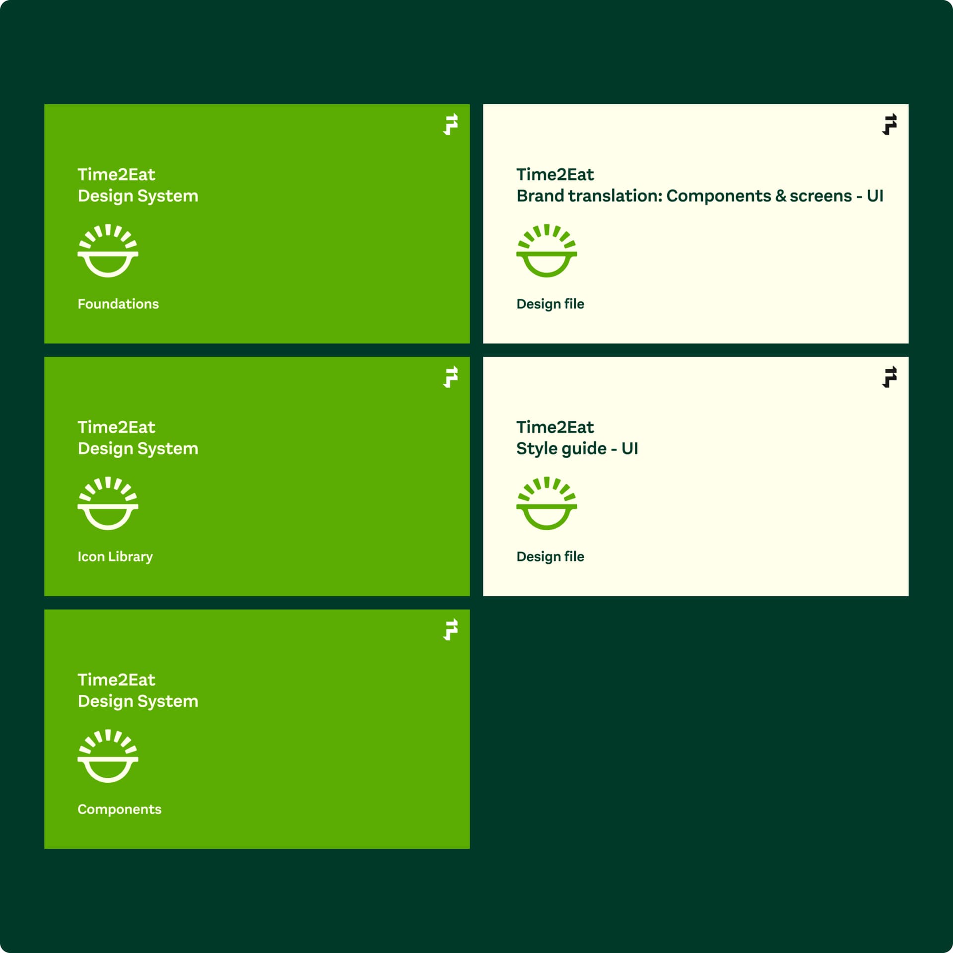
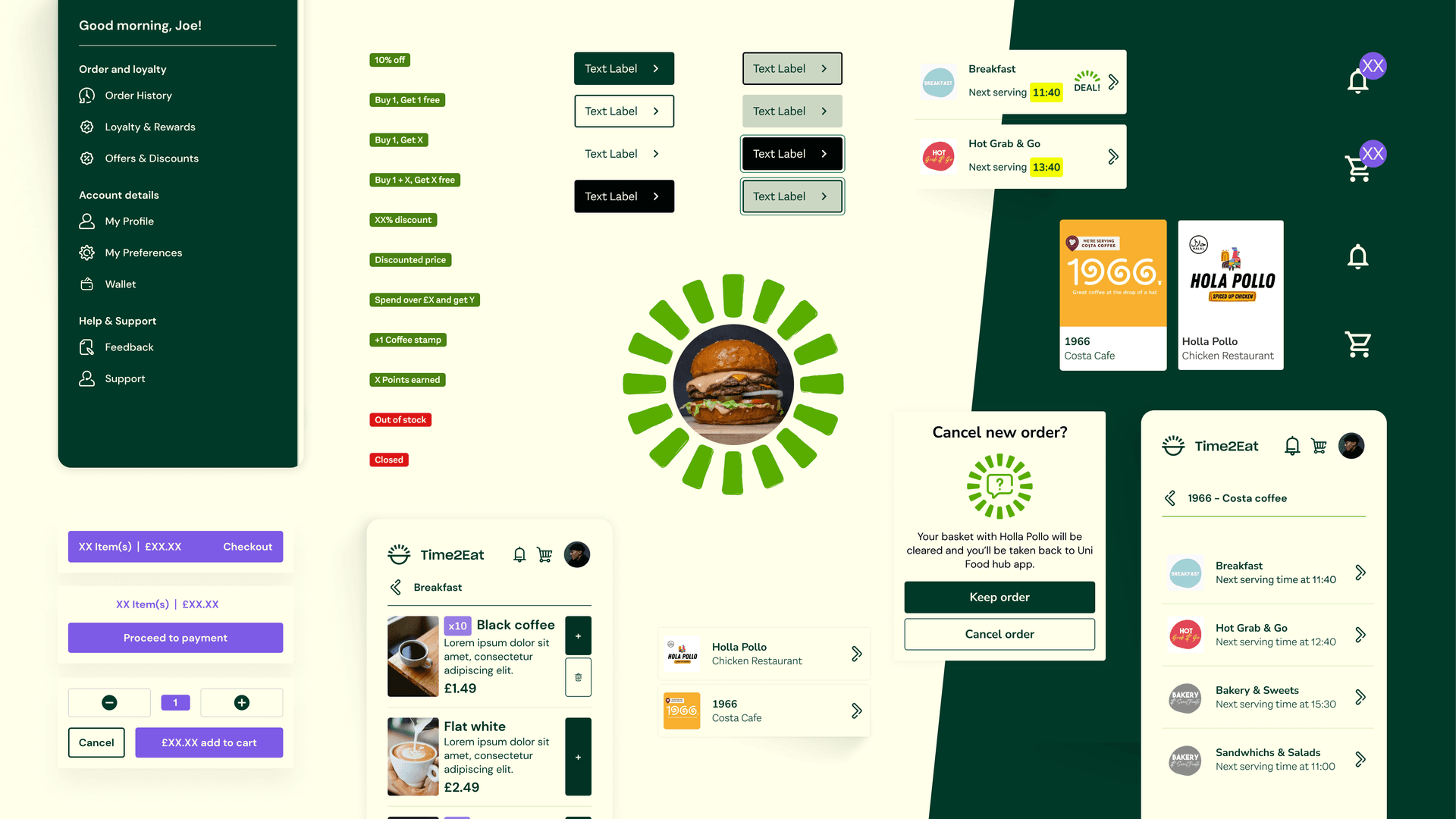
We created a scalable design system and provided education and guidance across design and development teams for how to use it. This aided efficiency and the pace of deployment while up-skilling the team in design thinking methodology.
Contact us
Like what you see?
We'd love to partner with you. Contact Ed, on ed@foolproof.co.uk
