Multi-channel design delivers sales uplift for Suzuki
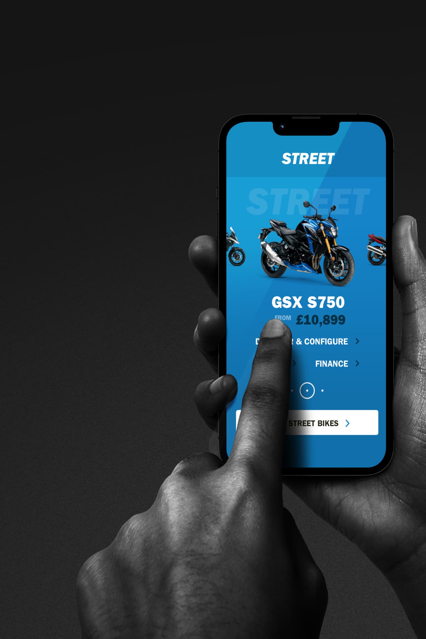
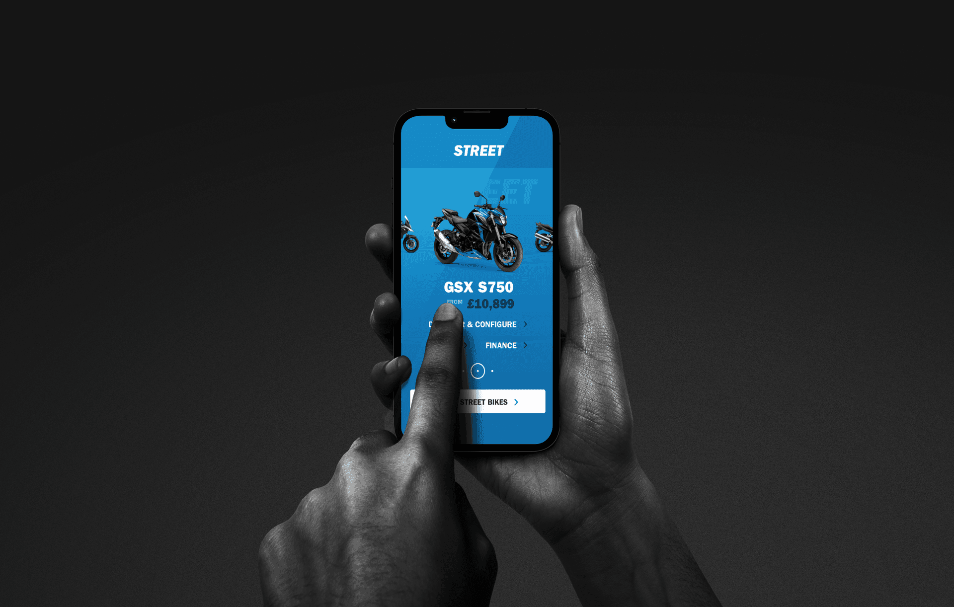
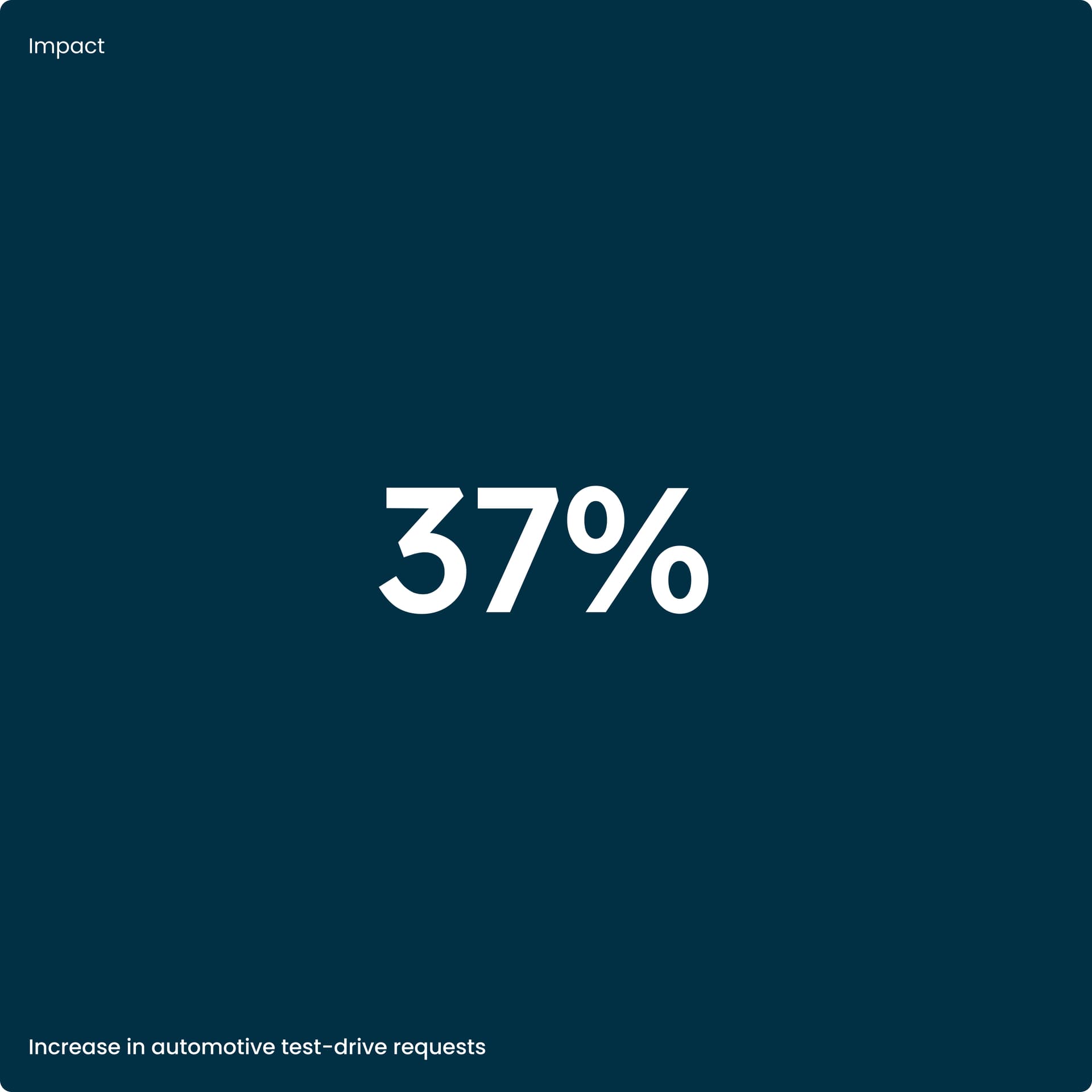
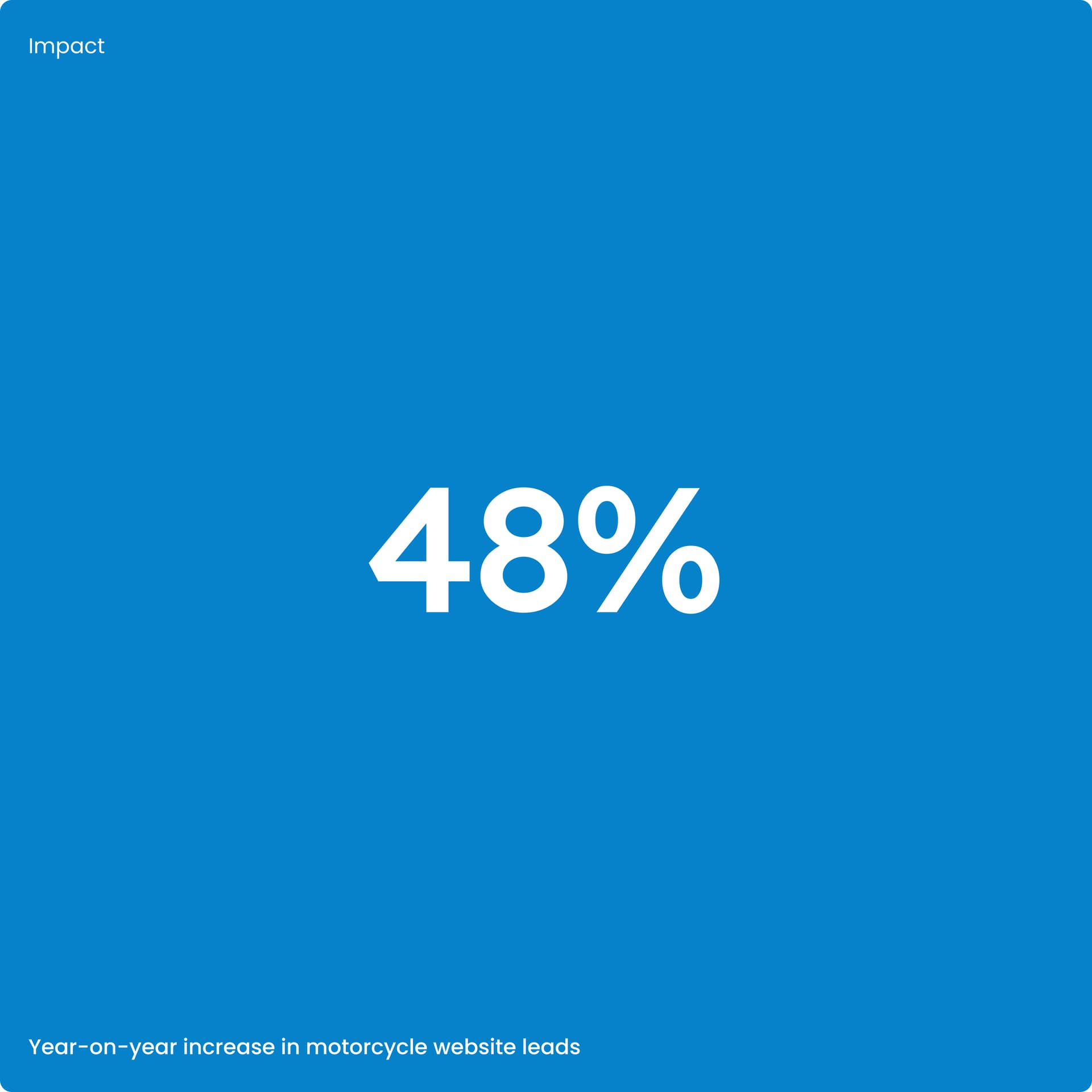
We designed and built the end-to-end customer experience across Suzuki’s product lines. The result was an impressive increase in sales metrics across each of the four sites we designed.
The challenge
Understanding different user needs and objectives in purchasing journeys across Cars, Motorcycles, All Terrain and Marine.
Designing and developing for flexibility by creating a pattern library and components for efficiency, consistency and speed to market.
The approach
Immersion into the customer’s world in all four product environments, online and in physical retail contexts.
Creating a Proof of Concept (PoC) for all four product divisions to gain stakeholder alignment and buy-in.
Owning the digital delivery of the experience including defining the technical solution.
Establishing a strategic proposition
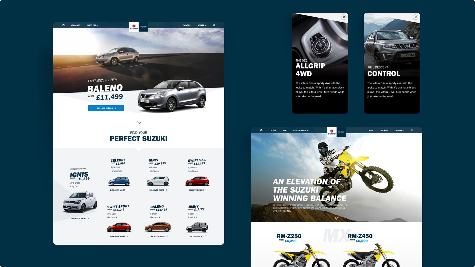
Suzuki’s digital offering had grown organically over many years, resulting in a collection of digital experiences which didn’t adequately meet customer buying and decision-making behaviours. Simply refreshing the visual design layer wasn’t going to solve the problems this raised. We worked with Suzuki to define their strategic proposition for digital sales journeys. This anchored all our design work. We focused on the need to connect customer experience across all digital touchpoints and make an elegant transition to real-world dealership experiences.
The research
We conducted research with Suzuki customers, dealers, and staff. Using a variety of research methods, we identified features that would help customers understand their choices and make informed, confident purchase decisions. Our research highlighted which elements were unique to different groups of Suzuki customers. For example, there was a distinction between bike buyers' need for rich visuals and 360º viewing, and car buyers' requirements for specific discoverable information such as the comparative size of vehicles.
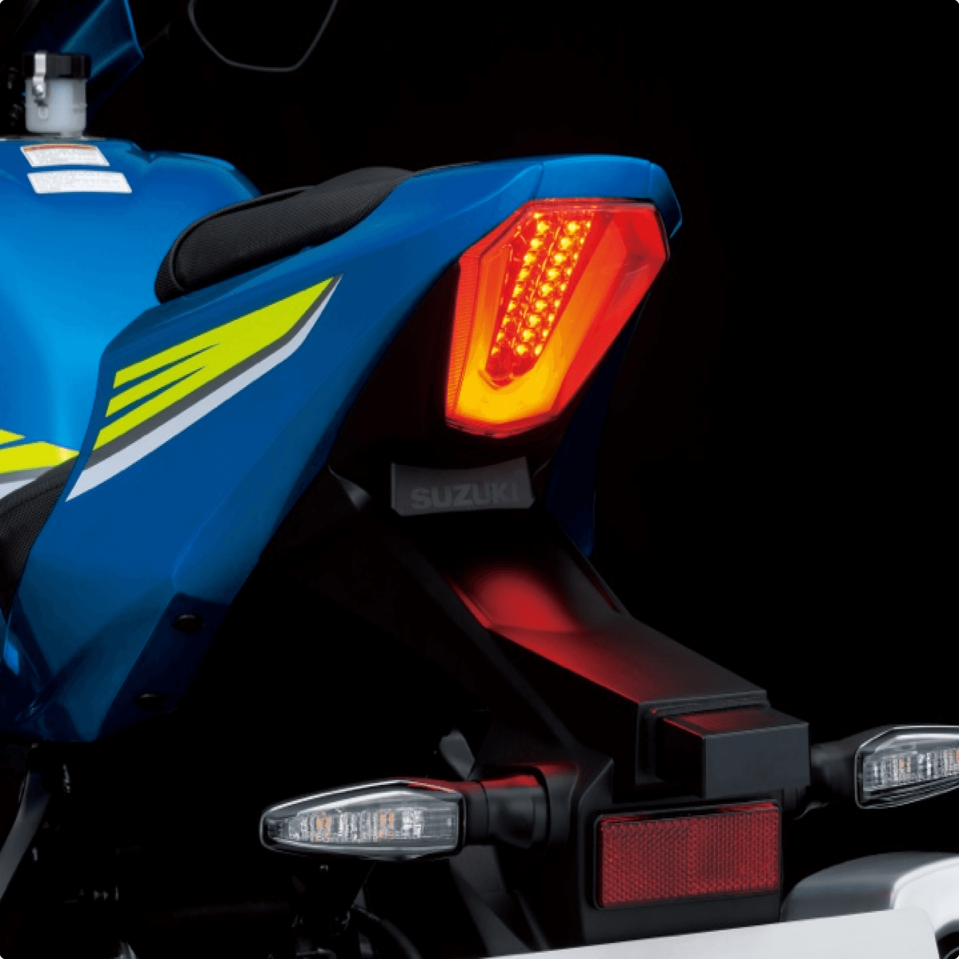
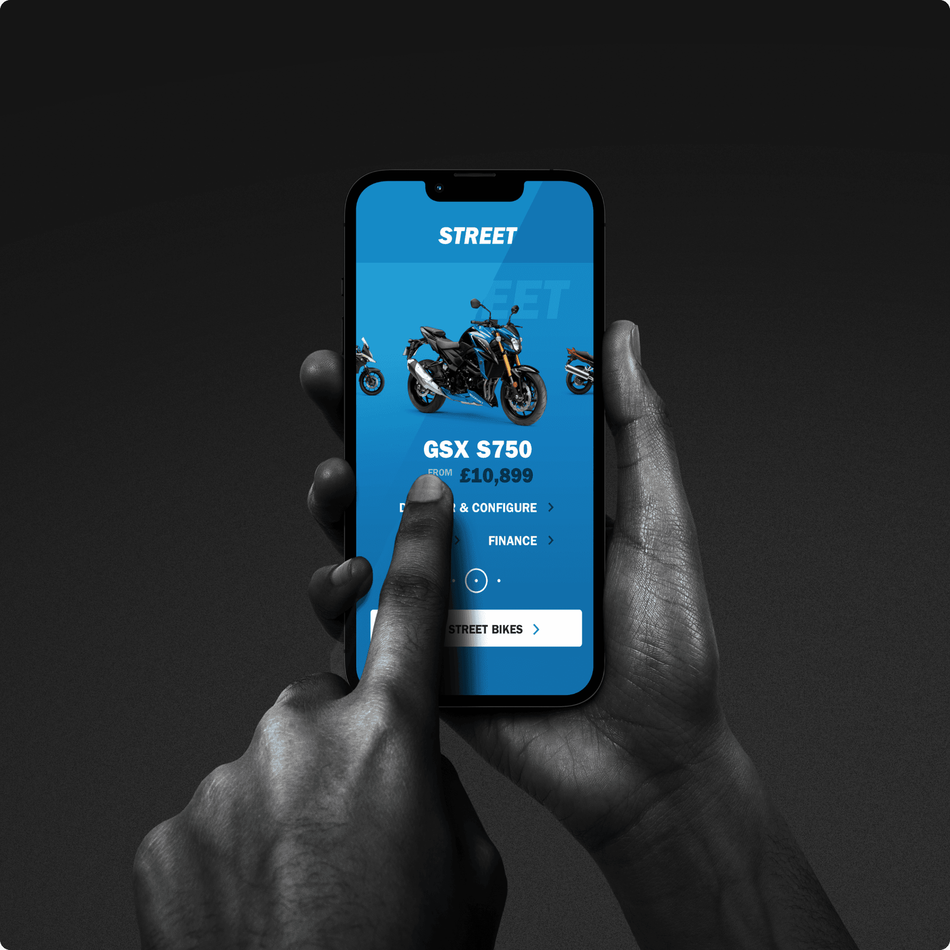
User insight helped set the design direction quickly and show this in a Proof of Concept. Before investing significantly in development we could check and improve our thinking with feedback from business stakeholders and target customers.
Never have I had so many positive comments about how fantastic our new website looks and works. The end product is beyond our expectations.
High-performance design
Building on the insight gathered during our customer research, we were able to move quickly from a PoC into product design which included:
Using customer insight to create a validated feature set and requirements.
Creating wireframes and low-fidelity prototypes for user testing.
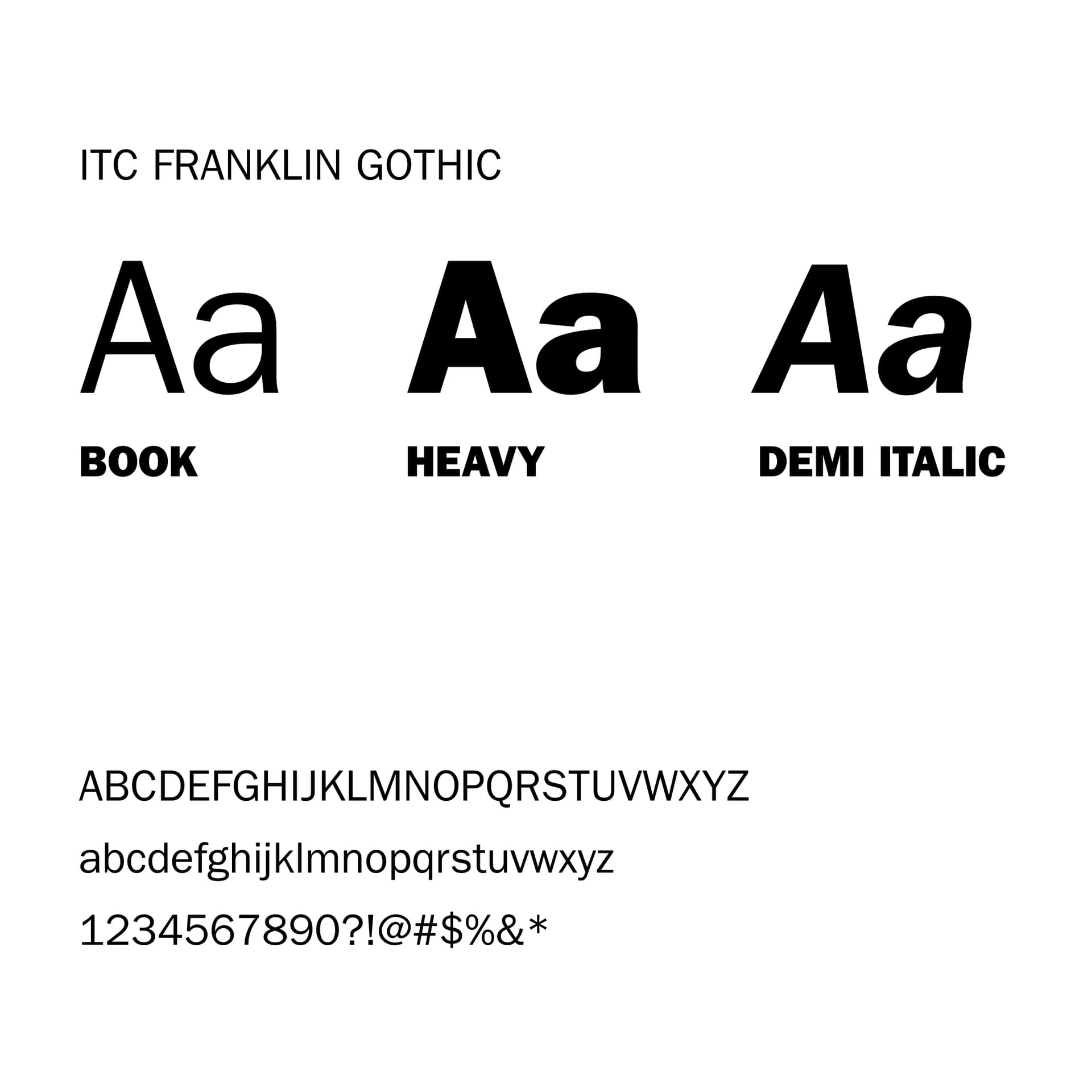
Visual and Interaction design in line with Suzuki’s distinctive brand.
Developing a scalable design system with flexible patterns in code.
Build and deployment.
Sketching wireframes allowed us to quickly test design solutions to customer problems. We noticed that distinguishing how big a vehicle is in relation to another vehicle was an important early factor in understanding the Suzuki range. These kinds of differentiating insights across user groups occurred throughout our design research process and fed into our visual design direction for each product line.
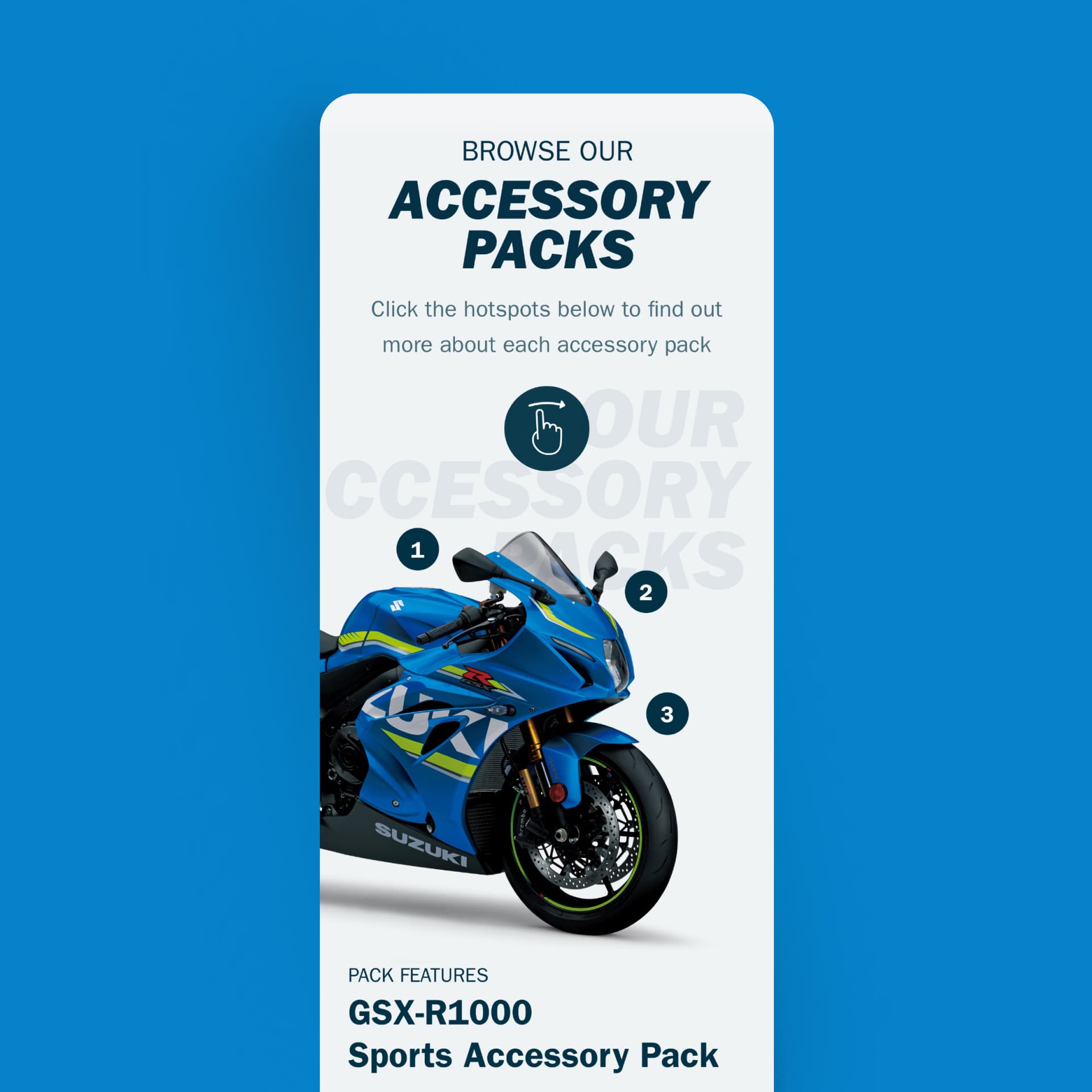
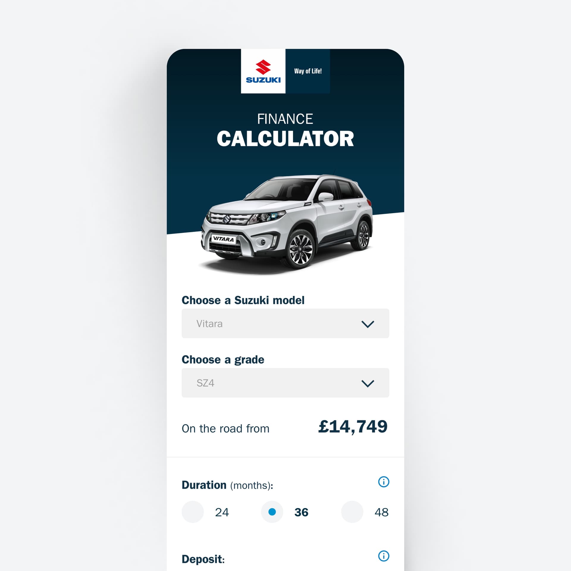
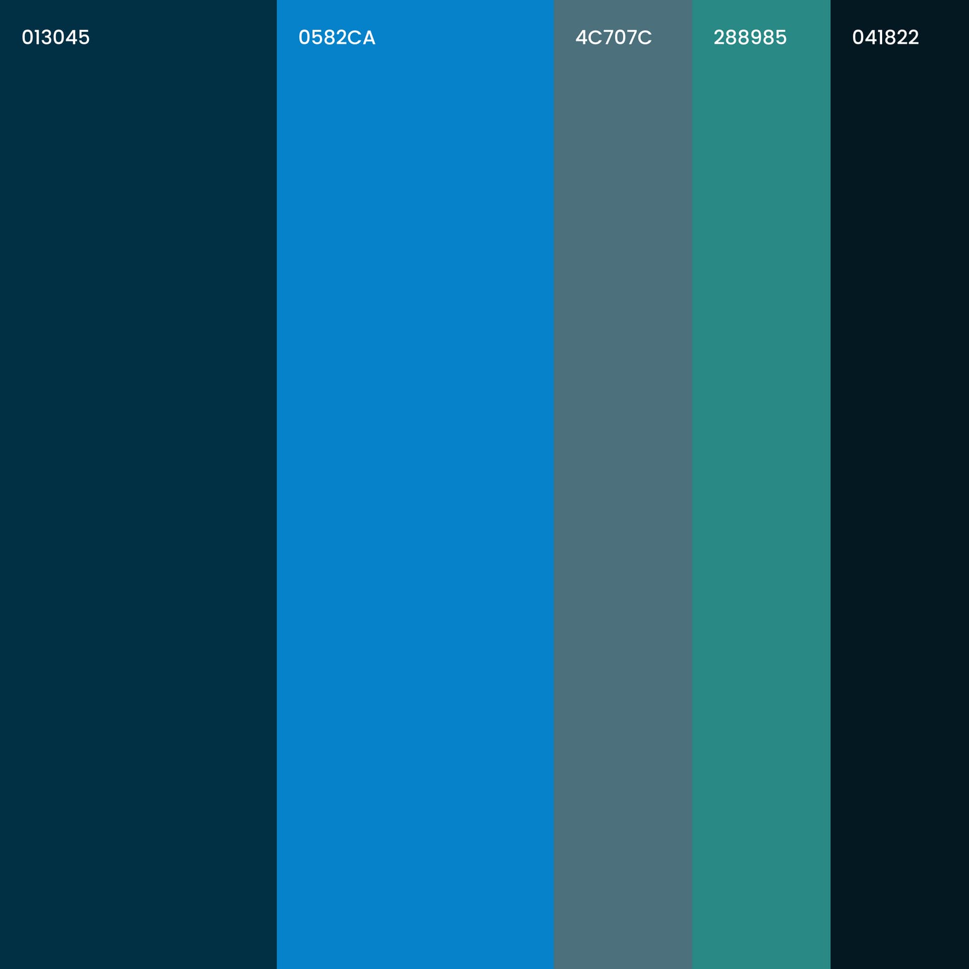
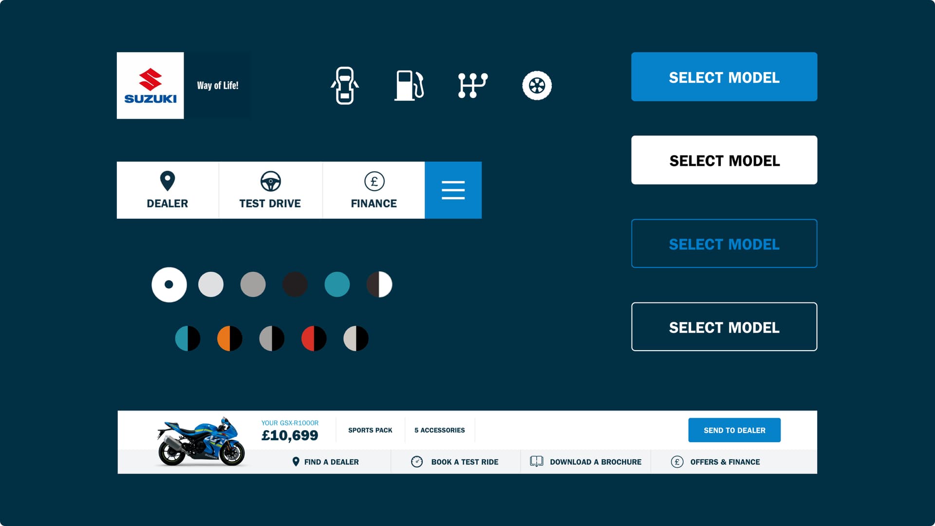
We took a component-based approach to designing and developing these digital experiences. We created six basic styles of page, consolidating Suzuki’s current offering by 75%. The benefit to this approach became clear when assessing the technical feasibility of the project. Our designs were to be deployed to a shared CMS, highlighting the need for shared templates and modules. This also demonstrated the value of defining consistent patterns to be used and reapplied across the brands. Throughout the rest of the design and development work we took a 70/30 approach to reusing components for Motorcycles from Cars, and a 90/10 approach for reusing existing components for ATV and Marine. This flexibility allows Suzuki to respond to sector-specific user needs while maintaining brand consistency and a high level of efficiency. During the project, each decision to flex the core patterns was based upon user requirements uncovered during research.
From digital to dealer
We prioritised a smooth and easy transition from digital to physical easy when designing and developing elements of the journey. For example, the ‘Send to Dealer’ button keeps prospective customers invested in the purchasing journey as well as strengthening their identification with the brand.
We designed tools for dealers such as special in-dealership configurators which connect the digital and physical experience. To make a purchase decision, most customers need time with the vehicle in a dealership; the digital tools we created maximise the value of this time for both dealer and customer.
Defining and governing a content strategy and practice
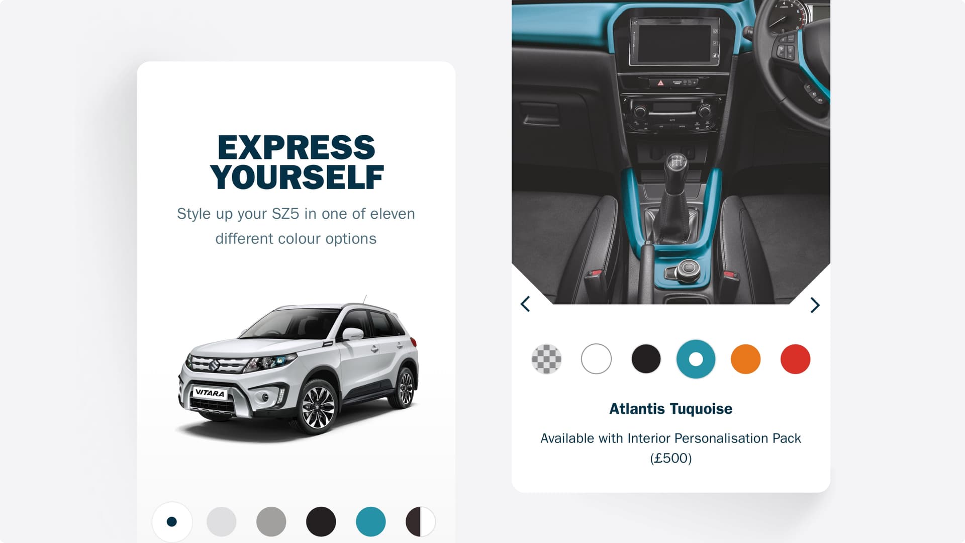
We developed the content strategy and oversaw asset creation. User research guided the development of every content asset from UX writing to the creation of imagery, iconography and other graphical assets. We knew which content was particularly important for different customer groups and this helped us direct interaction and UI design to create maximum value for the user. For example, 360º images are really important for bike buyers, so we checked and tested the imagery and users controls for this in research. Our user-first approach means we have a particular viewpoint on content creation, with relevancy to the user at its centre. Ultimately, this helps customers to make purchasing decisions and have the best possible experience when engaging with Suzuki.

Extending the design system
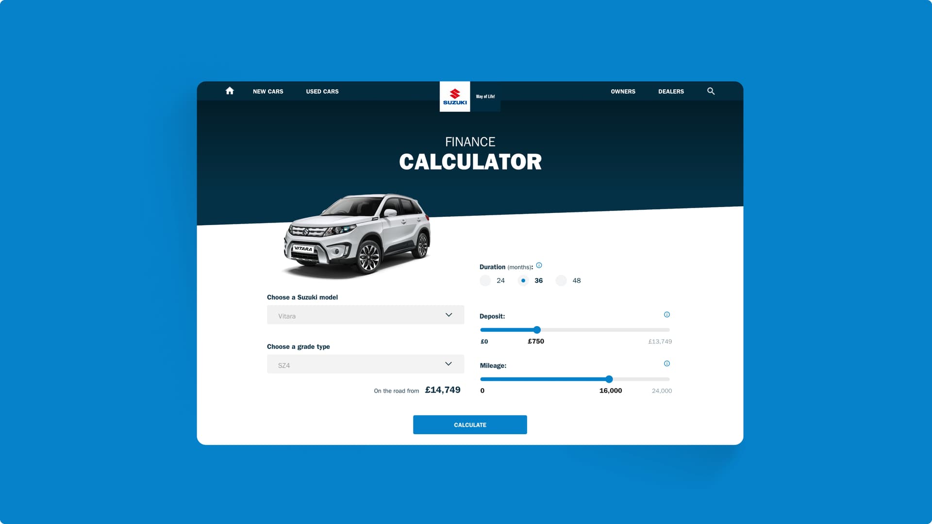
Since the launch of our work we have moved on to apply the system we defined to other Suzuki portals, starting with Suzuki fleet. The same 70/30 rule applied to reusing, designing, and developing new components for this platform. The unique elements of the design we defined for Fleet Managers focused on a tax calculator. This tool allowed Fleet Managers to calculate the costs associated with the tax payable on purchasing or hiring a fleet of vehicles from Suzuki.
Next steps
The distillation of the experience design principles, pattern library, and development practices we used on Suzuki’s suite of sites and portals gives Suzuki the ability to deploy consumer-tested components to new pages across all sub-brands with ease.
Increasing the scope of our work allows Suzuki to present a more unified online presence which we continue to refine with them.
Contact us
Like what you see?
We'd love to partner with you. Contact Ed, on ed@foolproof.co.uk
